Sherwin-Williams Slate Tile (SW 7624) is a refined, deep charcoal gray that exudes sophistication and versatility. Perfect for modern, transitional, or even traditional spaces, this color provides a dramatic backdrop while maintaining an understated elegance. Its balanced depth and rich tone make it a popular choice for homeowners and designers alike seeking to create a space that feels grounded and cohesive.
Slate Tile is a cool-toned gray, but what makes it unique is its subtle blue undertone. The blue hints are not overpowering, yet they lend the shade a modern edge, keeping it from feeling flat or overly neutral. Depending on the lighting conditions, you may notice the blue undertones becoming more pronounced, especially in natural light or cooler artificial lighting. This complexity in undertones makes Slate Tile a dynamic color that can shift in mood as the light changes throughout the day.
The versatility of Slate Tile allows it to pair beautifully with a wide range of coordinating colors. Whether you're creating a monochromatic palette or looking to add contrast and dimension, here are some excellent choices:
Whites and Off-Whites: Pair Slate Tile with clean whites like Sherwin-Williams Pure White (SW 7005) or warmer off-whites like Alabaster (SW 7008) to create a crisp, high-contrast look. These lighter tones highlight Slate Tile's depth and make the space feel bright yet grounded.
Blues: Enhance the inherent blue undertone of Slate Tile by pairing it with coastal-inspired blues like Naval (SW 6244) or Smoky Blue (SW 7604) for a serene and cohesive vibe.
Greens: For an earthy and organic palette, combine Slate Tile with muted greens such as Evergreen Fog (SW 9130) or Sea Salt (SW 6204). This pairing adds warmth and balance to the cool gray tone.
Neutrals: Complement the depth of Slate Tile with warm beige tones like Accessible Beige (SW 7036) or cooler grays like Repose Gray (SW 7015). These neutrals work well in transitional spaces where balance is key.
Metallic Accents: Incorporate metallics like brushed gold, copper, or matte black to elevate the sophistication of Slate Tile, especially in kitchens or bathrooms.
Slate Tile is an incredibly versatile shade that can be used in various applications to suit different design styles. Below are some of the best ways to incorporate this deep, dramatic gray into your space:
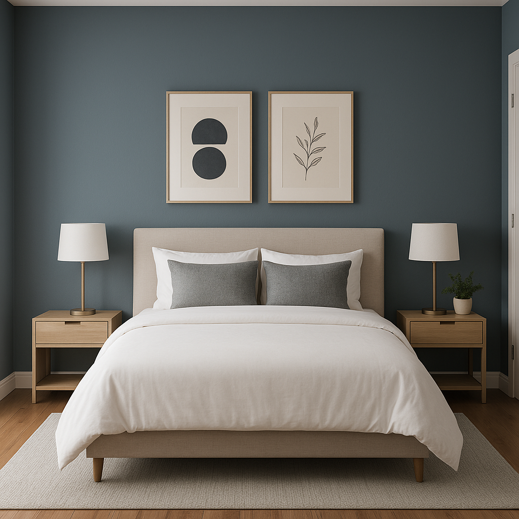
Slate Tile makes a striking choice for an accent wall. Its bold yet balanced tone draws the eye without overwhelming the space, making it ideal for living rooms, bedrooms, or home offices. Pair it with lighter walls to create visual contrast and depth.
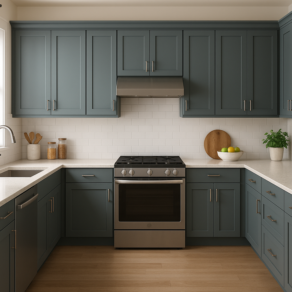
For a modern, luxurious kitchen, Slate Tile is an excellent choice for cabinetry. Its deep hue provides a sleek and sophisticated look, especially when paired with light countertops like marble, quartz, or butcher block. Add brushed gold hardware for a glamorous touch.
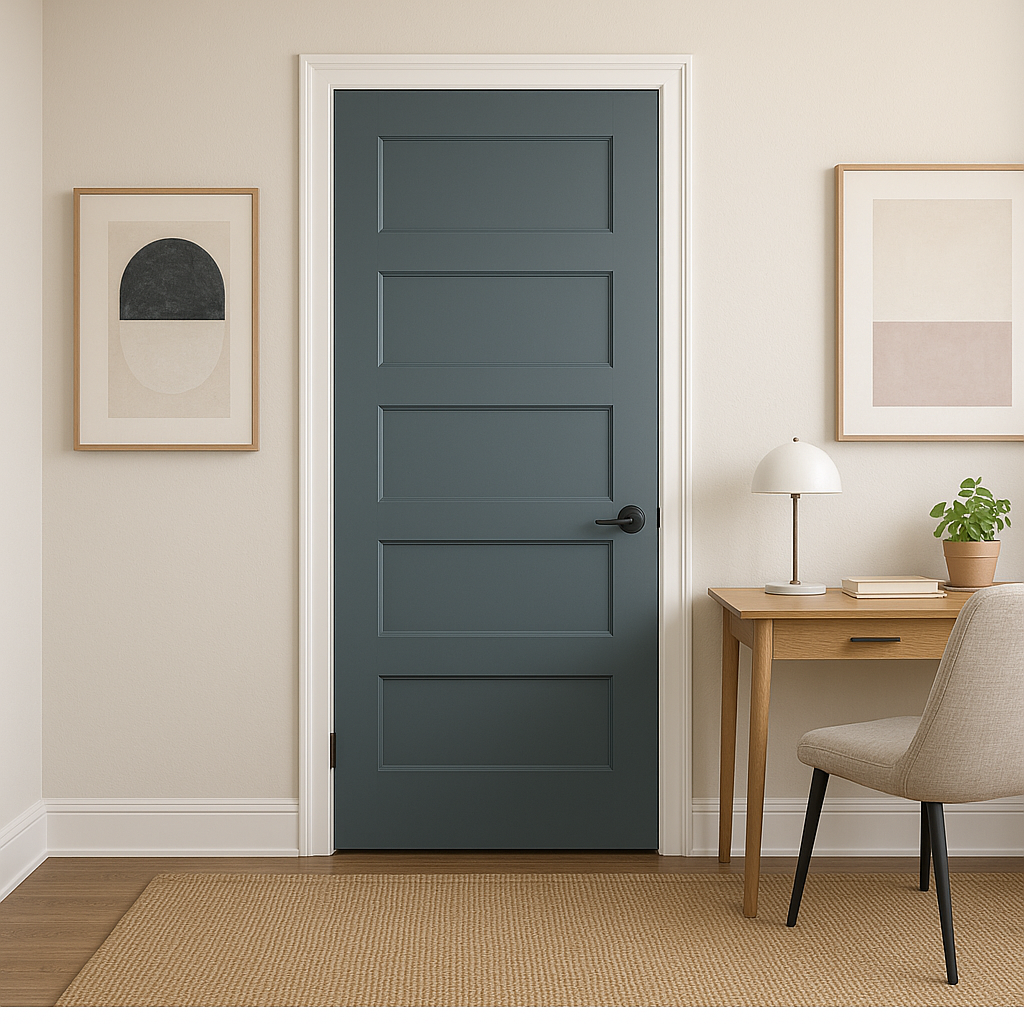
Slate Tile is equally stunning on the exterior of a home. Whether used for siding or as an accent color on shutters and doors, its cool undertones offer a fresh, contemporary look that complements both natural and urban environments.
Create a spa-like retreat by using Slate Tile on bathroom walls or vanities. Its cool undertones pair beautifully with white subway tiles, chrome fixtures, and natural stone accents.
If you're aiming for a cozy yet polished living room or den, Slate Tile can help achieve that balance. Use it for built-in shelving, fireplaces, or wainscoting to add depth and dimension.
Slate Tile’s cool undertone and rich, neutral base make it a perfect fit for industrial or modern designs. Pair it with exposed wood beams, concrete, and minimalist furniture for a clean, edgy aesthetic.
Because of its cool undertones, Slate Tile can shift slightly depending on the lighting in your space. In rooms with ample natural light, you may notice the blue undertone coming through more prominently, giving the color a crisp and refreshing feel. In spaces with warm artificial lighting, the charcoal gray may feel softer and slightly warmer. Always test the color in your room using a sample to see how it interacts with your unique lighting conditions.
Sherwin-Williams Slate Tile (SW 7624) proves that dark, moody hues can be versatile and timeless. Its ability to complement a wide range of colors and styles makes it a go-to choice for designers and homeowners aiming to create a space that feels elevated and intentional. Whether used as an accent or as the primary color in a room, Slate Tile brings richness and character to any design.
Note: These images were all generated with AI, there may be inaccurate color results. Please only use a general reference to get a rough idea of what a color may look like, we will continue to generate new images to improve accuracy.
View Colors Only by Brand (No Imagery):
Sherwin-Williams
|
Benjamin-Moore
|
Behr
|
Valspar
Live on the Eastern Slope of Colorado and looking for a local painting professional, check out all our painting services and reach out for a free estimate.
Copyright © 2026 : Wild Fox Painting Inc. : 12435 Mead Way, Littleton, CO 80125


