Sherwin-Williams Paperwhite (SW 7105) is a refined, soft neutral that effortlessly enhances any space with its understated elegance. Perfectly balanced between warm and cool tones, this color creates a calming and welcoming atmosphere, making it a versatile choice for a variety of interior styles. Its muted quality adds depth and dimension without overpowering other design elements, making it a favorite among interior designers for creating harmonious spaces.
Paperwhite is a delicate shade with subtle undertones that lean toward a gentle gray-beige or greige. These undertones give it a sophisticated edge, allowing it to complement both warm and cool color palettes. While some off-whites can feel stark or sterile, Paperwhite’s nuanced tones ensure a soft, inviting ambiance that feels neither too cold nor too warm. Depending on lighting conditions, you may notice hints of pale gray or beige emerge, offering dynamic versatility throughout the day.
Sherwin-Williams Paperwhite is highly adaptable, pairing beautifully with a broad spectrum of colors. Here are some coordinating color options to inspire your palette:
Soft Accents:
Pair Paperwhite with Sherwin-Williams Alabaster (SW 7008) for a clean, monochromatic look. Alabaster’s creamy white tone complements Paperwhite’s subtle warmth, creating a serene, minimalist aesthetic.
Warm Neutrals:
Combine it with Sherwin-Williams Accessible Beige (SW 7036) or Canvas Tan (SW 7531) for an earthy, grounded feel. These hues emphasize Paperwhite’s beige undertones, resulting in a cozy and inviting atmosphere.
Cool Contrast:
For a modern twist, use Sherwin-Williams Naval (SW 6244) or Cyberspace (SW 7076) as accent colors. These deep blues and grays create striking contrast against Paperwhite’s soft neutrality, adding drama and sophistication to the design.
Nature-Inspired Greens:
Bring in Sherwin-Williams Evergreen Fog (SW 9130) or Clary Sage (SW 6178) for a fresh, organic vibe. These muted greens pair seamlessly with Paperwhite to evoke tranquility and a connection to the outdoors.
Paperwhite is an incredibly versatile paint color that works well in various settings.
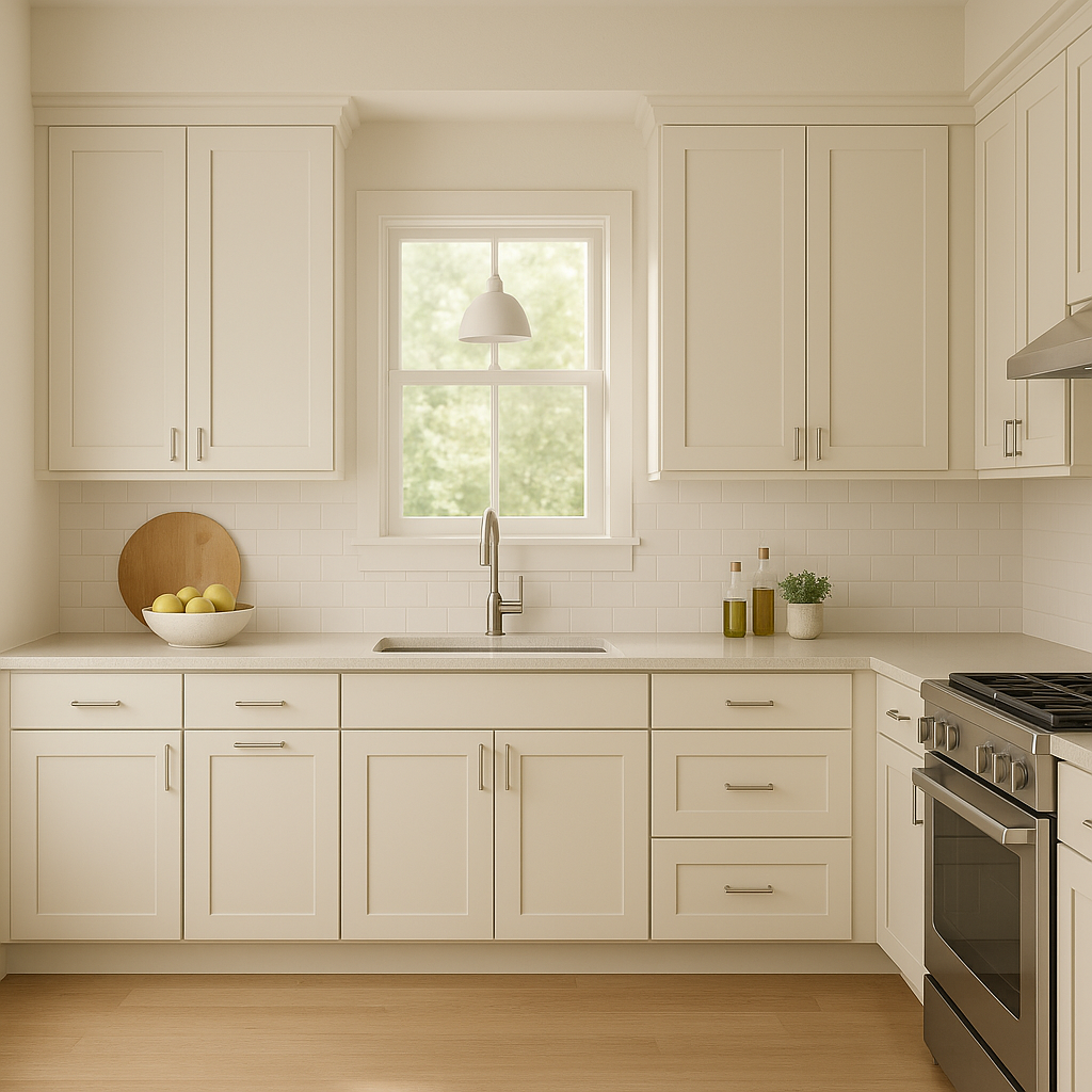
Living Rooms:
Create a cozy yet polished living space by using Paperwhite as your primary wall color. It provides a neutral backdrop for furniture, artwork, and textiles in both contemporary and traditional interiors.
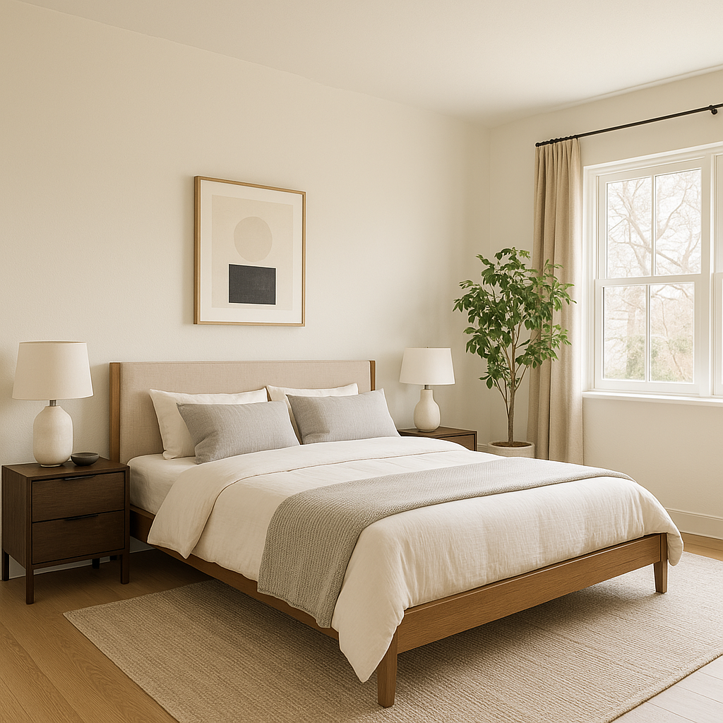
Bedrooms:
Paperwhite’s serene undertones make it ideal for bedrooms, where a restful and relaxing atmosphere is key. Pair it with soft linens and warm wood tones for an inviting retreat.
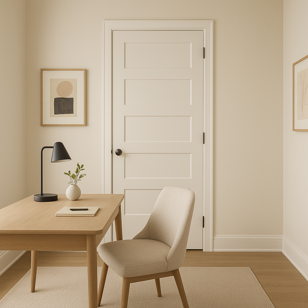
Home Offices:
For a productive yet calming workspace, Paperwhite offers an excellent balance of neutrality and sophistication. Accent with darker furniture or metallic finishes to add contrast and focus.
Bathrooms:
Use Paperwhite in bathrooms for a spa-like feel. Its soft, clean aesthetic pairs beautifully with marble countertops, chrome fixtures, and natural wood accents.
Open Concept Spaces:
Paperwhite is a go-to color for open floor plans, as it seamlessly connects different areas while maintaining a cohesive look. Its ability to adapt to diverse lighting conditions ensures harmony throughout the space.
The appearance of Sherwin-Williams Paperwhite can shift depending on lighting conditions. In spaces with abundant natural light, it often leans toward its pale gray undertones, offering a cool and crisp vibe. In dimmer areas or under artificial lighting, the beige undertones may become more prominent, lending warmth and coziness to the room. Always test Paperwhite in your space to observe how it interacts with your specific lighting environment.
Sherwin-Williams Paperwhite (SW 7105) is a masterful choice for those seeking a refined neutral that provides both versatility and sophistication. Whether you’re designing a modern minimalist home or a classic, timeless retreat, this color adapts beautifully to any aesthetic. Its gentle undertones and ability to coordinate with a wide range of colors make it a reliable and elegant foundation for your interior design vision.
Note: These images were all generated with AI, there may be inaccurate color results. Please only use a general reference to get a rough idea of what a color may look like, we will continue to generate new images to improve accuracy.
View Colors Only by Brand (No Imagery):
Sherwin-Williams
|
Benjamin-Moore
|
Behr
|
Valspar
Live on the Eastern Slope of Colorado and looking for a local painting professional, check out all our painting services and reach out for a free estimate.
Copyright © 2026 : Wild Fox Painting Inc. : 12435 Mead Way, Littleton, CO 80125


