Sherwin-Williams Marigold (SW 6664) is a bold, golden hue that radiates warmth, positivity, and energy. It’s a striking color that immediately draws attention, making it the perfect choice for spaces where you want to inspire creativity or evoke a cheerful, uplifting atmosphere. Marigold is reminiscent of blooming flowers in late summer, with its deep yellow-orange tones exuding an inviting and sunny demeanor.
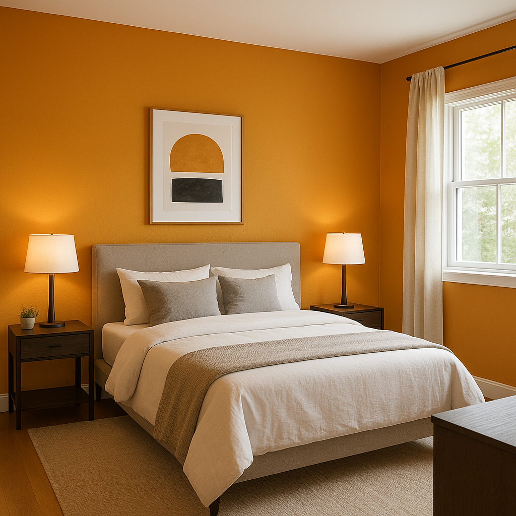
Marigold carries rich undertones of orange and soft amber, giving it a depth and vibrancy that feels both timeless and modern. These undertones ensure the color doesn’t appear flat or overly bright, but rather takes on a sophisticated golden warmth in various lighting conditions. In natural light, Marigold leans toward its sunny yellow side, while in softer, artificial light, the orange undertones become more pronounced, creating a cozy and intimate ambiance.
To truly make Sherwin-Williams Marigold shine, pair it with complementary and harmonizing hues. Here are some suggestions:
Neutral Coordinating Colors:
Earthy Complementary Colors:
Bold Accent Colors:
Marigold is a versatile color that can be used in a variety of design applications. Its bold personality makes it ideal for accent walls, focal points, and smaller spaces where you want to make a statement. Here are some ideas for incorporating Marigold into your interior design:
Living Rooms and Common Areas: Use Marigold on an accent wall to infuse energy and warmth into a space. Pair it with neutral furniture and accessories to balance its vibrant nature, or let it shine alongside earthy tones for a grounded yet cheerful look.
Home Offices or Creative Spaces: Marigold’s uplifting and vibrant qualities make it an excellent choice for spaces where creativity and focus are key. Combine it with softer neutrals and greens for a balanced environment.
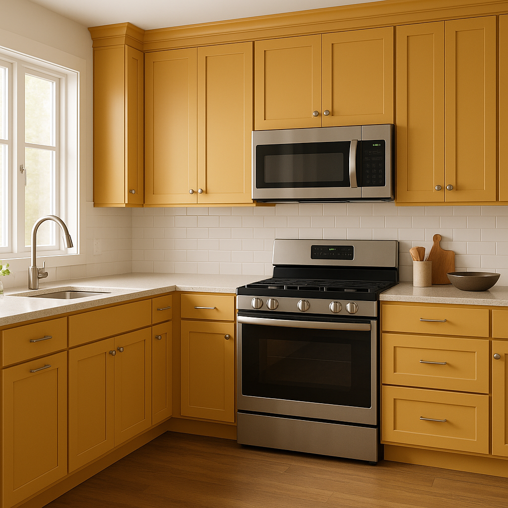
Kitchens and Dining Rooms: Bring warmth and cheer to your kitchen or dining area by incorporating Marigold on cabinetry, walls, or even as a backsplash. This color pairs beautifully with wood tones, metallic accents, and natural materials.
Children’s Rooms or Playrooms: Marigold’s playful and sunny disposition makes it a delightful choice for children’s spaces. Pair it with bright accent colors like pinks, blues, and greens to create an engaging and joyful atmosphere.
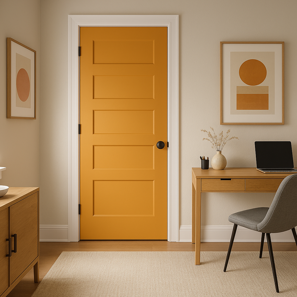
Entryways and Hallways: Make a bold first impression by using Marigold in entryways or hallways. Its vibrant hue welcomes guests with a sense of warmth and optimism.
Lighting plays a crucial role in how Sherwin-Williams Marigold is perceived. In spaces with ample natural light, the color takes on a brighter, sunnier appearance, emphasizing its yellow tones. In dimmer, artificial light, the orange undertones become more pronounced, creating a deeper, cozier effect. To fully enjoy this versatile hue, consider the lighting conditions in the space and how you want Marigold to feel in your home.
Sherwin-Williams Marigold (SW 6664) is a color that commands attention and brings life to any interior. Whether you use it as a bold statement or as a cheerful accent, this vibrant golden hue is sure to transform your space with its warmth and energy. Pair it thoughtfully with coordinating colors to create a harmonious design that reflects your personality and style.
Note: These images were all generated with AI, there may be inaccurate color results. Please only use a general reference to get a rough idea of what a color may look like, we will continue to generate new images to improve accuracy.
View Colors Only by Brand (No Imagery):
Sherwin-Williams
|
Benjamin-Moore
|
Behr
|
Valspar
Live on the Eastern Slope of Colorado and looking for a local painting professional, check out all our painting services and reach out for a free estimate.
Copyright © 2026 : Wild Fox Painting Inc. : 12435 Mead Way, Littleton, CO 80125


