Sherwin-Williams Breaktime (SW 6463) is a captivating shade that effortlessly combines a sense of tranquility with a playful edge. This soft, muted green boasts a light and airy presence, making it a versatile choice for spaces that crave a touch of refreshment and calm. With its soothing personality, Breaktime has the ability to transform interiors into peaceful havens or energizing retreats, depending on how it’s used.
Breaktime leans into its green roots with gentle blue undertones that infuse the shade with a soft coastal vibe. These cool undertones prevent the color from feeling overly warm or saturated, giving it a balanced appearance that is neither too bold nor too subdued. The subtle blue notes lend Breaktime a slightly aquatic feel, making it an excellent choice for spaces inspired by nature or water.
Sherwin-Williams Breaktime pairs beautifully with a range of complementary and contrasting hues. Its versatility makes it an ideal option for creating harmonious palettes or bold statements. Here are some coordinating colors to consider:
Neutral Partners:
For a balanced and serene look, pair Breaktime with soft neutrals like Sherwin-Williams Alabaster (SW 7008) or Snowbound (SW 7004). These creamy whites bring out the cool undertones in Breaktime while maintaining a light and airy ambiance.
Earthy Complements:
Earthy tones like Sherwin-Williams Accessible Beige (SW 7036) or Grayish (SW 6001) create a grounded and sophisticated vibe when paired with Breaktime. These shades enhance the green’s natural feel without overwhelming the space.
Bold Accents:
For a dynamic contrast, consider deep navy tones such as Sherwin-Williams Naval (SW 6244) or rich charcoal shades like Iron Ore (SW 7069). These darker hues provide a striking counterbalance to Breaktime’s softness.
Playful Pops:
Infuse some personality into your palette with cheerful accents like Sherwin-Williams Coral Reef (SW 6606) or Lemon Twist (SW 6909). These vibrant colors add a fun, energetic touch to the serene green base of Breaktime.
Sherwin-Williams Breaktime is a versatile color that can be used in a variety of spaces to evoke different moods and aesthetics. Here are some ideal applications:
Living Rooms:
Create a welcoming and relaxed atmosphere by using Breaktime on the walls of your living room. Pair it with light furnishings and natural textures like wood or rattan for a casual, breezy feel.
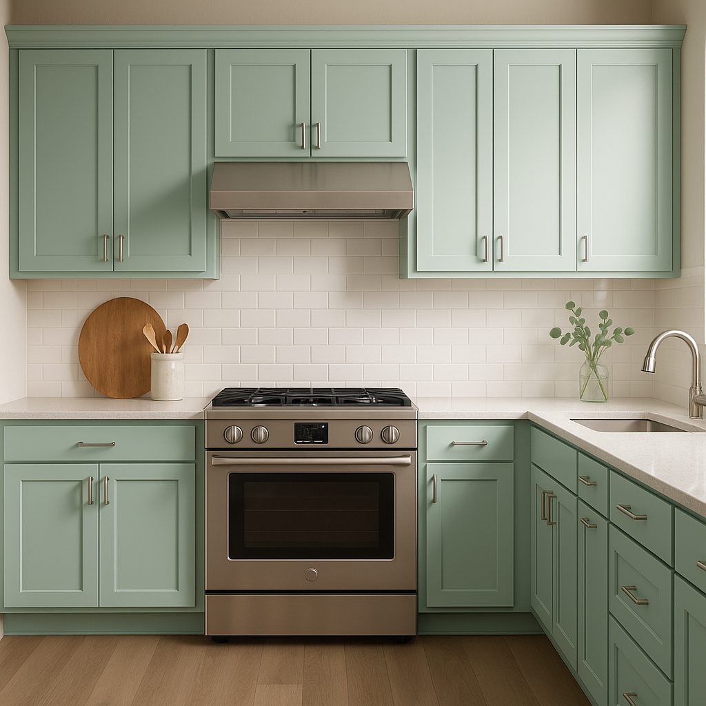
Kitchens:
Breaktime is a refreshing choice for kitchen cabinetry or walls. Its clean, crisp aesthetic pairs beautifully with white subway tiles, butcher block countertops, and stainless steel appliances.
Bathrooms:
Bring a spa-like feel to your bathroom with Breaktime. Its cool undertones are perfect for creating a serene retreat, especially when paired with polished chrome fixtures and soft white towels.
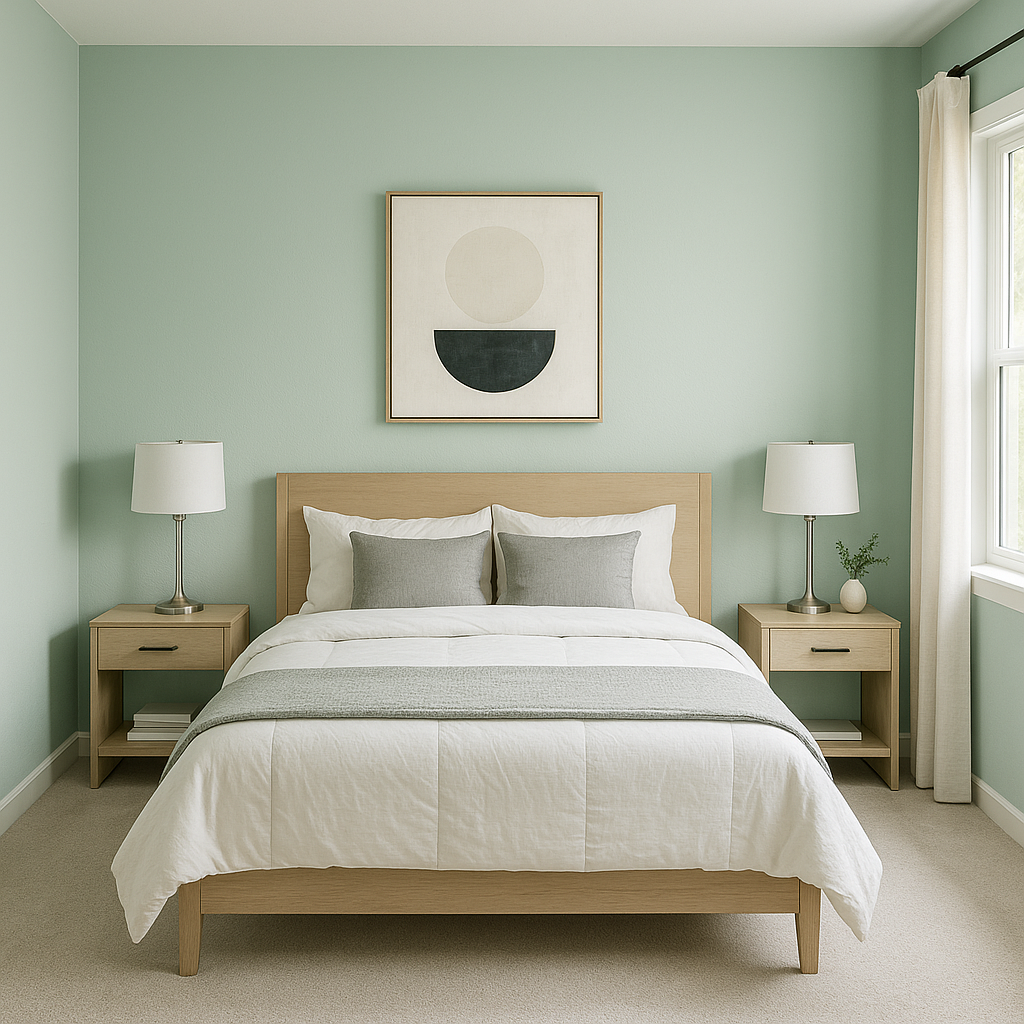
Bedrooms:
Use Breaktime in bedrooms to create a calming sanctuary. Pair it with neutral bedding and soft lighting to craft a space that promotes relaxation and rest.
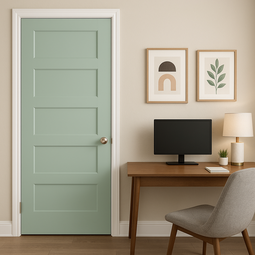
Accent Walls:
If you’re looking to introduce a subtle pop of color, Breaktime works wonderfully as an accent wall. Use it in offices, dining rooms, or entryways to add interest without overwhelming the space.
Sherwin-Williams Breaktime (SW 6463) is the perfect choice for anyone seeking a color that exudes calm, freshness, and versatility. Whether you’re looking to transform an entire room or add a subtle touch of nature-inspired beauty, this soft green delivers timeless elegance with a modern twist. Its ability to pair seamlessly with a wide range of coordinating colors ensures that your design possibilities are nearly endless.
Note: These images were all generated with AI, there may be inaccurate color results. Please only use a general reference to get a rough idea of what a color may look like, we will continue to generate new images to improve accuracy.
View Colors Only by Brand (No Imagery):
Sherwin-Williams
|
Benjamin-Moore
|
Behr
|
Valspar
Live on the Eastern Slope of Colorado and looking for a local painting professional, check out all our painting services and reach out for a free estimate.
Copyright © 2026 : Wild Fox Painting Inc. : 12435 Mead Way, Littleton, CO 80125


