
Sherwin-Williams Compatible Cream (SW 6387) is a timeless paint color that offers a warm and inviting ambiance to any space. This soft, buttery cream is a versatile neutral with subtle undertones that create an effortlessly cozy aesthetic. Its welcoming hue makes it a popular choice for homeowners and designers alike, blending seamlessly into both traditional and modern interiors.
Compatible Cream carries warm undertones of yellow and beige, giving it a sunny, cheerful disposition without being overpowering. The yellow undertone provides a soft glow, making it ideal for spaces where natural light can amplify its radiance. However, depending on the lighting and surrounding decor, the beige undertone can take center stage, offering a grounded and subdued neutrality. This dual personality ensures the color adapts beautifully to different lighting conditions, whether in bright morning sunlight or dim evening artificial lighting.
In north-facing rooms with cooler, bluish natural light, the creaminess of SW 6387 may appear slightly muted, leaning more into its beige base. Meanwhile, in south-facing rooms with warm, golden sunlight, the yellow undertones will shine through, creating a brighter, uplifting atmosphere.
Sherwin-Williams Compatible Cream is remarkably versatile, pairing well with a variety of colors to suit different design styles. Here are some coordinating colors to enhance its beauty:
For those seeking pops of color, Compatible Cream pairs beautifully with soft blues, blush pinks, and muted sage greens to bring life and personality to the space.
The adaptability of Sherwin-Williams Compatible Cream makes it an excellent choice for multiple applications throughout your home. Here are some ways to use this versatile color:
Create a cozy and inviting living room by using Compatible Cream on the walls. Its warm undertones make it an excellent backdrop for wooden furniture, soft textiles, and metallic accents. Pair it with neutral or earth-toned decor for a calming environment or add vibrant throw pillows and artwork for a lively feel.
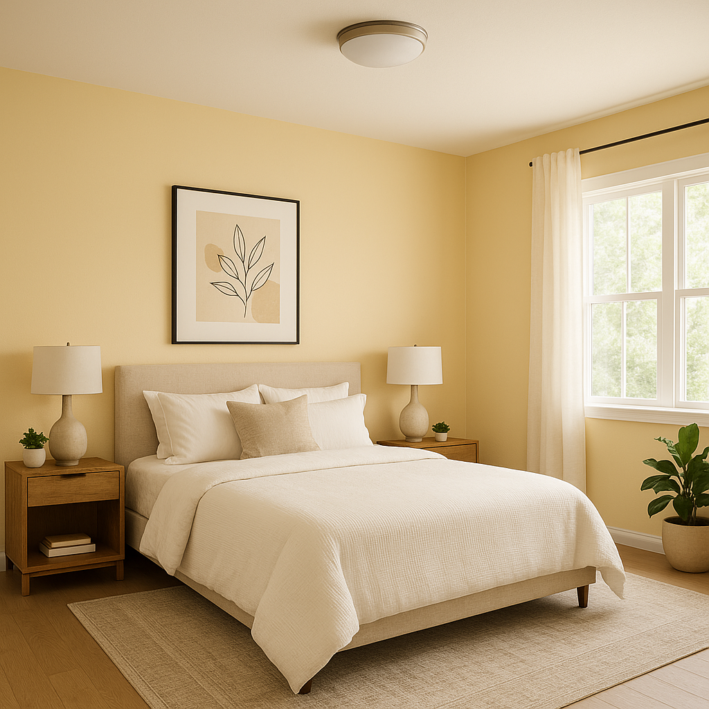
Compatible Cream is the perfect choice for bedrooms if you’re aiming for a serene and restful retreat. Its soft glow brings warmth and comfort, fostering a tranquil and relaxing atmosphere. Pair it with crisp white bedding and warm wood tones for a timeless look, or introduce muted blues and greens for a soothing color combination.
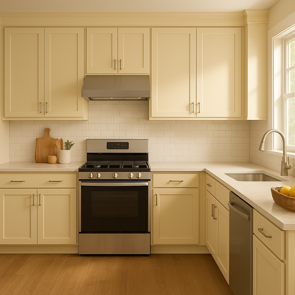
This creamy hue works beautifully in kitchens and dining rooms, creating a welcoming environment that feels bright and cheerful. It pairs wonderfully with white or cream cabinetry, natural wood finishes, and brushed brass hardware for an elegant yet approachable aesthetic. Consider using it on walls to complement subway tile backsplashes or stone countertops.
Hallways and entryways painted in Compatible Cream exude an inviting charm, setting the tone for the rest of your home. Its light reflection properties help brighten narrow spaces, and its neutrality ensures it blends well with adjoining rooms in various color schemes.
Compatible Cream brings warmth and sophistication to bathrooms, especially when paired with white trim and fixtures. Add accents like soft gray towels or gold hardware to elevate the look.
Sherwin-Williams Compatible Cream (SW 6387) is a standout choice for anyone seeking a warm, versatile neutral that works beautifully across a variety of styles and spaces. Its ability to adapt to lighting conditions and pair with coordinating colors makes it a reliable and timeless option for both large-scale projects and small updates. Whether you're refreshing a single room or designing a cohesive color palette for your entire home, Compatible Cream is a tried-and-true shade that balances elegance, warmth, and versatility.
Note: These images were all generated with AI, there may be inaccurate color results. Please only use a general reference to get a rough idea of what a color may look like, we will continue to generate new images to improve accuracy.
View Colors Only by Brand (No Imagery):
Sherwin-Williams
|
Benjamin-Moore
|
Behr
|
Valspar
Live on the Eastern Slope of Colorado and looking for a local painting professional, check out all our painting services and reach out for a free estimate.
Copyright © 2026 : Wild Fox Painting Inc. : 12435 Mead Way, Littleton, CO 80125


