Sherwin-Williams Comfort Gray (SW 6205) is a timeless paint color that has earned its place as a favorite among homeowners and designers alike. This sophisticated shade is part of the Sherwin-Williams Coastal Cool collection, and its tranquil, muted tone makes it an excellent choice for creating serene and welcoming spaces. With its subtle undertones and incredible versatility, Comfort Gray offers a unique blend of style and relaxation that complements a wide variety of interior design aesthetics.
Comfort Gray is often described as a soft green-gray, but its complexity reveals much more upon closer inspection. While its primary base is a gentle gray, it carries green undertones that lend it a soothing, nature-inspired feel. Depending on the lighting and surrounding decor, you may also detect hints of blue, making Comfort Gray a chameleon-like shade that adapts beautifully to different environments.
This dynamic quality makes Comfort Gray a perfect choice for homeowners seeking a versatile paint color that shifts gracefully throughout the day.
Sherwin-Williams Comfort Gray pairs effortlessly with a wide range of colors, offering endless possibilities for interior design. Whether you're aiming for a harmonious monochromatic palette or introducing contrasting accents, this hue adapts with ease. Below are some suggested coordinating colors that complement Comfort Gray beautifully:
Neutral Pairings:
Accent Colors:
Bold Contrasts:
For trim and ceilings, opt for SW 7005 Pure White or SW 6385 Dover White to add brightness and clarity to your space.
Comfort Gray’s calming presence makes it a versatile choice for a wide range of rooms and design styles. Its balanced mix of gray, green, and blue undertones provides a serene backdrop that works equally well in modern, coastal, farmhouse, and transitional interiors.
Comfort Gray creates an inviting atmosphere in living rooms, especially when paired with warm wood tones and plush textiles. Add touches of natural materials like jute rugs, woven baskets, or linen curtains to enhance its organic feel.
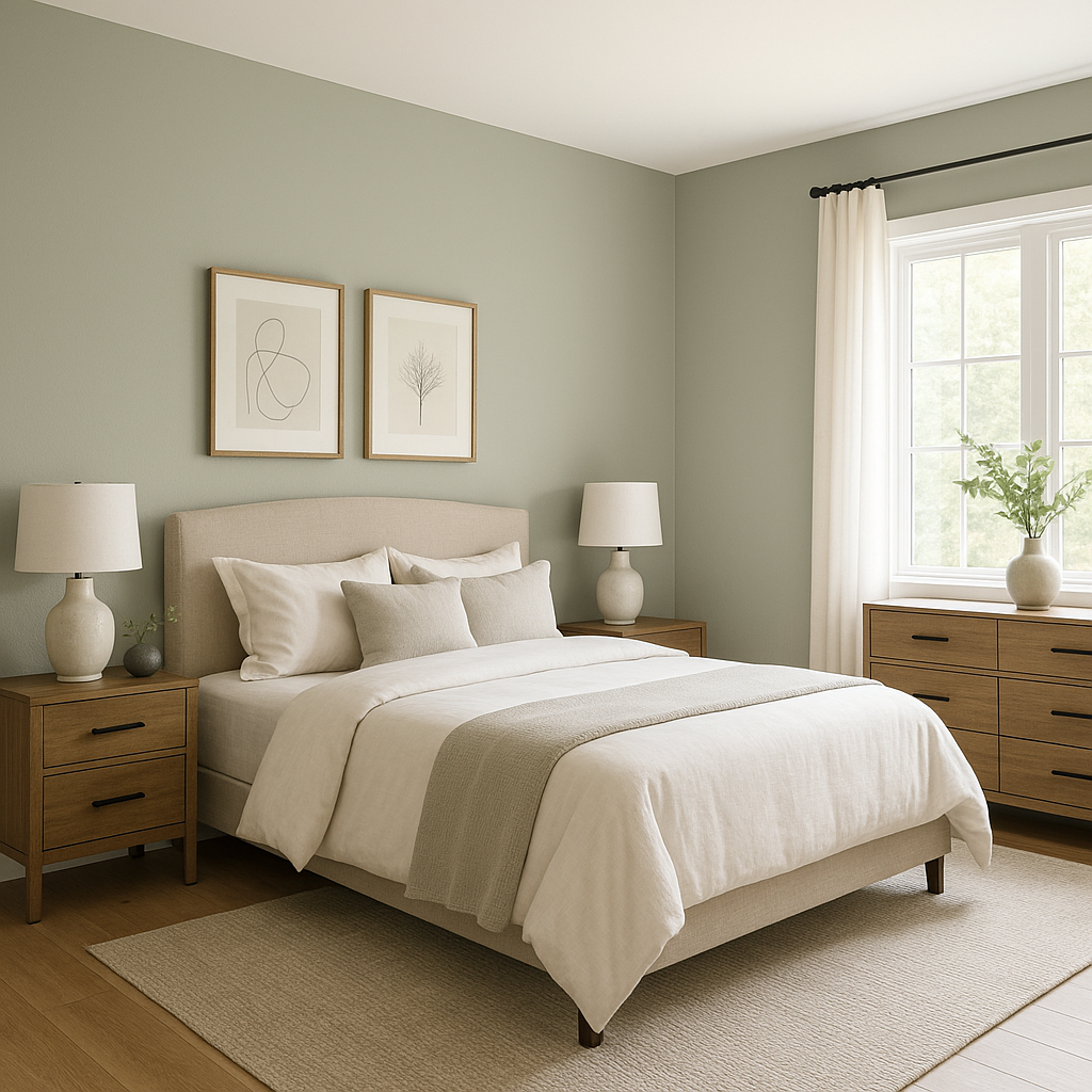
For a restful retreat, Comfort Gray is an ideal choice for bedrooms. Its tranquil qualities promote relaxation, making it perfect for spaces designed to unwind. Pair it with soft whites, light grays, or pastel hues to achieve a dreamy look.
Bring a spa-like ambiance to bathrooms with Comfort Gray. Its cool undertones evoke the calming essence of water and nature, making it a popular option for creating a peaceful sanctuary. Coordinate with white subway tiles, brushed nickel fixtures, and soft teal accents for a clean, refreshing aesthetic.
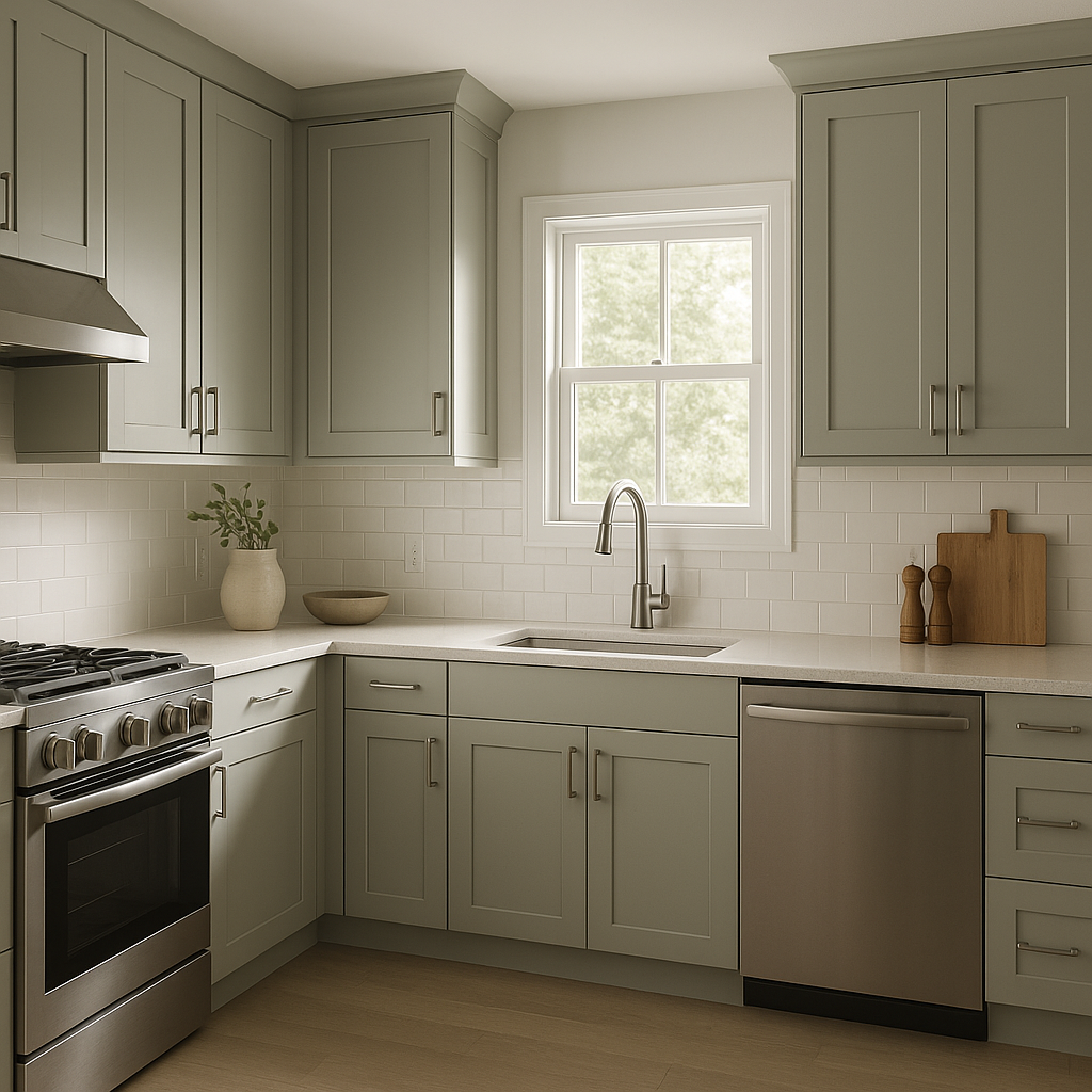
Comfort Gray shines in kitchens, especially when paired with crisp white cabinetry and natural stone countertops. Add pops of color through decor like patterned rugs, ceramic dishes, or bold backsplash tiles to bring vibrancy to the space.
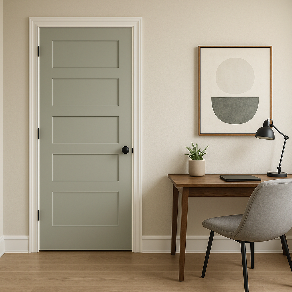
If you're designing a home office, Comfort Gray provides a balanced backdrop that fosters focus and creativity without overwhelming the senses. Pair it with warm wood furniture and metallic finishes for a polished look.
Sherwin-Williams Comfort Gray is more than just a paint color—it's an experience. Its ability to adapt to different lighting conditions and its harmonious blend of gray, green, and blue undertones make it a standout choice for creating tranquil yet stylish interiors. Whether you're revamping a single room or planning a whole-home color scheme, Comfort Gray offers the versatility and elegance to meet your design goals. With its soothing demeanor and endless pairing possibilities, this hue promises to transform your space into a haven of comfort and beauty.
Note: These images were all generated with AI, there may be inaccurate color results. Please only use a general reference to get a rough idea of what a color may look like, we will continue to generate new images to improve accuracy.
View Colors Only by Brand (No Imagery):
Sherwin-Williams
|
Benjamin-Moore
|
Behr
|
Valspar
Live on the Eastern Slope of Colorado and looking for a local painting professional, check out all our painting services and reach out for a free estimate.
Copyright © 2026 : Wild Fox Painting Inc. : 12435 Mead Way, Littleton, CO 80125


