Sherwin-Williams Intuitive (SW 6017) is an enchanting and soft shade of purple that effortlessly blends sophistication with tranquility. This muted color is perfect for crafting spaces that evoke a sense of calm and creativity. Whether you're designing a cozy living room, an inspiring workspace, or a serene bedroom, Intuitive is a versatile choice that can elevate the ambiance of your home.
Intuitive is a delicate, muted lavender with gray undertones that keep it grounded rather than overly vibrant. Its subtle coolness makes it approachable and versatile, working beautifully with a variety of design styles, from modern minimalism to eclectic bohemian. The gray undertones prevent Intuitive from feeling too sweet or juvenile—it's a mature purple that feels sophisticated and serene.
When viewed under warm lighting, Intuitive takes on a slightly warmer and cozier tone, while cooler lighting highlights its soft lavender essence. This adaptability makes it a great choice for spaces with varying lighting conditions.
Sherwin-Williams Intuitive pairs seamlessly with a variety of complementary and contrasting hues. Here are some coordinating colors to consider:
Neutral Pairings:
To keep the palette subdued and timeless, pair Intuitive with soft neutrals like Sherwin-Williams Snowbound (SW 7004) or Repose Gray (SW 7015). These hues highlight Intuitive’s calmness while creating a harmonious backdrop.
Earthy Accents:
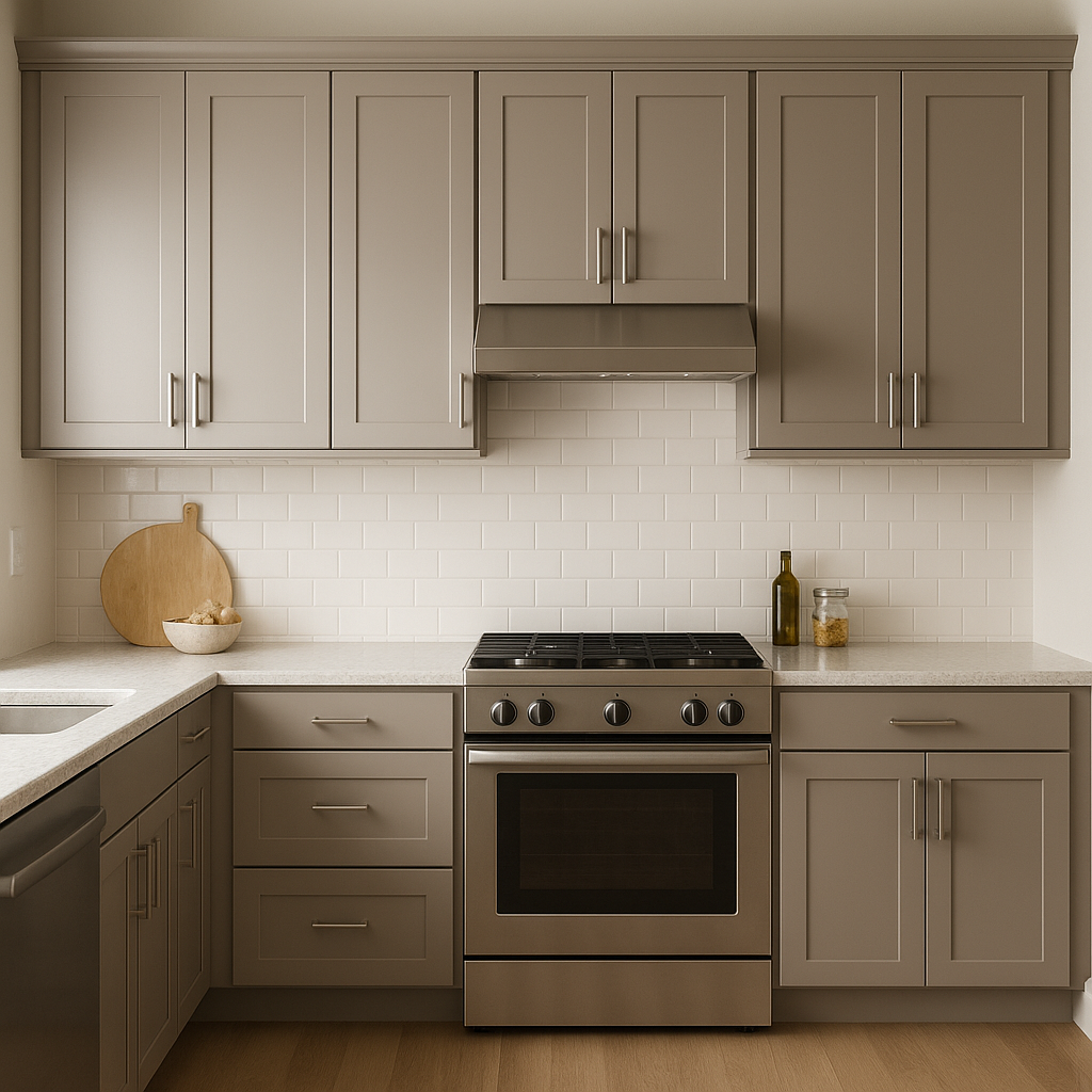
For a grounded and organic aesthetic, incorporate earthy tones like Sherwin-Williams Urbane Bronze (SW 7048) or Accessible Beige (SW 7036). These colors add warmth and depth to the space.
Vibrant Contrast:
Add a pop of energy to your design by pairing Intuitive with bold shades such as Sherwin-Williams Naval (SW 6244) or Coral Reef (SW 6606). These contrasting tones provide visual interest and a modern edge.
Monochromatic Harmony:
If you prefer a layered, monochromatic look, consider other lavender and purple shades like Sherwin-Williams Lite Lavender (SW 6554) or Loyal Blue (SW 6510) to create a subtle yet dynamic gradient effect.
Sherwin-Williams Intuitive is a versatile color that can be used in various settings and design applications. Here are some ideas to inspire your next project:
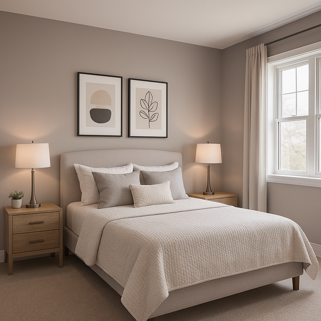
Bedrooms:
As a calming and soothing color, Intuitive is ideal for bedrooms. Pair it with crisp white bedding, soft gray curtains, and natural wood accents to create a tranquil retreat that promotes relaxation.
Living Rooms:
Bring a sense of understated elegance to your living room by using Intuitive as a feature wall color. Pair it with neutral furniture and metallic accents, such as brass or gold, for a modern yet inviting vibe.
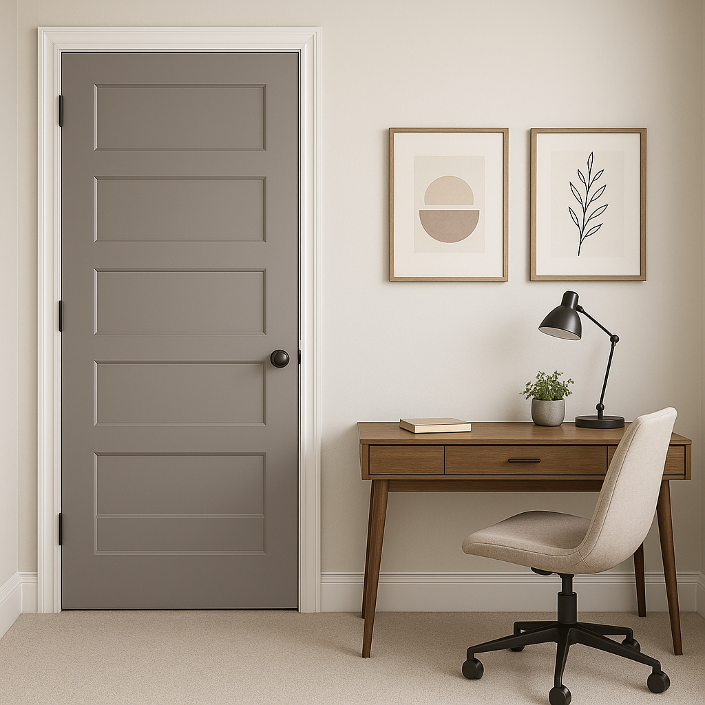
Home Offices:
Intuitive’s serene energy makes it a great choice for home offices or creative spaces. Pair it with clean white desks and natural greenery to foster focus and inspiration.
Bathrooms:
For a spa-like atmosphere, use Intuitive on bathroom walls. Combine it with marble surfaces, chrome fixtures, and plush towels in soft whites or grays for an effortlessly sophisticated look.
Children’s Rooms:
Though not overly bright, Intuitive can work beautifully in children’s bedrooms or playrooms when combined with playful accents like pastel yellows or soft pinks. It’s a refined choice that grows with the child, making it a long-lasting option.
Accent Walls and Decor:
If you’re hesitant to commit to Intuitive as a full-room color, consider using it on an accent wall, in cabinetry, or even in decor elements like painted furniture or artwork. It’s a great way to introduce the color without overwhelming the space.
As with any paint color, lighting plays a crucial role in how Intuitive appears in your space. In rooms with ample natural light, Intuitive feels airy and fresh, while artificial lighting can either warm it up or enhance its cool undertones. Test the color in your space with swatches and observe it at different times of day to find the best lighting balance.
Sherwin-Williams Intuitive (SW 6017) is a color that exudes elegance, calmness, and versatility, making it a sophisticated choice for any home. With its soothing lavender hue and gray undertones, it can transform your space into a serene sanctuary or an inspiring haven. Mix and match coordinating colors, and let Intuitive bring out the best in your interior design vision.
Note: These images were all generated with AI, there may be inaccurate color results. Please only use a general reference to get a rough idea of what a color may look like, we will continue to generate new images to improve accuracy.
View Colors Only by Brand (No Imagery):
Sherwin-Williams
|
Benjamin-Moore
|
Behr
|
Valspar
Live on the Eastern Slope of Colorado and looking for a local painting professional, check out all our painting services and reach out for a free estimate.
Copyright © 2026 : Wild Fox Painting Inc. : 12435 Mead Way, Littleton, CO 80125


