Benjamin Moore Providence (HC-98) is a distinguished warm neutral that perfectly bridges the gap between rich tradition and modern sophistication. Part of the Historical Collection, this color draws inspiration from the timeless elegance of classic architecture, making it an excellent choice for interiors that aim to evoke a sense of heritage and refinement. With its soft, muted presence, Providence brings warmth and depth to any space without overpowering the room.
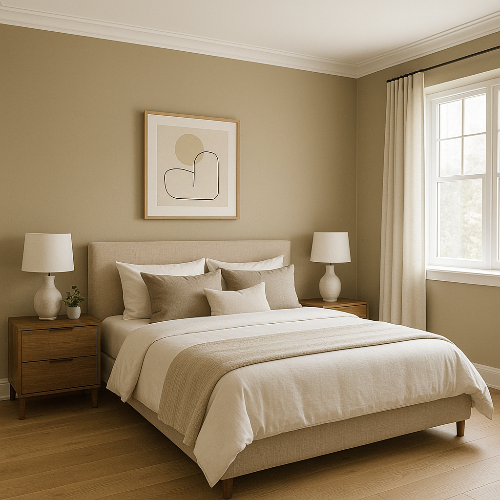
Providence (HC-98) carries subtle undertones of creamy beige and faint taupe, creating a harmonious warmth that adapts beautifully to different lighting conditions. In spaces with ample natural light, it reveals its lighter, sand-like qualities, while in dimmer settings, it shows a slightly deeper, earthy tone. This versatility makes it an ideal selection for both cozy, intimate rooms and more formal, expansive areas.
Benjamin Moore Providence (HC-98) pairs effortlessly with a wide range of colors, making it an excellent choice for both monochromatic palettes and dynamic color schemes. Here are some coordinating colors to consider:
For a more playful approach, pair Providence with muted greens or dusty blues, such as Benjamin Moore Saybrook Sage (HC-114) or Benjamin Moore Wythe Blue (HC-143), to bring out its earthy qualities.
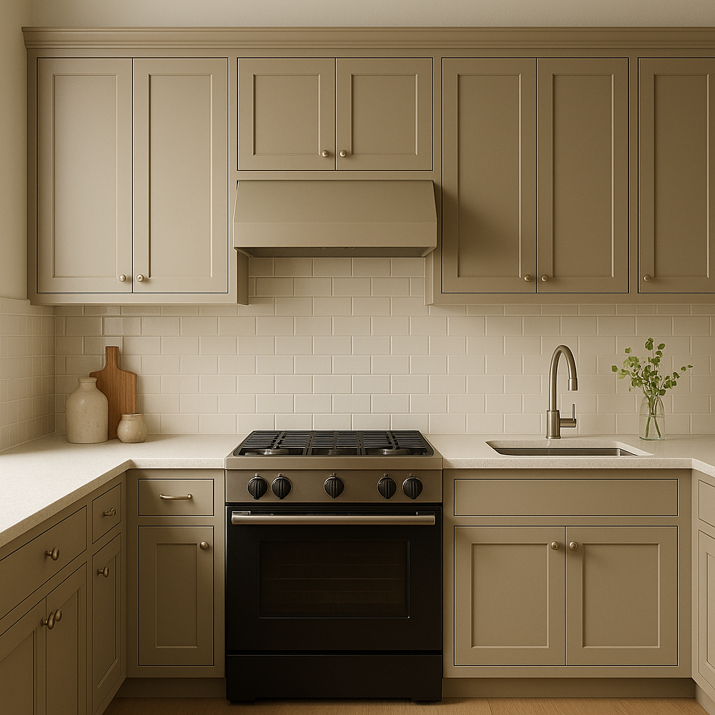
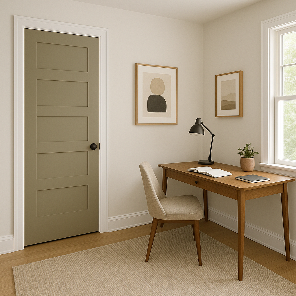
Providence is a versatile shade that works seamlessly across a variety of interior design styles, from traditional to transitional and even rustic-modern spaces. Here are some key applications:
The appearance of Providence can shift depending on the lighting, making it essential to test the color in your specific space. In bright, natural light, it feels light and airy, while in artificial or low light, it takes on a slightly darker, more intimate tone.
Providence (HC-98) is a timeless, versatile choice for interiors that demand both warmth and elegance. Whether you're refreshing a single room or harmonizing an entire home, its adaptability ensures it will remain a beloved classic for years to come.
View Colors Only by Brand (No Imagery):
Sherwin-Williams
|
Benjamin-Moore
|
Behr
|
Valspar
Live on the Eastern Slope of Colorado and looking for a local painting professional, check out all our painting services and reach out for a free estimate.
Copyright © 2026 : Wild Fox Painting Inc. : 12435 Mead Way, Littleton, CO 80125


