Benjamin Moore Carter (CW-355) is a sophisticated, creamy neutral that exudes timeless elegance and versatility. As part of the Benjamin Moore Classic Color Collection, Carter is the ideal choice for homeowners and designers seeking a color that complements traditional, modern, and transitional spaces alike. Its understated warmth and balanced tone make it a go-to option for creating serene and inviting interiors.
Carter leans toward the warmer side of the neutral spectrum, with soft beige undertones that give it a welcoming and approachable feel. This well-balanced shade carries subtle hints of earthy cream, allowing it to pair effortlessly with a wide range of coordinating colors. Its undertones are gentle enough to avoid appearing overly yellow, yet warm enough to steer away from feeling stark or cold. This makes Carter a versatile neutral that works beautifully in both natural and artificial lighting conditions.
Carter’s neutral warmth makes it easy to pair with complementary hues, from soft pastels to deep, dramatic tones. Here are some suggestions for coordinating colors:
Carter’s adaptability makes it suitable for a wide range of applications. Whether you’re refreshing a single room or designing an entire home, this shade is a reliable choice for creating a cohesive look.
Carter is perfect for living rooms and family rooms where you want to foster a sense of warmth and relaxation. Its creamy tones create a welcoming backdrop for a mix of textures and finishes, from rustic wood furniture to sleek metallic accents. Add plush throws and a mix of neutral and bold decorative pillows for a layered, cozy feel.
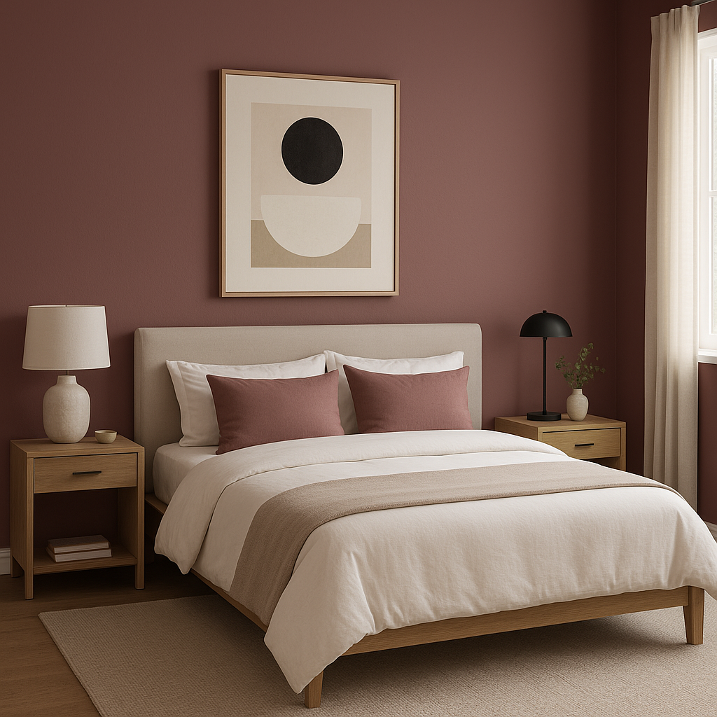
Turn bedrooms into restful retreats by coating walls in Carter. Pair with crisp white bedding and soft, natural textures like linen curtains or woven rugs. Add subtle pops of color through artwork or decorative accessories to personalize the space while keeping the overall palette serene.
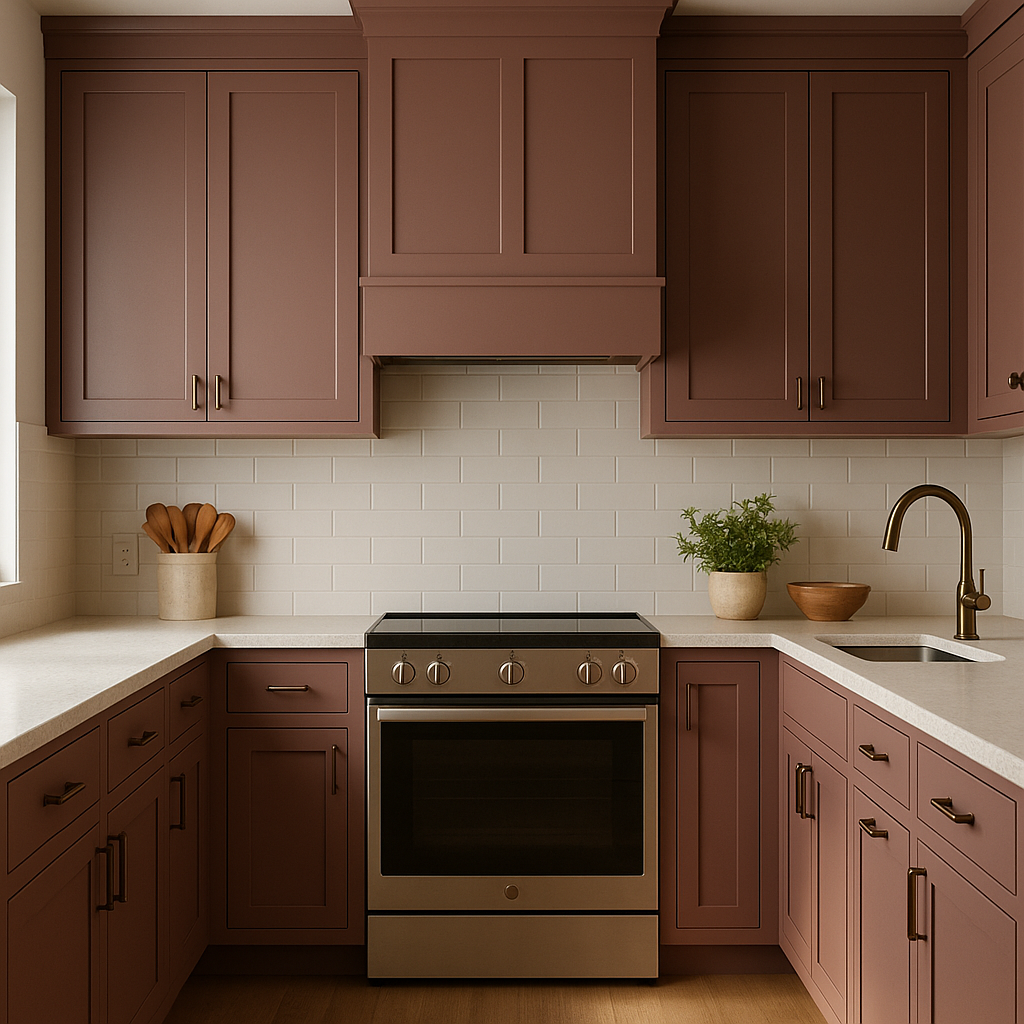
In kitchens or dining rooms, Carter can serve as a grounding neutral that works well with a variety of cabinetry finishes, including white, gray, and even dark wood tones. Consider using Carter on walls and pairing it with bold accent colors for seating or decor to create a balanced yet lively atmosphere.
For a spa-like bathroom, Carter offers a soothing foundation that pairs beautifully with natural stone or tile finishes. Use crisp white towels and decor accents to enhance the fresh and clean aesthetic.
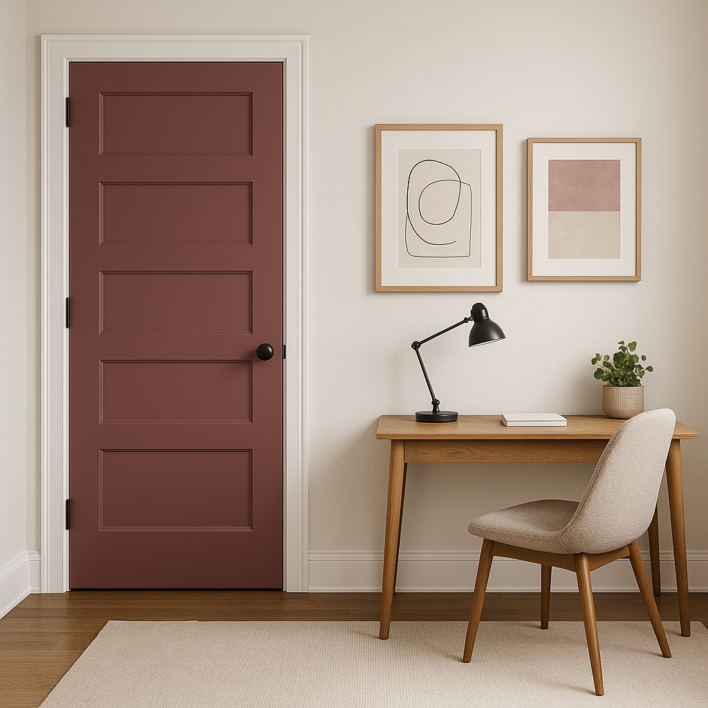
Carter shines in transitional areas like hallways, entryways, and staircases. Its neutral undertones help create a seamless flow between rooms, making it a great choice for open-concept designs. Enhance the space with framed artwork or mirrors to add personality and visual interest.
Benjamin Moore Carter (CW-355) is more than just a neutral—it’s a versatile, elegant shade that can serve as a foundation for endless design possibilities. Its creamy undertones and adaptability across different lighting conditions make it a dependable choice for walls, ceilings, and even furniture. Whether you’re designing a cozy modern farmhouse or a stately traditional home, Carter provides a sophisticated touch that will elevate any space.
With its ability to seamlessly pair with a variety of coordinating hues, Carter invites creativity while maintaining its timeless appeal. If you’re looking for a neutral that feels warm, inviting, and effortlessly chic, Benjamin Moore Carter (CW-355) is the perfect solution for your next design project.
View Colors Only by Brand (No Imagery):
Sherwin-Williams
|
Benjamin-Moore
|
Behr
|
Valspar
Live on the Eastern Slope of Colorado and looking for a local painting professional, check out all our painting services and reach out for a free estimate.
Copyright © 2026 : Wild Fox Painting Inc. : 12435 Mead Way, Littleton, CO 80125


