Benjamin Moore Revolutionary (CW-155) is a rich, deep blue-gray paint color that exudes sophistication and confidence. Perfectly straddling the line between a bold statement and a versatile neutral, this hue is part of the esteemed 2021 Century Collection, which emphasizes craftsmanship, depth, and timeless appeal. Revolutionary is more than just a paint color—it is an invitation to transform your space into one of elegance and intrigue.
Revolutionary (CW-155) is characterized by its moody blue-gray base with subtle green undertones. These undertones give the color a chameleon-like quality, allowing it to shift subtly depending on the lighting and surrounding decor. In rooms with ample natural light, the blue tones take center stage, creating a serene and calm ambiance. In dimmer spaces or artificial lighting, the green undertones emerge slightly, adding warmth and depth to the color. This complexity makes Revolutionary a dynamic choice for any interior where sophistication is key.
Benjamin Moore Revolutionary pairs beautifully with a range of complementary shades, making it a versatile option for both monochromatic and contrasting palettes. Here are some coordinating colors to consider:
Soft Neutrals: Pair Revolutionary with crisp whites like Chantilly Lace (OC-65) or Simply White (OC-117) to create a clean, modern aesthetic. These light neutrals provide a striking contrast to the deep tone of Revolutionary, allowing it to stand out as a focal point.
Earthy Tones: For a more grounded and harmonious palette, consider coordinating with earthy shades such as Pashmina (AF-100) or Ballet White (OC-9). These warm neutrals complement Revolutionary’s subtle green undertones, creating a cozy and inviting atmosphere.
Accent Colors: To add a pop of personality, pair Revolutionary with bold accents like the golden warmth of Hawthorne Yellow (HC-4) or the vibrant coral of Caliente (AF-290). These dynamic pairings create an energetic and visually captivating space.
Moody Companions: For a dramatic, layered look, consider pairing Revolutionary with other deep hues such as Black Pepper (2130-40) or Knoxville Gray (HC-160). These darker tones enhance the richness of Revolutionary, creating a luxurious and immersive environment.
Revolutionary is a versatile color that can be used in a variety of spaces to achieve dramatically different effects. Its bold yet refined nature makes it perfect for creating a statement while maintaining a sense of elegance. Below are a few ways to incorporate this stunning shade into your interior design:
In living spaces, Revolutionary can be used to create a cozy and intimate environment. Paint all four walls for a dramatic effect, or use it as an accent wall behind a fireplace or built-in shelving. Pair with plush textiles, warm wood tones, and metallic accents for a sophisticated, layered look.
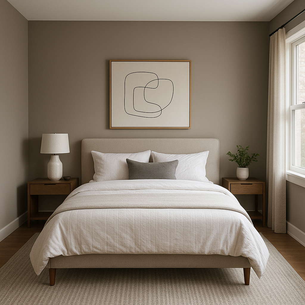
Revolutionary is an excellent choice for bedrooms, where its soothing blue-gray tones promote relaxation and restfulness. Use it as the primary wall color and pair with crisp white linens and soft gray or green accents for a serene retreat. For added drama, consider using Revolutionary on ceiling panels or as a backdrop for a statement headboard.
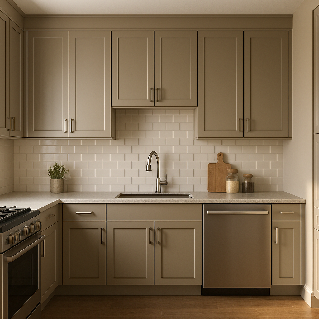
Bring classic elegance to your kitchen or dining room by using Revolutionary on cabinetry or wainscoting. Its deep, saturated tone contrasts beautifully with marble countertops, brushed brass fixtures, or a crisp white backsplash. For a more modern look, pair it with sleek black accents and bold geometric patterns.
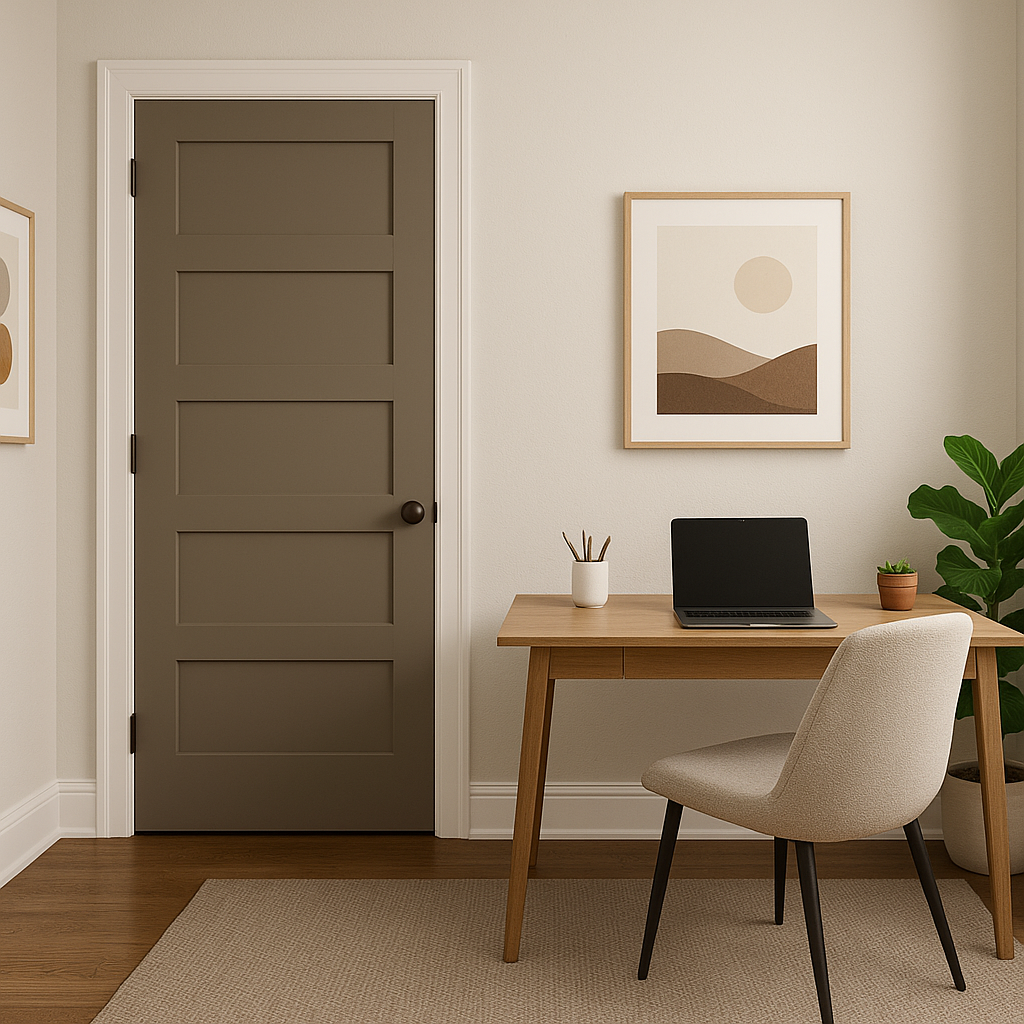
Revolutionary’s moody depth makes it an ideal choice for creating a focused and inspiring home office or library. Use it as the wall color and pair with rich wood furniture, leather upholstery, and ambient lighting to evoke a sense of quiet sophistication and productivity.
For outdoor applications, Revolutionary can make a striking statement when used as a front door or exterior shutter color. It pairs beautifully with white trim and natural stone accents, adding a touch of modern elegance to your home’s curb appeal.
Because of its complex undertones, Revolutionary’s appearance will vary based on the lighting in your space. In rooms with cool, northern light, the blue tones will appear more pronounced, giving a crisp and fresh feel. In spaces with warm, southern or incandescent light, the green undertones emerge, creating a cozier and more grounded atmosphere. To ensure the perfect application, test the color in your space at different times of day before committing to a full project.
Benjamin Moore Revolutionary (CW-155) is a masterful balance of boldness and versatility. Whether used sparingly as an accent or applied generously throughout a space, this sophisticated blue-gray tone offers a timeless solution for those seeking to elevate their interiors with depth, character, and elegance. With its dynamic undertones and compatibility with a range of palettes, Revolutionary is truly a color that lives up to its name.
View Colors Only by Brand (No Imagery):
Sherwin-Williams
|
Benjamin-Moore
|
Behr
|
Valspar
Live on the Eastern Slope of Colorado and looking for a local painting professional, check out all our painting services and reach out for a free estimate.
Copyright © 2026 : Wild Fox Painting Inc. : 12435 Mead Way, Littleton, CO 80125


