
Benjamin Moore Penthouse (CSP-35) is a refined, medium-toned taupe that exudes warmth and understated elegance. Perfectly balanced between beige and gray, this versatile hue is part of Benjamin Moore's Color Stories collection, celebrated for its depth, complexity, and dynamic interplay of undertones. With its ability to adapt to various lighting conditions and design aesthetics, Penthouse is an excellent choice for creating a harmonious and timeless ambiance in any room.
Penthouse (CSP-35) is a neutral with subtle undertones that lean toward warm gray and brown. Depending on the lighting in your space, you may notice soft lavender or greige hints that add dimension without overpowering the color. These undertones make Penthouse a sophisticated choice for spaces that need a neutral palette with depth and character. The warm undertones keep it cozy and welcoming, while the gray influence lends modernity and restraint.
Under natural light, Penthouse appears brighter and slightly warmer, revealing its taupe and beige notes. In artificial or dim lighting, the gray undertones deepen, creating a more atmospheric and moody effect. This dynamic quality makes Penthouse an adaptable choice for both sunny and shadowed areas.
Benjamin Moore Penthouse pairs beautifully with a range of complementary shades, offering flexibility for diverse design styles. Whether you're looking to create contrast or maintain a cohesive palette, here are some coordinating colors to consider:
The versatility of Penthouse makes it suitable for a variety of applications, ranging from residential to commercial spaces. Here are some ways to incorporate this timeless color into your interior design:
Penthouse is an ideal choice for living rooms, where its neutral warmth creates a welcoming and stylish environment. Pair it with plush furniture and layered textures like velvet, linen, or wool to elevate the space. Complement the walls with metallic or wooden accents for added sophistication.
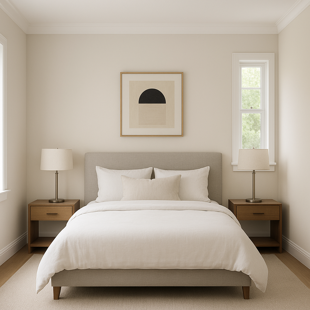
In bedrooms, Penthouse fosters a serene and relaxing atmosphere. Combine it with soft white linens and muted pastel accessories for a calming retreat. For a more dramatic look, use Penthouse as a backdrop for rich jewel tones like emerald green or sapphire blue in bedding and decor.
Penthouse works well in kitchens and bathrooms, where its neutral elegance complements cabinetry, countertops, and tiles. Use it on the walls to tie together contrasting materials like marble, quartz, or wood. Pair it with brushed nickel or matte black fixtures for a modern touch.
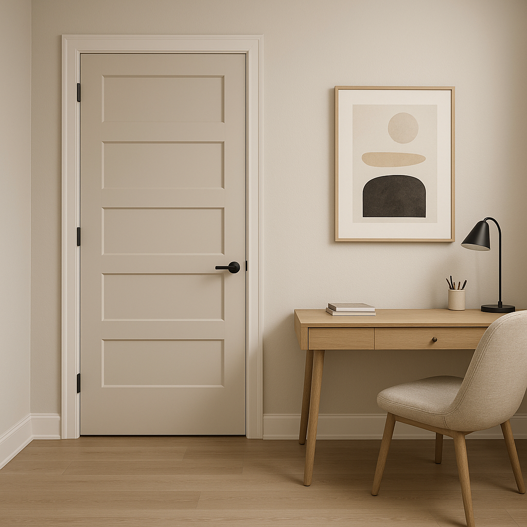
Create a productive yet cozy home office space with Penthouse. Its neutral tone minimizes distractions while adding subtle sophistication. Pair it with dark wood furniture and pops of greenery for a balanced and inspiring setup.
For restaurants, offices, or boutique settings, Penthouse offers a professional yet inviting aesthetic. Its versatility allows it to seamlessly blend into various design themes, from contemporary to traditional.
Benjamin Moore Penthouse is more than just a neutral—it’s a sophisticated canvas that adapts to your design vision. Its warm undertones and timeless appeal make it a favorite among interior designers, while its ability to coordinate with a wide range of colors ensures it remains a versatile option for any space. Whether you’re revamping a single room or designing an entire home, Penthouse is an exceptional choice for creating a polished and balanced look.
Give Penthouse (CSP-35) a try and transform your space into a haven of understated elegance and warmth!
View Colors Only by Brand (No Imagery):
Sherwin-Williams
|
Benjamin-Moore
|
Behr
|
Valspar
Live on the Eastern Slope of Colorado and looking for a local painting professional, check out all our painting services and reach out for a free estimate.
Copyright © 2026 : Wild Fox Painting Inc. : 12435 Mead Way, Littleton, CO 80125


