Benjamin Moore Burnt (CSP-120) is a refined, earthy shade that exudes warmth and elegance. This rich neutral belongs to the Benjamin Moore Color Stories collection, a palette celebrated for its depth and complexity. Burnt is a warm taupe with subtle undertones that make it versatile and easy to pair with a wide range of hues. Its sophisticated presence makes it a standout choice for creating cozy yet elevated spaces, whether in residential or commercial interiors.
Burnt features warm undertones that lean towards brown and gray, giving it a balanced neutrality. The nuanced combination of these undertones ensures that the color doesn’t skew too cold or too warm, making it adaptable in various light conditions. In rooms with natural sunlight, Burnt reveals its earthy richness, while in artificial lighting, it softens into a cozy, enveloping shade.
The gray undertones provide a grounding quality, allowing Burnt to act as a bridge between cooler and warmer color palettes. This chameleon-like nature makes it equally at home in modern minimalist designs or traditional, rustic interiors.
When working with Burnt (CSP-120), its versatility shines through in the way it pairs seamlessly with other colors. Here are some coordinating hues that enhance its beauty:
Burnt’s adaptability makes it a go-to choice for a variety of interior design applications. Here are some creative ways to use this color in your spaces:
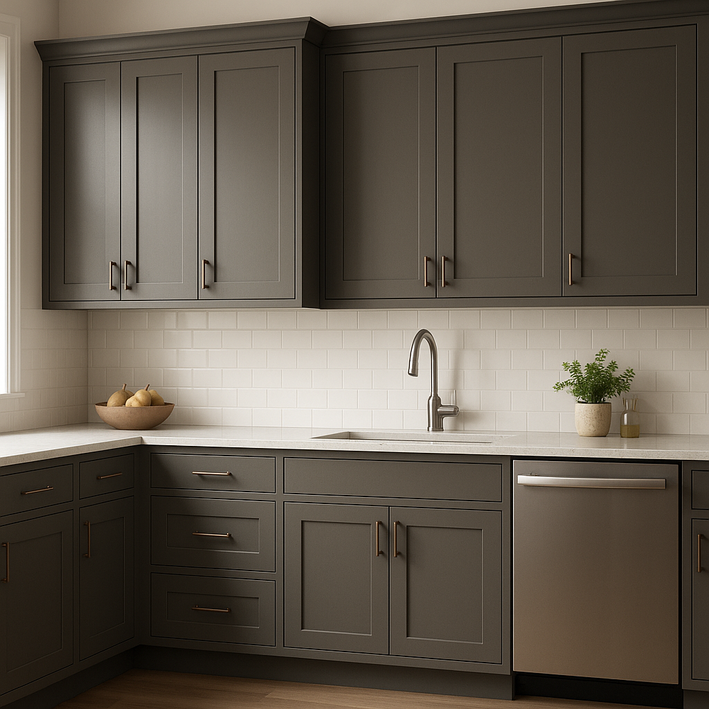
Burnt brings a cozy sophistication to living rooms, making it ideal for feature walls or as an all-over wall color. Pair it with plush furniture in neutral tones and add textured throws or patterned rugs to complete the look.
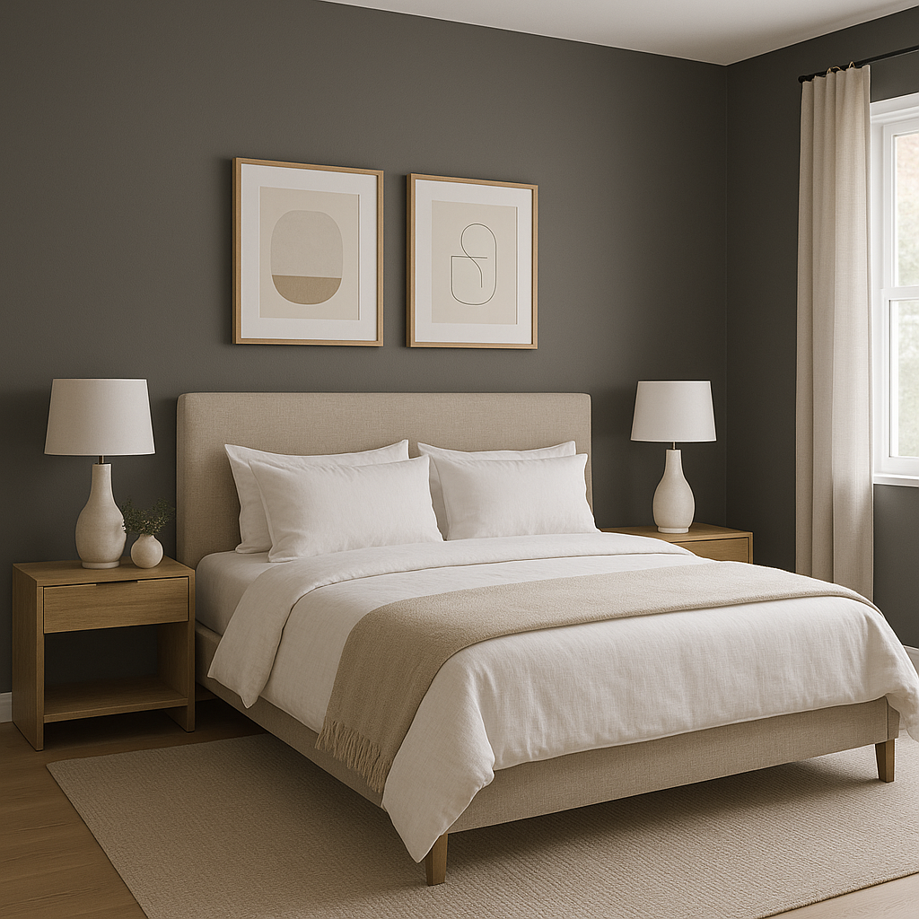
In bedrooms, Burnt creates a restful retreat with its soothing warmth. Use it as a backdrop for upholstered headboards in cream or beige tones, and layer soft linens for a tranquil, hotel-inspired vibe.
For a dining room that feels refined and intimate, Burnt works beautifully on walls paired with dark wood furniture. Consider adding metallic light fixtures or mirrors to amplify the room’s elegance.
Make a striking first impression by using Burnt in entryways or foyers. Its welcoming warmth draws visitors in, especially when paired with statement art pieces or decorative accents in gold or bronze.
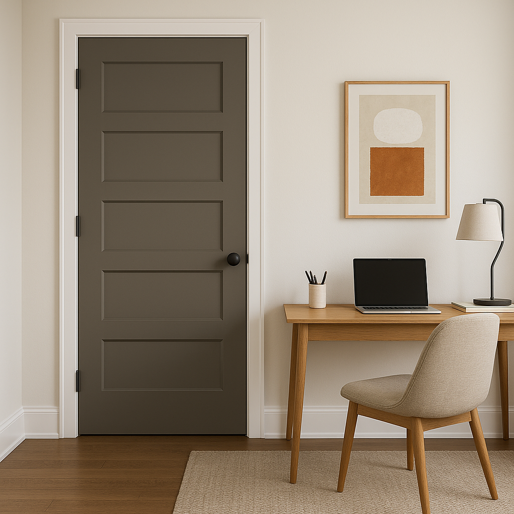
Burnt fosters focus and productivity in home offices while maintaining a polished, professional appearance. Pair it with sleek furniture in black or espresso finishes for a tailored, modern workspace.
Burnt is equally effective in boutique hotels, restaurants, or offices that need a touch of understated luxury. Its rich neutrality creates a calming yet upscale atmosphere that appeals to a broad audience.
As with any paint color, lighting plays a pivotal role in how Burnt appears in your space. In rooms with abundant natural light, Burnt’s warmth is more pronounced, giving the room a sunlit glow. In dimly lit spaces or under incandescent lighting, it deepens into a richer taupe, creating a cozy, intimate ambiance.
For rooms with cooler daylight or LED lighting, Burnt’s gray undertones come forward slightly, offering a cooler and more subdued effect. To maximize its beauty, test Burnt in your space at different times of day to observe its dynamic shifts.
Benjamin Moore Burnt (CSP-120) is the epitome of versatility, warmth, and understated luxury. Whether you’re designing a contemporary home or a classic, traditional space, this color offers the perfect foundation for creativity. Its rich undertones, ability to coordinate with a broad spectrum of colors, and adaptability to various lighting conditions make Burnt an excellent choice for interior designers and homeowners alike.
Embrace the timeless elegance of Burnt (CSP-120), and let this sophisticated neutral transform your space into a haven of style and comfort.
View Colors Only by Brand (No Imagery):
Sherwin-Williams
|
Benjamin-Moore
|
Behr
|
Valspar
Live on the Eastern Slope of Colorado and looking for a local painting professional, check out all our painting services and reach out for a free estimate.
Copyright © 2026 : Wild Fox Painting Inc. : 12435 Mead Way, Littleton, CO 80125


