Benjamin Moore In (CC-934) is a stunning neutral paint color that effortlessly combines sophistication and versatility. Known for its understated elegance, this shade is part of Benjamin Moore's Classic Color Collection, a curated palette of timeless hues designed to enhance any interior. Whether you're crafting a serene space or a refined backdrop, In is an exceptional choice that can adapt to various design styles.
The beauty of In (CC-934) lies in its ability to strike a perfect balance between warmth and coolness. This shade carries subtle taupe undertones, making it lean slightly towards a greige (gray-beige) hue. These undertones give the color its adaptability, allowing it to complement a wide range of palettes without overpowering the space. The taupe base ensures that In feels grounded and cozy, while the slight gray influence lends it a sophisticated and modern edge.
The undertones shift subtly depending on the lighting in the room:
One of the reasons In (CC-934) is so loved by interior designers is its ability to pair beautifully with other colors. Here are some coordinating shades to consider:
The versatility of In (CC-934) makes it a popular choice for virtually any room in the home. Its neutral yet rich characteristics allow it to shine in various design applications:
Use In to create a sophisticated, welcoming living room or family space. Pair it with plush furnishings in neutral tones, textured throw pillows, and metallic accents for a polished look. The color also works beautifully alongside natural wood furniture.
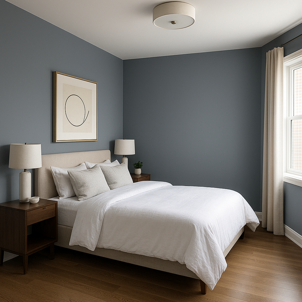
The calming taupe-gray undertones of In make it an excellent choice for bedrooms. Pair it with soft linens in whites, creams, or muted pastels for a tranquil retreat that promotes relaxation.
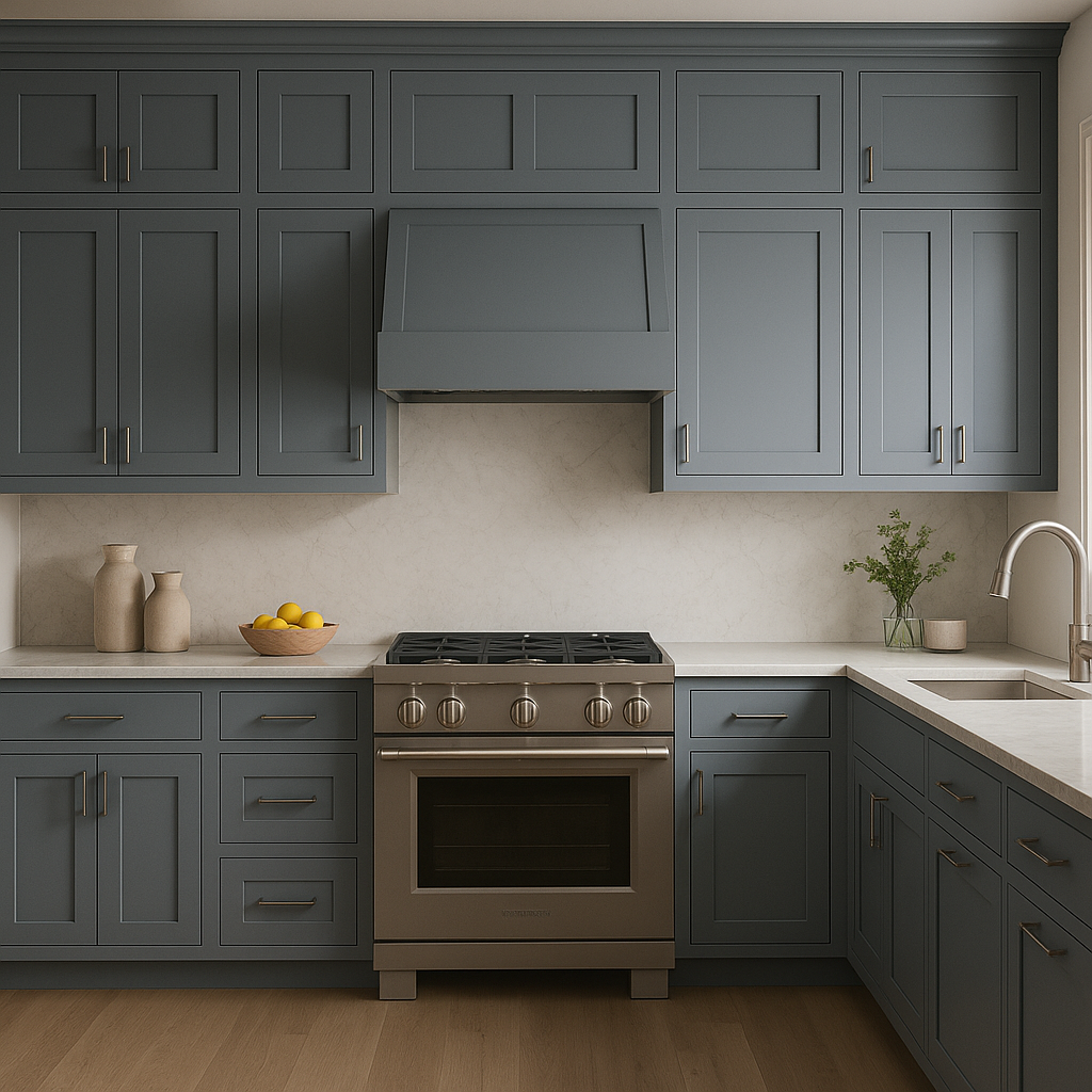
In (CC-934) can bring elegance to kitchens and dining spaces. Use it on walls alongside bright white cabinetry or pair it with natural stone countertops for a cohesive, luxurious feel. Accents in brushed gold or chrome add a touch of modernity.
For a serene bathroom, In is a perfect backdrop. Pair it with white tiles, marble finishes, and soft lighting to create a spa-like oasis. Add greenery for a refreshing pop of color.
Create a productive and stylish workspace with In. Its neutral tone fosters focus while still feeling warm and inviting. Pair it with dark wood furniture or sleek metallic accents for a contemporary look.
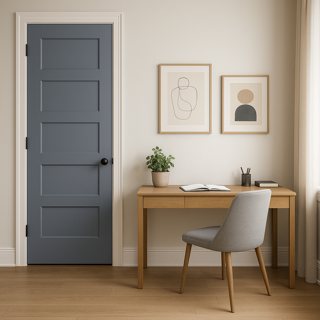
Consider In (CC-934) to elevate transitional spaces like hallways and entryways. The color provides a neutral palette that flows seamlessly into adjoining rooms, enhancing the overall cohesiveness of your home.
Benjamin Moore In (CC-934) is a timeless neutral that delivers both warmth and sophistication. With its adaptive taupe-gray undertones, ability to coordinate effortlessly with other colors, and suitability for a wide range of uses, this shade is a superb choice for homeowners and designers alike. Whether you're refreshing a single room or planning an entire home redesign, In is a versatile foundation that sets the stage for elegant and enduring style.
View Colors Only by Brand (No Imagery):
Sherwin-Williams
|
Benjamin-Moore
|
Behr
|
Valspar
Live on the Eastern Slope of Colorado and looking for a local painting professional, check out all our painting services and reach out for a free estimate.
Copyright © 2026 : Wild Fox Painting Inc. : 12435 Mead Way, Littleton, CO 80125


