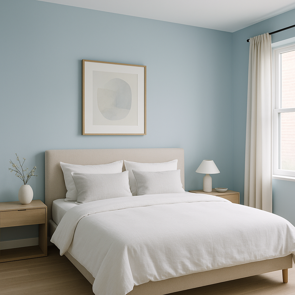
Benjamin Moore Watercolor (CC-788) is a timeless and refined shade that sits comfortably in the category of warm neutrals. It offers a delicate blend of beige and greige, creating a color that feels both grounded and airy. Its versatility and understated charm make it a favorite among interior designers and homeowners alike, particularly for spaces where you want a calm yet polished atmosphere.
Watercolor (CC-788) carries subtle warm undertones of creamy beige with just a hint of gray. These undertones give the color a soft, approachable quality without veering too yellow or too cool. The gray hints refine its warmth, ensuring it feels sophisticated and modern rather than overly traditional. Because of its balanced undertones, Watercolor adapts beautifully to different lighting conditions, appearing warmer in south-facing rooms and more neutral in spaces with cooler natural light.
Benjamin Moore Watercolor (CC-788) works harmoniously with a wide range of coordinating colors, making it remarkably easy to incorporate into your home.
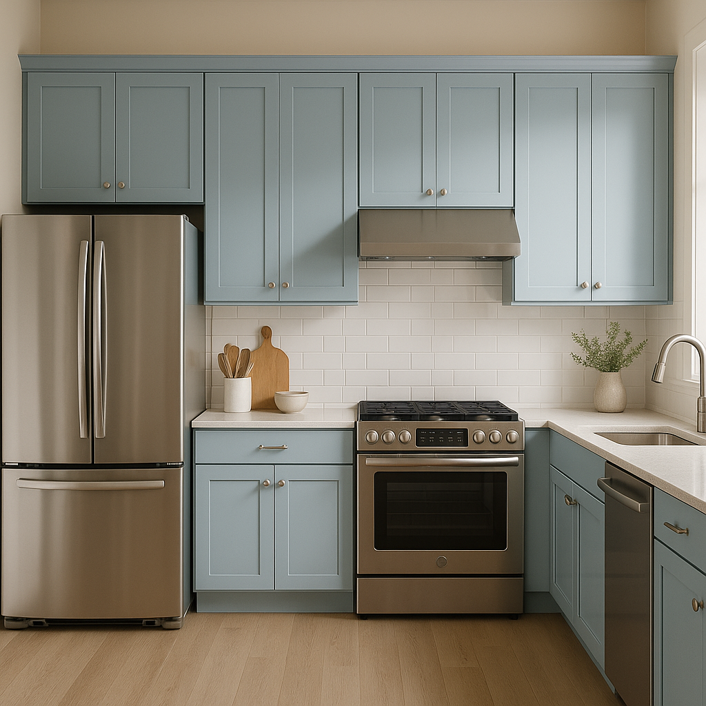
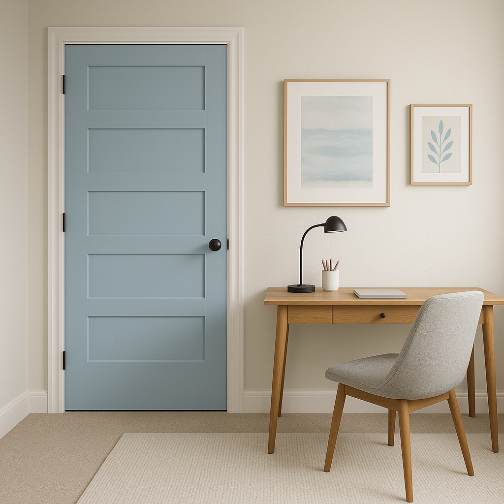
Watercolor (CC-788) is a true workhorse in interior design, offering endless possibilities for enhancing the beauty of your home.
Benjamin Moore Watercolor (CC-788) is a masterfully balanced neutral that works well in both traditional and contemporary settings. Its ability to adapt to different lighting conditions and pair effortlessly with a variety of colors makes it a reliable choice for any room. Whether you're creating a monochromatic palette or adding contrast with bold accents, Watercolor provides a polished foundation for your design vision.
If you're looking for a neutral that bridges warm and cool tones while exuding timeless sophistication, Benjamin Moore Watercolor (CC-788) is a perfect choice to elevate your interiors.
View Colors Only by Brand (No Imagery):
Sherwin-Williams
|
Benjamin-Moore
|
Behr
|
Valspar
Live on the Eastern Slope of Colorado and looking for a local painting professional, check out all our painting services and reach out for a free estimate.
Copyright © 2026 : Wild Fox Painting Inc. : 12435 Mead Way, Littleton, CO 80125


