Benjamin Moore Florentine (CC-520) is a sophisticated and deeply evocative color that brings warmth, character, and refinement to any space. This shade sits at the intersection of classic and modern, making it an incredibly versatile choice for interiors. Its rich, earthy undertones and luxurious depth make it ideal for creating inviting, elegant environments.
Florentine is a warm, mid-tone brown with subtle red and orange undertones. These undertones give the color a sense of vibrancy and life, while still maintaining its grounded, earthy feel. The red and orange elements provide a gentle warmth, making Florentine a perfect choice for cozy, welcoming spaces. It’s a shade that feels both timeless and contemporary, adapting beautifully to various design styles, from traditional to modern.
To create a harmonious and visually appealing palette, consider pairing Florentine with the following coordinating colors:
These pairings allow Florentine to shine as a standout shade or act as a grounding neutral in more complex color schemes.
Florentine’s luxurious warmth makes it a versatile choice for a variety of spaces. Here are some of the best ways to incorporate this rich hue into your home or commercial setting:
Florentine creates a cozy, intimate atmosphere that is perfect for spaces meant for relaxation and connection. Use it on the walls to envelop the room in warmth, or apply it as an accent color to add depth to a neutral palette. Pair it with plush textures like velvet or wool to amplify the coziness.
This color is an excellent choice for dining rooms, where its warm undertones can help foster an inviting and convivial environment. Florentine pairs beautifully with wood furniture, whether light oak or dark mahogany, and shines under soft, ambient lighting.
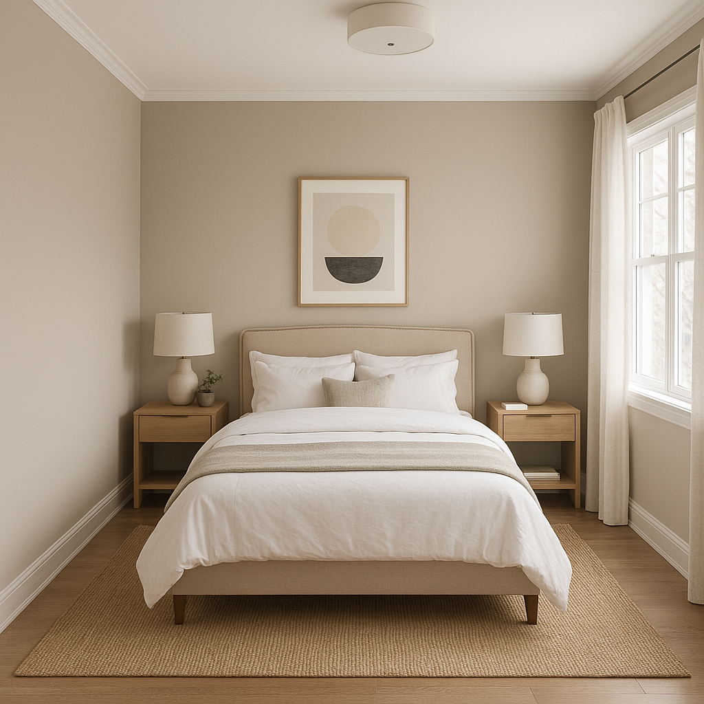
For a restful yet stylish bedroom, use Florentine as a feature wall behind the bed. Its earthy tone promotes tranquility while still feeling rich and layered. Pair it with soft linens in cream or taupe for a balanced and serene look.
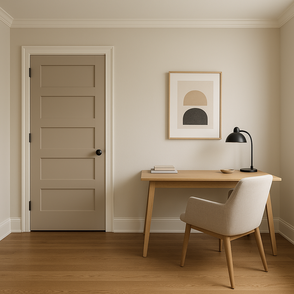
Florentine’s depth and richness can create a focused and inspiring environment in a home office. Use it on all walls for a dramatic effect or as an accent wall to ground the space. Pair with metallic accents and leather furniture for a professional, polished aesthetic.
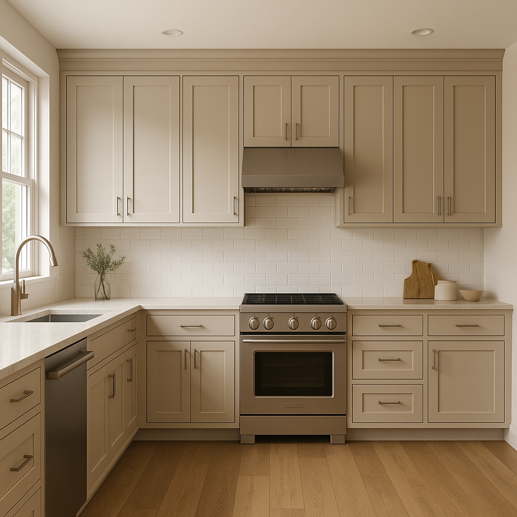
Florentine is an unexpected yet stunning choice for cabinetry or kitchen walls. Its warm undertones play well with natural materials like stone countertops, wood floors, and brass hardware, resulting in a space that feels both modern and timeless.
In restaurants, boutique stores, or hotel lounges, Florentine can add an upscale, welcoming vibe. Its warm undertones naturally draw people in, making it ideal for spaces where ambiance matters.
The mood of Florentine can vary depending on the lighting in a space. In rooms with abundant natural light, the reddish undertones are more pronounced, giving the color a sun-kissed warmth. In rooms with dim or artificial lighting, it takes on a deeper, almost chocolatey appearance. Be sure to test the color under different light conditions to see how it transforms throughout the day.
Florentine is more than just a paint color; it’s a statement. Its rich, earthy warmth adds depth and character to any setting, making it a favorite among interior designers and homeowners alike. Whether you’re looking to create a cozy retreat, a sophisticated gathering space, or a professional environment, this versatile hue provides a timeless foundation for your design vision.
Florentine (CC-520) is a masterful balance of warmth, elegance, and adaptability, offering endless possibilities for creating a space that feels both grounded and elevated. Its ability to coordinate with a wide range of colors and styles ensures it will remain a beloved choice for years to come.
View Colors Only by Brand (No Imagery):
Sherwin-Williams
|
Benjamin-Moore
|
Behr
|
Valspar
Live on the Eastern Slope of Colorado and looking for a local painting professional, check out all our painting services and reach out for a free estimate.
Copyright © 2026 : Wild Fox Painting Inc. : 12435 Mead Way, Littleton, CO 80125


