Benjamin Moore Tamarind (AF-120) is a rich, earthy brown that exudes warmth, elegance, and versatility. This nuanced shade is part of the Affinity® Collection, known for its harmonious and thoughtfully curated color palette. Tamarind’s deep, grounding tone makes it an exceptional choice for creating cozy, inviting spaces while maintaining a refined and timeless aesthetic.
Tamarind carries subtle undertones of warm chocolate and muted espresso, giving it a luxurious depth without feeling heavy or overwhelming. These undertones make it a balanced neutral that leans warm, perfect for spaces that need a touch of coziness. While predominantly brown, Tamarind has the ability to shift slightly depending on the lighting—under natural sunlight, it may appear lighter and more organic, while in dimmer artificial light, it transforms into a more dramatic and moody hue.
One of the standout features of Tamarind is its versatility in pairing with other colors. Whether you’re aiming for a monochromatic look or a dynamic contrast, Tamarind works beautifully with a range of shades. Here are some coordinating colors to consider:
Tamarind is an incredibly adaptable color that works well in a variety of interior design styles, from transitional to rustic to contemporary. Here are some inspiring ways to use Tamarind in your home:
Transform your living room into a cozy haven by painting the walls in Tamarind. Pair it with soft, plush furnishings in cream or taupe to create a warm and inviting space. Add pops of color with throw pillows or artwork in muted greens or ochres for a touch of visual interest.
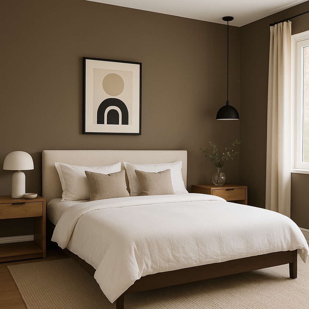
Tamarind is a fantastic choice for bedrooms, where its soothing and grounding qualities can promote relaxation. Consider using it as an accent wall behind the bed, complemented by crisp white linens and dark wood furniture for a sophisticated, hotel-inspired retreat.
For dining areas, Tamarind provides an intimate and luxurious atmosphere perfect for entertaining. Pair it with metallic accents, such as gold or brass light fixtures, and rich wood tones to create a space that feels upscale yet approachable.
In a home office, Tamarind can help foster focus and productivity while maintaining a sense of comfort. Use it as a backdrop for built-in shelving or cabinetry, and incorporate coordinating grays and whites for a polished, professional look.
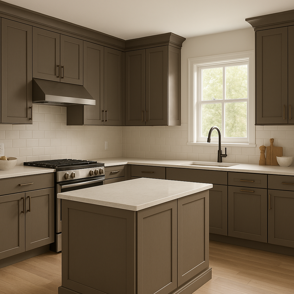
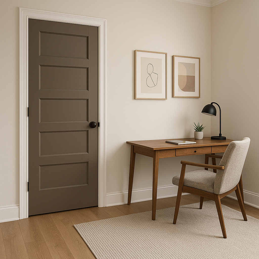
Tamarind is equally stunning as an accent color. Use it for doors, trim, or built-in bookshelves to add depth and dimension to your space. Its rich tone also enhances architectural features such as wainscoting, crown molding, or paneling.
As with any paint color, lighting plays a significant role in how Tamarind will look in your space. In rooms with ample natural light, Tamarind’s warm undertones will shine through, creating a cozy yet breathable atmosphere. In spaces with limited light, consider pairing it with lighter, brighter accents to maintain balance and prevent the room from feeling too dark.
Benjamin Moore Tamarind (AF-120) is a masterful neutral that offers depth, warmth, and versatility. Whether used as a main wall color or an accent, Tamarind brings a sophisticated and grounded feel to any space, allowing you to create rooms that are both stylish and inviting.
View Colors Only by Brand (No Imagery):
Sherwin-Williams
|
Benjamin-Moore
|
Behr
|
Valspar
Live on the Eastern Slope of Colorado and looking for a local painting professional, check out all our painting services and reach out for a free estimate.
Copyright © 2026 : Wild Fox Painting Inc. : 12435 Mead Way, Littleton, CO 80125


