Benjamin Moore Buttermilk (919) is a warm, creamy neutral that exudes timeless elegance and effortless charm. Its soft, buttery hue offers a welcoming ambiance that pairs beautifully with traditional, transitional, and modern spaces alike. Whether you're looking to create a serene backdrop or add a hint of warmth to your interiors, Buttermilk is a versatile choice that can complement various design aesthetics.
Buttermilk (919) features subtle yellow and beige undertones, giving it a gentle warmth without being overpowering. These undertones make it more approachable than stark whites or cooler grays, as they imbue the color with a sense of coziness and comfort. The delicate balance of yellow-beige undertones ensures that the hue remains soft and neutral, making it adaptable to different lighting conditions. In natural light, Buttermilk appears fresh and bright, while in dimmer settings, it takes on a richer, more intimate tone.
Buttermilk is an excellent team player in a color palette, harmonizing beautifully with both warm and cool tones. Here are some coordinating colors that pair well with Buttermilk:
Deep Browns and Chocolates: For a rich, grounded look, pair Buttermilk with colors like Benjamin Moore Espresso Bean (AF-300) or Dark Chocolate (2111-10). These deep hues create a stunning contrast and add sophistication.
Soft Grays and Greiges: Complement Buttermilk’s warmth with cool-toned neutrals like Benjamin Moore Revere Pewter (HC-172) or Edgecomb Gray (HC-173). These shades create a balanced and serene environment.
Fresh Whites: Crisp whites like Benjamin Moore Chantilly Lace (OC-65) or Simply White (OC-117) work beautifully with Buttermilk to enhance its creamy qualities and create a clean, airy aesthetic.
Muted Blues and Greens: Add a touch of color with soft blues such as Benjamin Moore Smoke (2122-40) or gentle greens like Soft Fern (2144-40). These shades bring a subtle vibrancy while maintaining the overall calming vibe.
The versatility of Benjamin Moore Buttermilk makes it suitable for a wide range of applications throughout your home. Here are some creative ways to use this warm neutral:
Living Rooms: Create a cozy, welcoming atmosphere by using Buttermilk on the walls of your living space. Pair it with richly textured furniture and accent pieces in darker hues for a grounded yet inviting look.
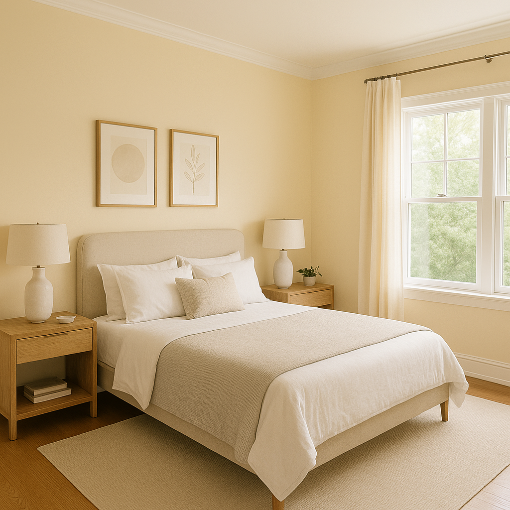
Bedrooms: Buttermilk’s subtle warmth is perfect for crafting a serene retreat. Layer it with soft linens and muted pastel accents to evoke a sense of tranquility.
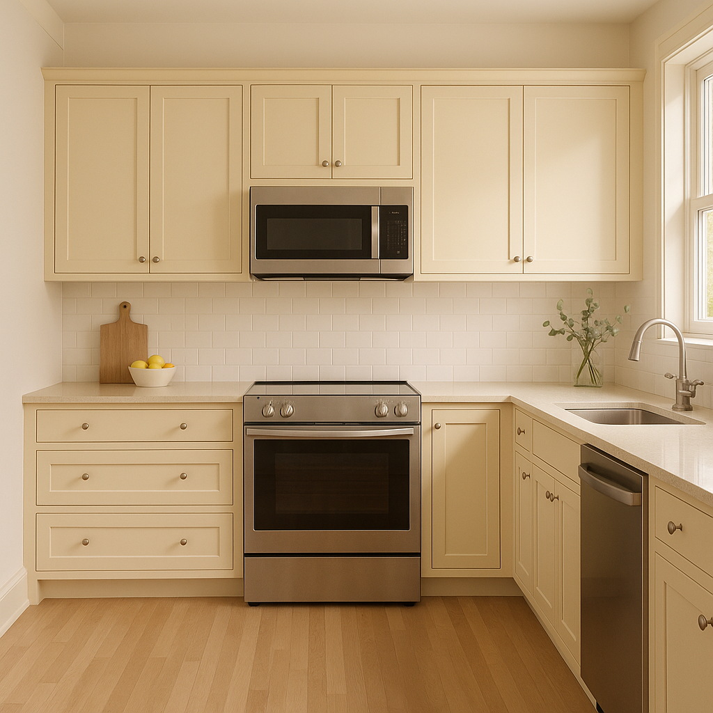
Kitchens: Use Buttermilk for kitchen cabinetry or walls to achieve a classic, farmhouse-inspired aesthetic. Pair it with marble countertops and brushed gold hardware for a timeless yet modern feel.
Dining Areas: Elevate your dining space by combining Buttermilk walls with rich wood tones in furniture or flooring. The warm backdrop will make your space feel intimate and luxurious.
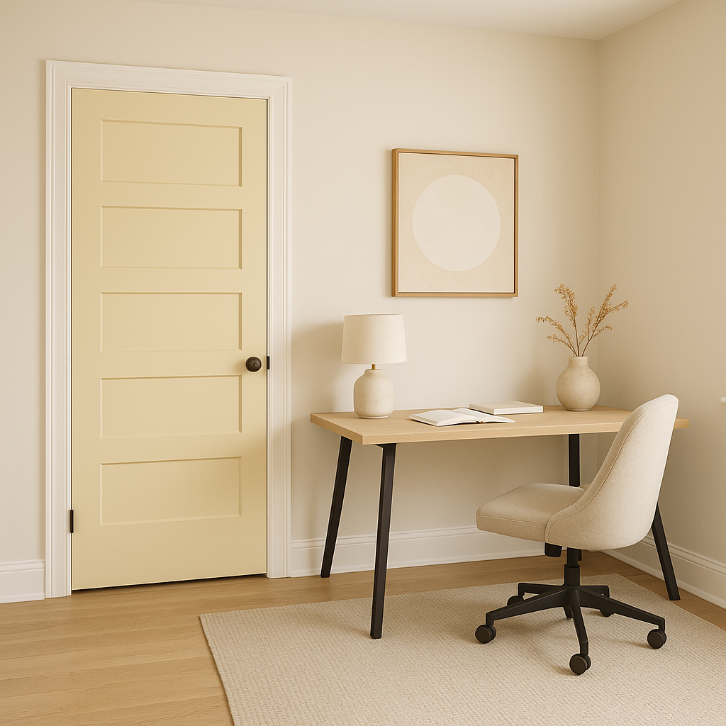
Entryways and Hallways: Set a welcoming tone for your home by painting entryways or hallways in Buttermilk. Its understated elegance works well in transitional spaces, creating a seamless flow between rooms.
The appearance of Buttermilk can vary depending on the lighting in your space. In rooms with ample natural light, the color appears brighter and more vibrant, emphasizing its creamy yellow undertones. In areas with artificial or dim lighting, the beige undertones become more pronounced, lending a cozier and slightly deeper appeal. Always test paint samples in your space to see how the color interacts with your specific lighting conditions.
Benjamin Moore Buttermilk (919) is an effortlessly versatile and timeless neutral that can transform any room into a warm and inviting haven. Its ability to adapt across styles and lighting conditions makes it a reliable choice for homeowners and designers alike. With its creamy undertones and ability to coordinate with a range of colors, Buttermilk is the perfect foundation for creating spaces that feel both elegant and comfortable.
View Colors Only by Brand (No Imagery):
Sherwin-Williams
|
Benjamin-Moore
|
Behr
|
Valspar
Live on the Eastern Slope of Colorado and looking for a local painting professional, check out all our painting services and reach out for a free estimate.
Copyright © 2026 : Wild Fox Painting Inc. : 12435 Mead Way, Littleton, CO 80125


