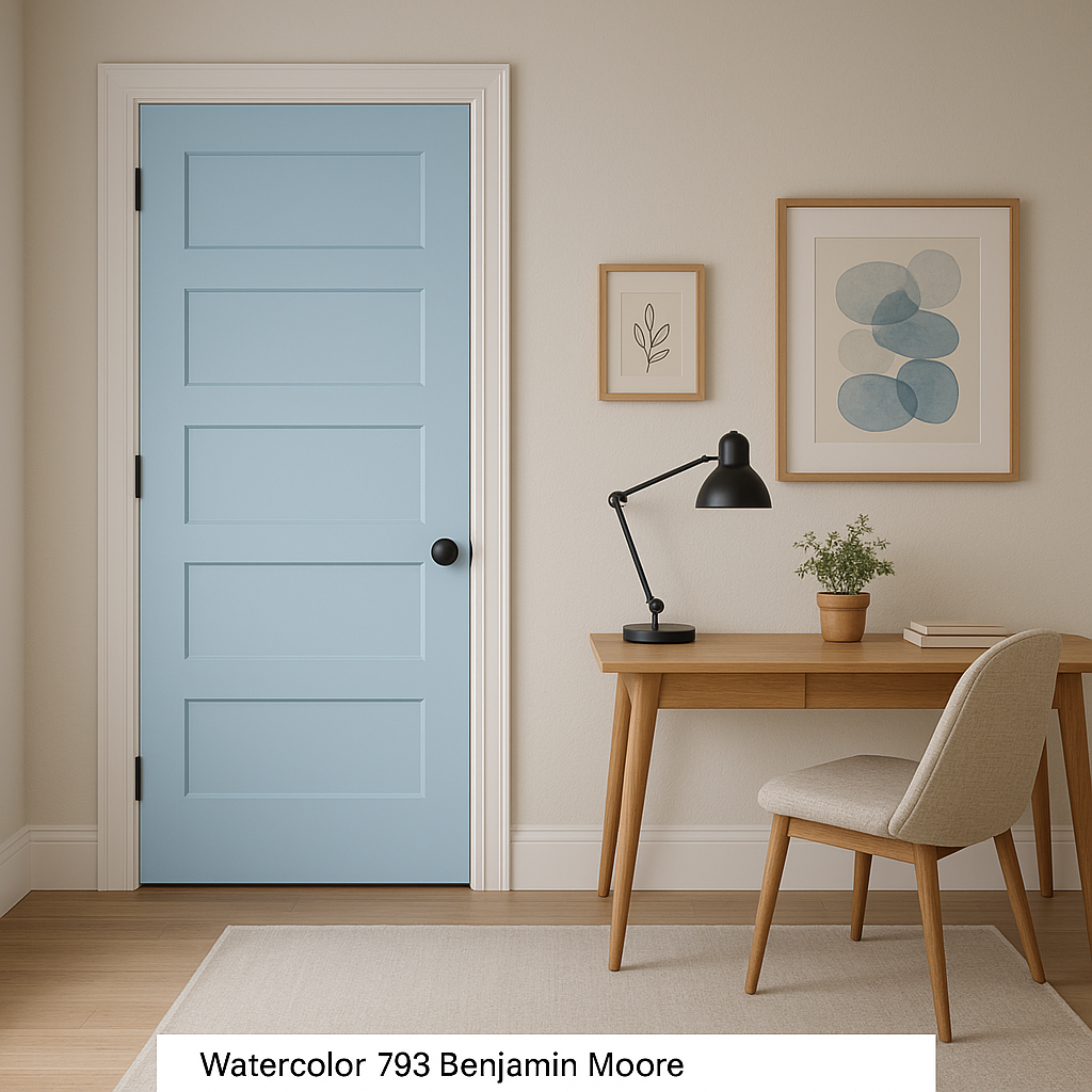
Benjamin Moore Watercolor (793) is a soft, dreamy shade that perfectly balances the tranquility of muted blue with the sophistication of gray undertones. This versatile color brings a sense of calm and serenity to any space, making it an excellent choice for creating peaceful environments. Whether you're designing a cozy bedroom, a spa-like bathroom, or a welcoming entryway, Watercolor has the ability to transform your interiors with its understated elegance.
One of the most appealing aspects of Watercolor is its unique blend of undertones. While it predominantly reads as a pale blue, it carries subtle gray undertones that make it feel grounded and refined. These undertones ensure the color doesn’t lean overly pastel or juvenile, providing a sophisticated edge that works beautifully in both traditional and contemporary spaces. The touch of gray also allows Watercolor to adapt seamlessly to changing light, appearing cooler in bright, natural daylight and slightly warmer in softer, artificial lighting.
Watercolor is a highly adaptable hue that pairs beautifully with a wide range of coordinating colors. Here are a few suggestions to inspire your color palette:
Neutral Pairings: Pair Watercolor with warm off-whites like Benjamin Moore White Dove (OC-17) or creamy neutrals like Benjamin Moore Swiss Coffee (OC-45) for a clean and classic look. These combinations create a fresh and inviting space that feels open and airy.
Contrasting Accents: For a more dramatic effect, introduce deep navy tones like Benjamin Moore Hale Navy (HC-154) or charcoal grays such as Benjamin Moore Kendall Charcoal (HC-166). These contrasts create depth and sophistication, ideal for accent walls or furniture pieces.
Soft Complements: To emphasize Watercolor’s soothing vibe, layer it with soft, pastel tones such as Benjamin Moore Pale Oak (OC-20) or Benjamin Moore Sea Foam (2123-60). These harmonious pairings work well in spaces where relaxation is key, such as nurseries or reading nooks.
Natural Elements: Combine Watercolor with earthy greens like Benjamin Moore Saybrook Sage (HC-114) or warm beige tones like Benjamin Moore Shaker Beige (HC-45). These combinations evoke a natural, organic feel that’s perfect for farmhouse or coastal-inspired interiors.
Benjamin Moore Watercolor (793) is an incredibly versatile color that works well in a variety of design contexts. Its subtle sophistication makes it a popular choice for both residential and commercial spaces. Here are some ideas for incorporating Watercolor into your interiors:
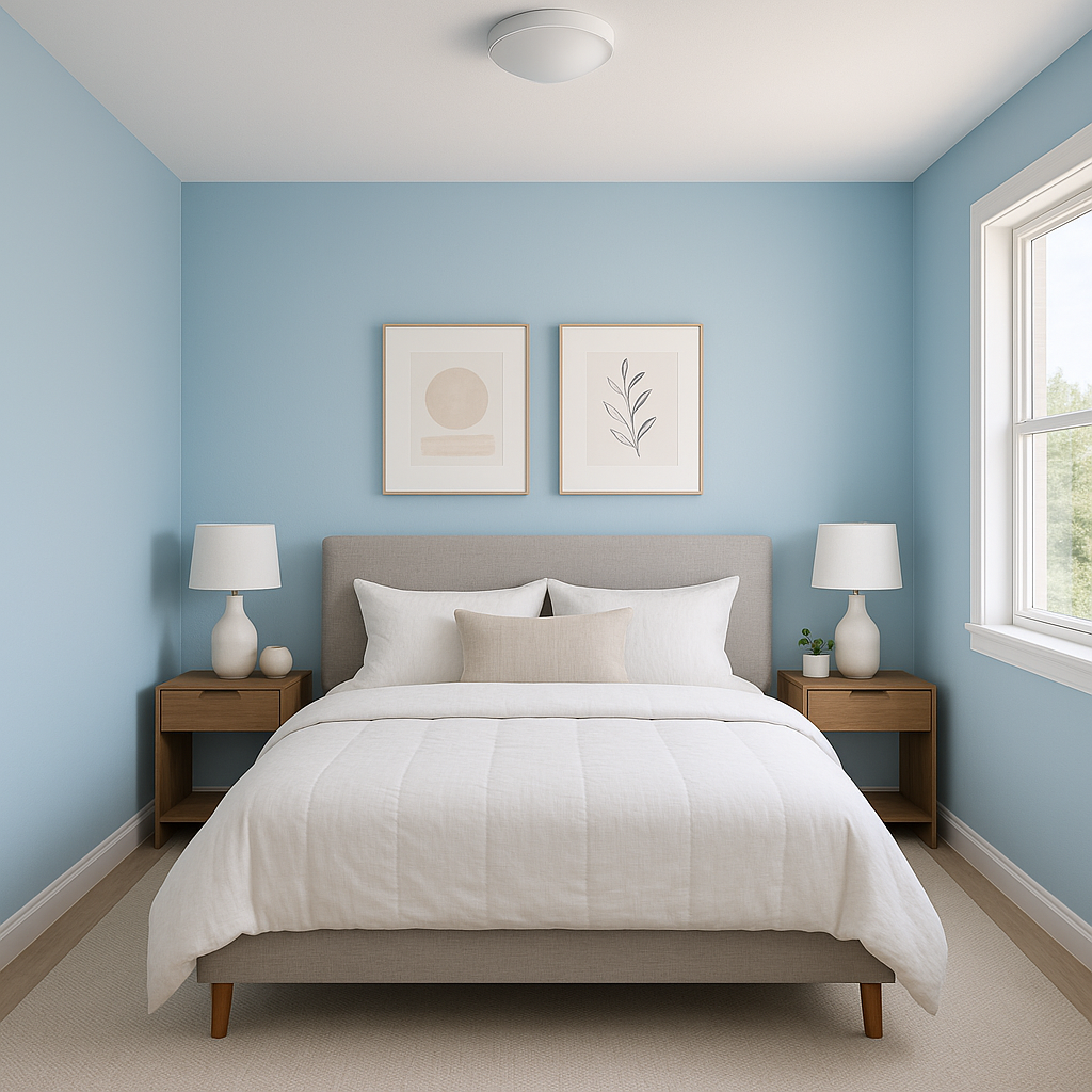
Bedrooms: Create a peaceful retreat by using Watercolor on the walls of your bedroom. Pair it with crisp white bedding and natural wood furniture for a calming and timeless look.
Bathrooms: Watercolor’s spa-like quality makes it ideal for bathrooms. Use it on walls or cabinetry and complement it with polished chrome fixtures and marble countertops for a luxurious feel.
Living Rooms: In living areas, Watercolor can set the tone for a relaxed yet stylish space. Combine it with textured fabrics like linen or velvet, and incorporate metallic accents for added depth.
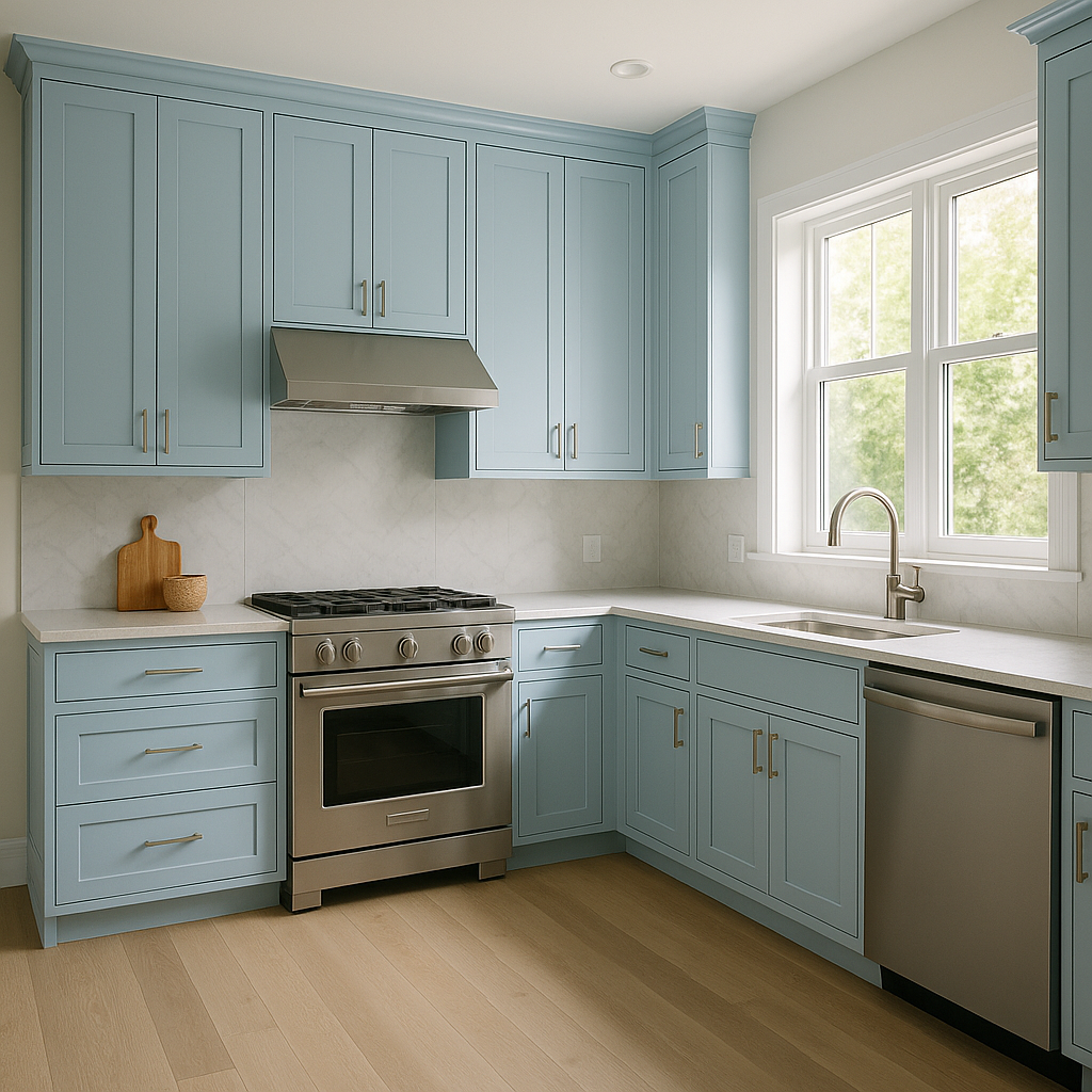
Kitchens: For a fresh and airy kitchen, consider Watercolor for your cabinetry or backsplash. Pair it with soft white counters and brushed brass hardware for a contemporary yet inviting aesthetic.
Home Offices: Promote focus and calm in your workspace by using Watercolor as the primary wall color. Add pops of greenery and natural wood finishes to cultivate a productive yet serene environment.
Accent Walls: If you’re not ready to commit to Watercolor for an entire room, try it as an accent wall. It pairs beautifully with neutral tones and adds just the right amount of color without overwhelming the space.
Watercolor is a color that transcends trends, offering timeless beauty and versatility. Its ability to adapt to various design styles, lighting conditions, and color palettes makes it a favorite among interior designers and homeowners alike. Whether you’re looking to create a tranquil bedroom oasis or add a subtle splash of color to a neutral space, Benjamin Moore Watercolor (793) is a reliable choice that delivers understated elegance and a sense of calm to any room.
By incorporating complementary colors and thoughtful design elements, you can maximize the impact of Watercolor in your interiors, creating spaces that feel both stylish and inviting.
View Colors Only by Brand (No Imagery):
Sherwin-Williams
|
Benjamin-Moore
|
Behr
|
Valspar
Live on the Eastern Slope of Colorado and looking for a local painting professional, check out all our painting services and reach out for a free estimate.
Copyright © 2026 : Wild Fox Painting Inc. : 12435 Mead Way, Littleton, CO 80125


