
Benjamin Moore Bayberry (790) is a sophisticated, earthy green that effortlessly blends richness and subtlety to create a hue that feels both classic and modern. Whether you're designing a cozy retreat, a rustic-inspired space, or a refined interior with natural elements, Bayberry provides a grounded yet elegant touch. Its versatility and depth make it a favorite for homeowners and designers alike, offering a shade that can anchor a room or act as a complementary accent.
Bayberry is characterized by its warm, olive-green base with hints of muted brown undertones. These earthy undertones lend the color a soft, organic feel that avoids being overly bold or overpowering. Unlike brighter greens that can feel stark, Bayberry's subdued nature brings a sense of calm and sophistication to any room. The subtle brown influence ensures the color leans towards a natural look, making it an excellent choice for spaces inspired by nature or vintage aesthetics.
Bayberry pairs beautifully with a variety of complementary tones, making it easy to incorporate into different design schemes. Here are some standout coordinating colors:
Warm Neutrals: Shades like Benjamin Moore's White Dove (OC-17) or Simply White (OC-117) work well to lighten and balance Bayberry. These creamy whites offer a soft contrast, making Bayberry pop without overwhelming the space.
Earthy Browns: Colors such as Kendall Charcoal (HC-166) or Kingsport Gray (HC-86) accentuate Bayberry's warm undertones, creating a harmonious palette that feels grounded and cozy.
Muted Blues: Consider pairing Bayberry with Van Deusen Blue (HC-156) or Boothbay Gray (HC-165) to achieve a balanced yet intriguing mix of cool and warm tones.
Soft Yellows: For a cheerful and inviting look, opt for colors like Hawthorne Yellow (HC-4) or Windham Cream (HC-6). These golden hues bring brightness and warmth to Bayberry's earthy depth.
Bayberry is an incredibly versatile color that can be used in multiple ways to enhance your living spaces. Its adaptability makes it suitable for both traditional and contemporary designs. Here are some ideas for incorporating Bayberry:
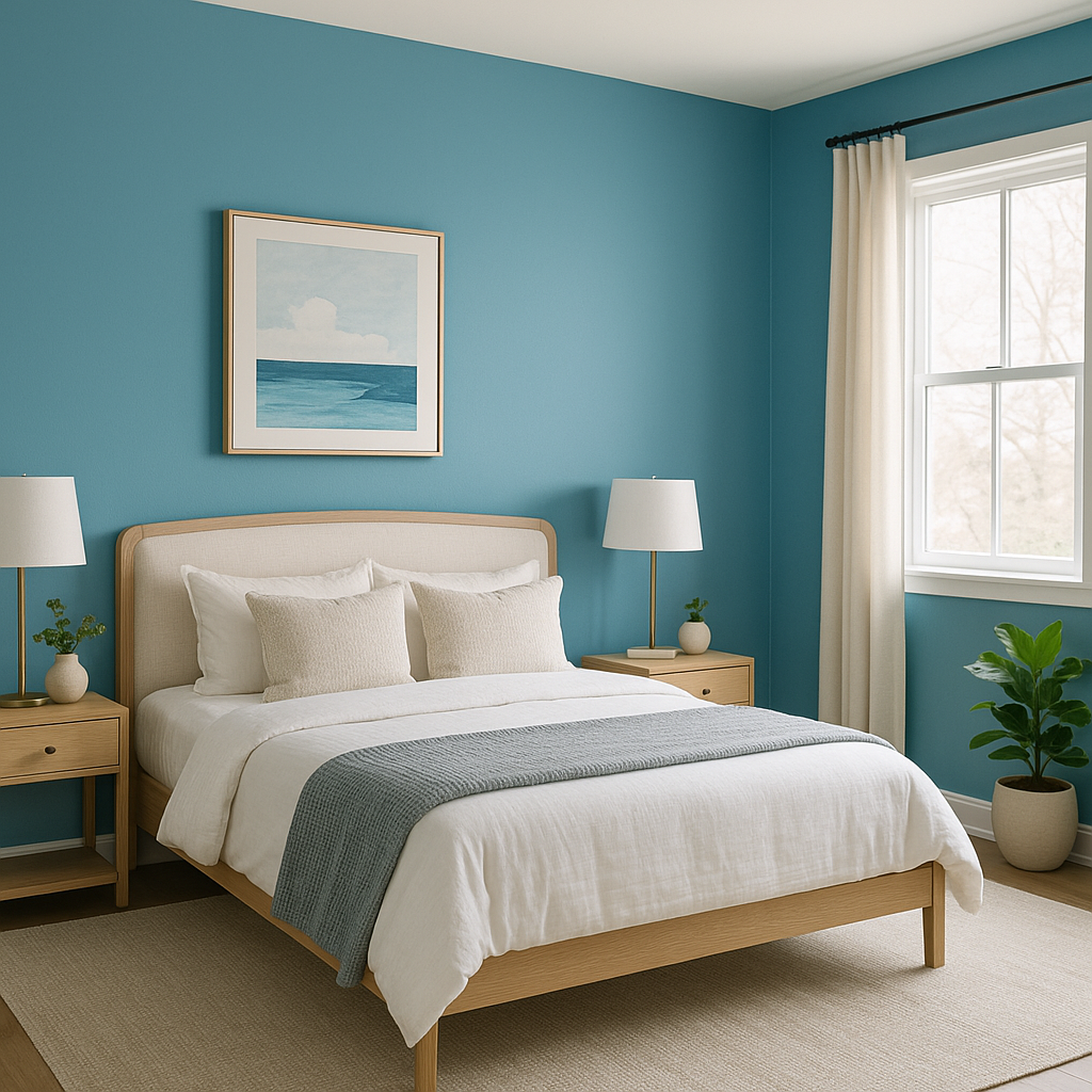
Bayberry works beautifully as an accent wall to add depth and character to a room. Pair it with neutral walls and white trim for a crisp, polished look that highlights the richness of the green hue.
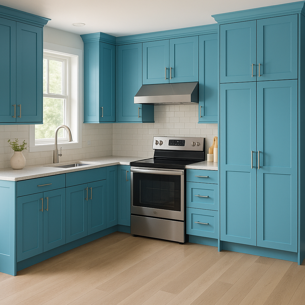
For a bold yet timeless look, use Bayberry on kitchen cabinets, bathroom vanities, or built-in shelving. This color brings an organic, grounding feel to these spaces while maintaining a sense of elegance.
Bayberry's refined nature makes it an excellent choice for dining rooms or studies. Its richness evokes a sense of intimacy and sophistication, creating an inviting atmosphere for focused work or meaningful gatherings.
Bayberry isn’t just for interiors—it’s a stunning choice for exteriors as well. Use it on shutters, doors, or as a primary house color to make a statement that feels stylish yet connected to the surrounding environment.
Incorporate Bayberry into your space through upholstered furniture, area rugs, or decorative accents. It works beautifully in textiles, bringing a soft yet impactful touch to your design scheme.
Bayberry is more than just a paint color—it’s an expression of timeless design and natural beauty. Its earthy undertones, versatility, and ability to coordinate with a wide range of colors make it a go-to choice for creating spaces that feel warm, inviting, and balanced. Whether you’re looking to add sophistication to a room or a sense of calm to your décor, Bayberry offers an impeccable solution.
With its ability to work in traditional, rustic, and even modern spaces, Bayberry (790) is a shade that will stand the test of time while keeping your home effortlessly stylish.
View Colors Only by Brand (No Imagery):
Sherwin-Williams
|
Benjamin-Moore
|
Behr
|
Valspar
Live on the Eastern Slope of Colorado and looking for a local painting professional, check out all our painting services and reach out for a free estimate.
Copyright © 2026 : Wild Fox Painting Inc. : 12435 Mead Way, Littleton, CO 80125


