Benjamin Moore Harbor (740) is a sophisticated and versatile color that strikes a perfect balance between serene blue and grounding green. This enchanting shade evokes the tranquil beauty of coastal waters, making it an ideal choice for creating spaces that feel calming, refreshing, and effortlessly elegant. Its medium intensity allows it to serve as both a striking feature color and a soothing backdrop, depending on how it's paired and applied.
The richness of Harbor (740) lies in its subtle undertones. This blue-green hue carries soft gray undertones that mute its vibrancy, adding depth and sophistication. The gray element prevents it from feeling overly bright or saturated, making it a calming and refined choice for interiors. The blue and green tones work harmoniously, creating a color that feels organic and connected to nature. Harbor (740) adapts beautifully to various lighting conditions, appearing slightly cooler in spaces with natural light and a touch warmer in artificial light.
Benjamin Moore Harbor (740) is remarkably versatile, pairing well with a wide range of colors for different design aesthetics. Here are several coordinating options:
Neutral Pairings:
Bold Contrasts:
Earthy Complements:
Living Rooms: This soothing blue-green shade works beautifully in living rooms, especially when paired with light, neutral furniture and natural textures like rattan, linen, or wood. Harbor brings a relaxed yet polished ambiance to spaces intended for gathering and unwinding.
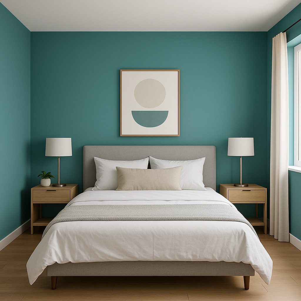
Bedrooms: Harbor (740) is an exceptional choice for bedrooms, where its tranquil tones encourage rest and relaxation. Pair it with crisp white bedding and soft gray accents for a serene sanctuary.
Bathrooms: Infuse your bathroom with coastal-inspired charm by using Harbor on walls or cabinetry. Complement it with white tiles, brushed nickel fixtures, and soft towels in sandy beige or stone gray to complete the look.
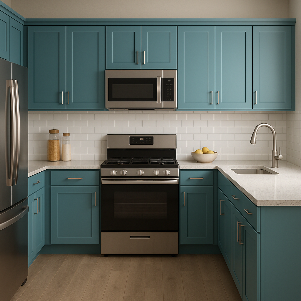
Kitchens: Harbor is a stunning choice for kitchen cabinetry, especially when paired with marble countertops and brass hardware. Its understated elegance enhances both classic and contemporary kitchen designs.
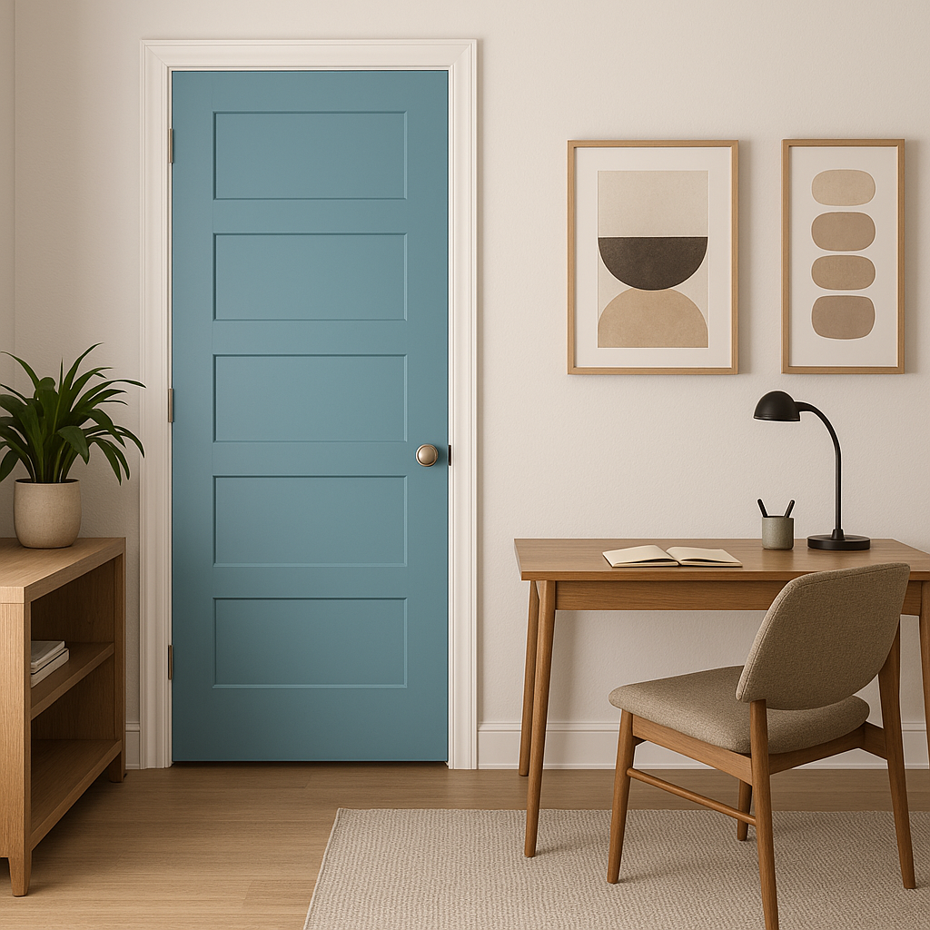
Accent Walls: Use Harbor (740) as an accent wall color in a study, entryway, or dining room to add depth and visual intrigue. Its soothing yet sophisticated hue can elevate the mood of any space.
As with any paint color, lighting plays a significant role in how Harbor (740) appears in your space. In rooms with ample natural light, its blue tones tend to shine, creating a soft, airy feel. In spaces with limited or artificial light, its gray undertones become more pronounced, offering a grounded and cozy vibe.
Benjamin Moore Harbor (740) is a timeless color that brings a sense of serenity and sophistication to interiors. Its balanced blend of blue, green, and gray undertones ensures it adapts seamlessly to a variety of styles, making it a go-to choice for homeowners and designers alike. Whether you're aiming for a coastal retreat, a modern oasis, or a classic haven, Harbor (740) delivers enduring beauty and versatility.
View Colors Only by Brand (No Imagery):
Sherwin-Williams
|
Benjamin-Moore
|
Behr
|
Valspar
Live on the Eastern Slope of Colorado and looking for a local painting professional, check out all our painting services and reach out for a free estimate.
Copyright © 2026 : Wild Fox Painting Inc. : 12435 Mead Way, Littleton, CO 80125


