
Benjamin Moore Pleasant (696) is a timeless and versatile shade that evokes a sense of comfort and understated sophistication. With its warm and inviting presence, Pleasant is a soft beige with subtle golden undertones that make it ideal for creating spaces that feel cozy yet refined. Whether you're designing a serene bedroom retreat or a welcoming living room, this hue provides the perfect backdrop for a range of interior styles.
The defining characteristic of Pleasant (696) is its delicate golden undertone, which infuses the color with a gentle warmth. These undertones make it more than just a neutral beige—it has a radiant quality that adapts beautifully to various lighting conditions. In natural light, Pleasant appears lighter and airier, while in dim or artificial lighting, its golden notes come forward, creating a cozier and more intimate atmosphere. The warm undertones ensure that Pleasant feels approachable and inviting, making it a favorite choice for spaces where comfort is key.
Benjamin Moore Pleasant (696) is incredibly versatile, effortlessly coordinating with a wide range of hues to suit various design aesthetics. Here are some suggestions for complementary colors:
Neutral Companions: Pair Pleasant with Benjamin Moore Simply White (OC-117) or White Dove (OC-17) for a clean, classic look. These crisp whites balance the warmth of Pleasant and bring a sense of brightness to your space.
Earthy Accents: For a grounded, natural vibe, consider pairing Pleasant with shades like Benjamin Moore Revere Pewter (HC-172) or Edgecomb Gray (HC-173). These muted grays and greiges create a serene and harmonious palette.
Soft Pastels: Enhance the warmth of Pleasant by introducing soft pastel hues like Benjamin Moore Palladian Blue (HC-144) or Wind Chime (1469). These gentle blues and greens add a touch of freshness while maintaining a tranquil ambiance.
Bold Contrasts: If you’re looking for drama, pair Pleasant with darker hues like Benjamin Moore Hale Navy (HC-154) or Black Pepper (2130-40). The contrast creates visual interest and adds depth to your design.
Pleasant (696) is a versatile color that works beautifully in a variety of spaces. Its warm neutrality allows it to adapt to different design needs, making it a go-to choice for both residential and commercial interiors.
Create a space that invites relaxation and connection by using Pleasant on your walls. Pair it with plush furniture in cream, taupe, or soft gray tones for an inviting, layered look. Add in golden accents or natural wood finishes to enhance the warmth of the color.
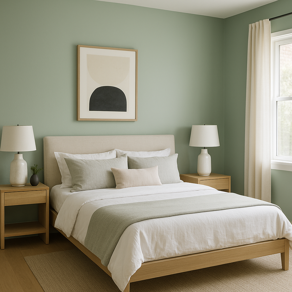
Pleasant is an excellent choice for bedrooms, as its soothing undertones help foster a tranquil atmosphere. Combine it with soft white bedding and pastel accents for a dreamy, serene retreat. For a more luxurious feel, add metallic finishes like brushed gold or warm bronze.
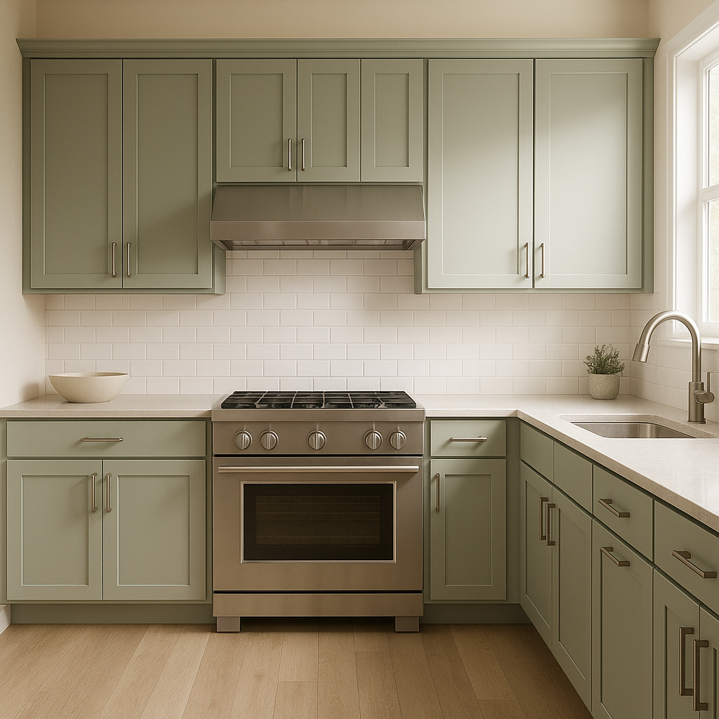
The warm glow of Pleasant makes it ideal for kitchens and dining spaces. Use it on walls, cabinetry, or even as a backdrop for open shelving. Pair it with crisp white countertops and subway tiles for a classic look, or with darker cabinetry for a more modern, dramatic effect.
Pleasant’s ability to adapt to changing light conditions makes it an excellent choice for transitional spaces like hallways and entryways. Its welcoming aura sets the tone for the rest of your home, creating a seamless flow between rooms.
For a workspace that feels both productive and calming, Pleasant is an ideal wall color. Pair it with natural wood desks, neutral decor, and plants to inspire focus while maintaining a comfortable environment.
Benjamin Moore Pleasant (696) offers a perfect balance of warmth and neutrality, making it a versatile choice for any interior design project. Its golden undertones add a touch of elegance, while its adaptability ensures it works beautifully with a wide range of coordinating colors and design styles. Whether you're refreshing a single room or reimagining your entire home, Pleasant (696) is a color you can rely on to bring harmony and sophistication to your space.
View Colors Only by Brand (No Imagery):
Sherwin-Williams
|
Benjamin-Moore
|
Behr
|
Valspar
Live on the Eastern Slope of Colorado and looking for a local painting professional, check out all our painting services and reach out for a free estimate.
Copyright © 2026 : Wild Fox Painting Inc. : 12435 Mead Way, Littleton, CO 80125


