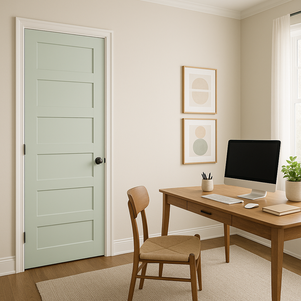
Benjamin Moore Opal 680 is a timeless paint color that exudes elegance and subtle warmth. Perfectly embodying the balance between soft sophistication and understated charm, Opal 680 is a versatile shade that can enhance a variety of interior styles. This pale, muted neutral is a great choice for those who want to create a serene and inviting atmosphere without overwhelming the space. Its adaptability makes it a favorite among homeowners, interior designers, and DIY enthusiasts alike.
Opal 680 is a delicate blend of warm and cool tones, making it an incredibly balanced neutral. It leans slightly warm with a soft beige or creamy undertone, but it also has a whisper of gray that keeps it from feeling too yellow or overly warm. These subtle undertones give the color its versatility, allowing it to work beautifully in both modern and traditional spaces. The muted quality of Opal 680 ensures that it doesn’t overpower other design elements, making it an ideal backdrop for layered interiors.
One of the standout features of Benjamin Moore Opal 680 is how effortlessly it pairs with other colors. Whether you want to create a monochromatic palette or add striking contrast, this color accommodates a wide range of hues. Here are some coordinating color options to consider:
Soft Whites and Creams: Pair Opal 680 with shades like Benjamin Moore Simply White (OC-117) or Chantilly Lace (OC-65) for a clean, timeless look. These soft whites highlight Opal’s warmth without overpowering its subtle gray undertone.
Earthy Neutrals: For a cohesive, natural palette, consider pairing Opal 680 with earthy tones like Revere Pewter (HC-172) or Edgecomb Gray (HC-173). These colors complement its depth and create a harmonious, serene environment.
Cool Blues and Greens: Add a hint of contrast with cooler shades like Palladian Blue (HC-144) or Soft Fern (2144-40). These colors bring a refreshing energy to the space while maintaining the tranquility of Opal 680.
Dramatic Darks: For a bolder look, pair Opal 680 with deep, moody colors such as Hale Navy (HC-154) or Kendall Charcoal (HC-166). The contrast between the light neutral and the darker accents adds depth and sophistication.
Opal 680’s versatility allows it to shine in various applications throughout your home. Its balanced undertones make it a dependable choice for any room, blending effortlessly into any design scheme. Here are some of the best ways to use this elegant shade:
Opal 680 is an excellent choice for living rooms, where you want to create a cozy yet polished space. Its subtle warmth makes it inviting, while the soft gray undertones keep it modern. Pair it with layered textures like linen, wool, and natural wood for added depth.
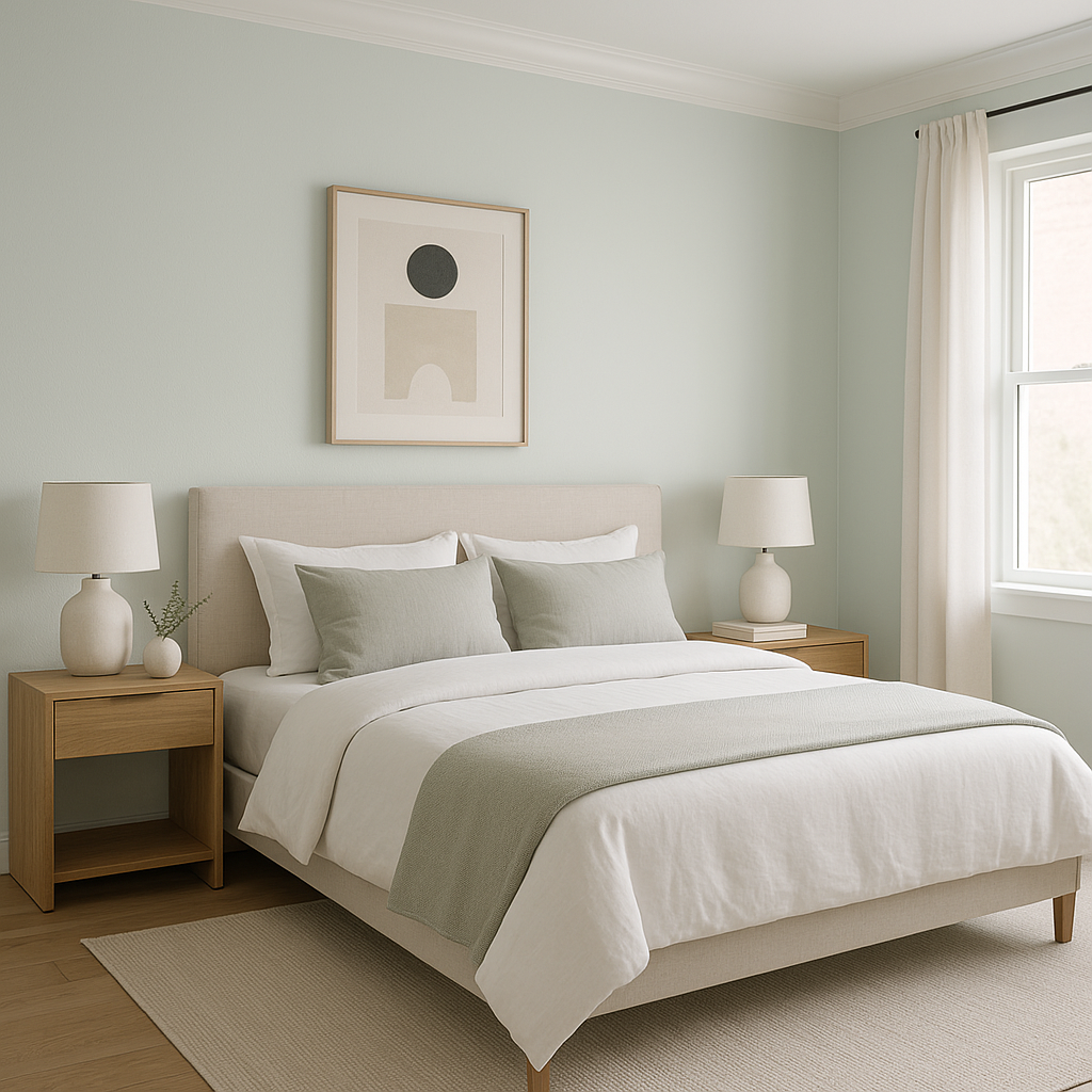
For a serene and restful retreat, Opal 680 is ideal in bedrooms. Its tranquil quality helps to create a calming ambiance, perfect for unwinding at the end of the day. Combine it with soft pastels, plush bedding, and metallic accents for a luxurious touch.
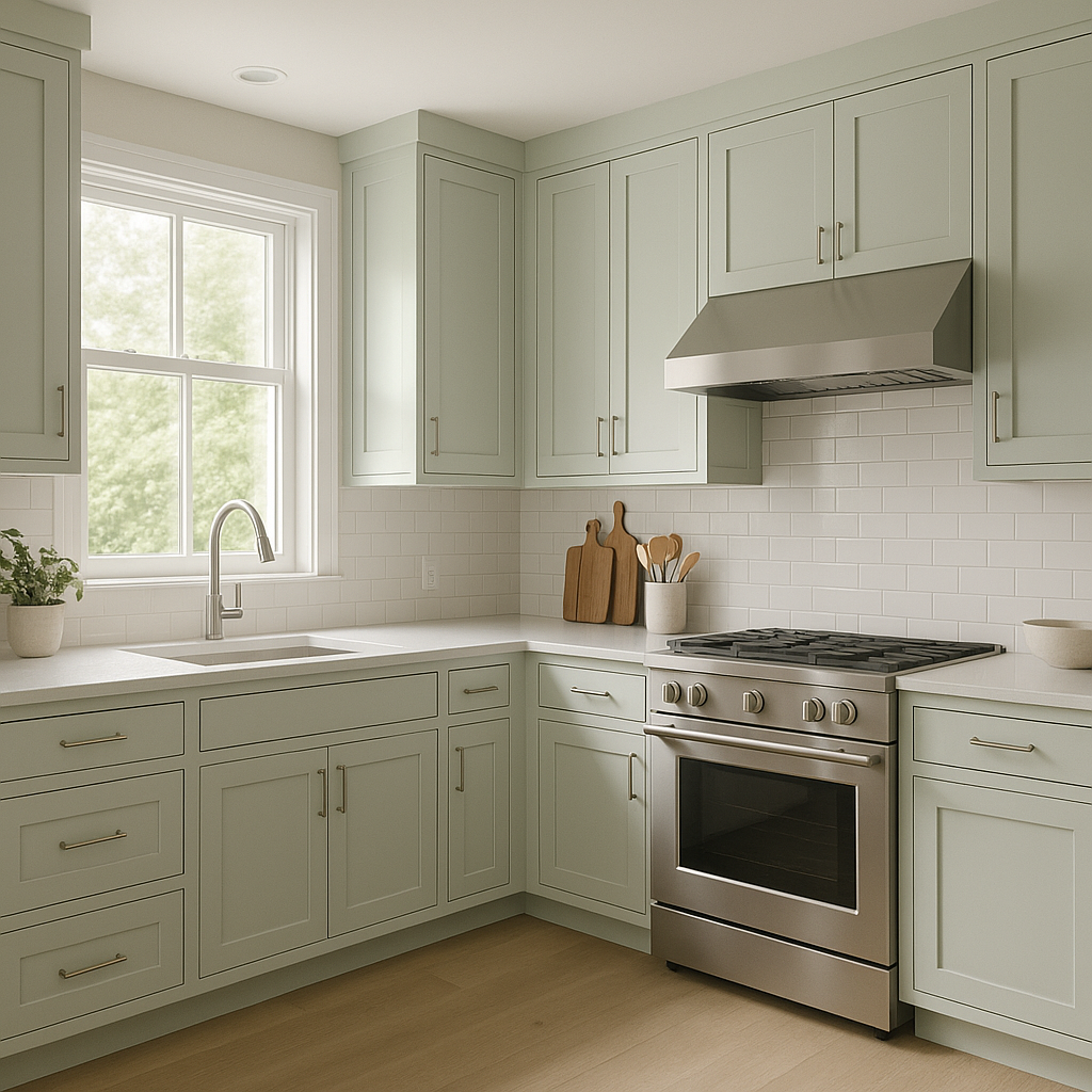
Opal 680 works beautifully in kitchens, especially when paired with white or cream cabinetry and natural stone countertops. Its neutral tone balances the brightness of white while maintaining a clean, fresh look. Add black hardware or fixtures for a hint of contrast.
In bathrooms, Opal 680 can evoke a spa-like atmosphere. Its muted warmth pairs well with marble, brushed nickel fixtures, and soft lighting. Consider using it on the walls with crisp white trim for a timeless aesthetic.
View Colors Only by Brand (No Imagery):
Sherwin-Williams
|
Benjamin-Moore
|
Behr
|
Valspar
Live on the Eastern Slope of Colorado and looking for a local painting professional, check out all our painting services and reach out for a free estimate.
Copyright © 2026 : Wild Fox Painting Inc. : 12435 Mead Way, Littleton, CO 80125


