Benjamin Moore Sea 657 is a versatile and tranquil paint color that effortlessly evokes the natural beauty of coastal waters. This soft, muted blue-green shade is a perfect choice for creating spaces that feel calm, soothing, and inviting. Whether you're designing a beach-inspired retreat or simply looking for a color to bring a serene vibe to your interiors, Sea 657 delivers an understated elegance that works beautifully in a variety of settings.
Sea 657 is a harmonious blend of blue and green tones, with subtle gray undertones that lend the color a sophisticated and grounded appeal. The gray undertones help to soften the vibrancy of the blue-green, making it less saturated and more versatile for different lighting conditions. In spaces with natural light, the color leans toward a breezy aqua, while in dimmer settings, its gray undertones become more pronounced, giving it a quiet and refined presence. These undertones make Sea 657 adaptable, ensuring it complements a wide range of design styles and moods.
Benjamin Moore Sea 657 pairs beautifully with a variety of colors, making it an excellent choice for creating cohesive color palettes. Here are a few coordinating colors to consider for your design:
Whites and Off-Whites: Pair Sea 657 with crisp whites like Benjamin Moore Chantilly Lace (OC-65) or warmer off-whites like White Dove (OC-17) to create a fresh and timeless look. These lighter shades provide contrast while enhancing the airy quality of Sea 657.
Neutral Grays: Soft grays such as Stonington Gray (HC-170) or Gray Owl (2137-60) complement the gray undertones in Sea 657, creating a balanced and sophisticated palette.
Beige and Taupe: For a more grounded look, consider pairing Sea 657 with warm neutrals like Edgecomb Gray (HC-173) or Revere Pewter (HC-172). These shades add warmth and depth, making spaces feel cozy yet elegant.
Deep Blues and Navy: For a dramatic touch, combine Sea 657 with rich blues like Hale Navy (HC-154) or Newburyport Blue (HC-155). These darker hues provide striking contrast while staying within the coastal-inspired theme.
Soft Greens: If you're aiming for a monochromatic scheme, lighter greens like Palladian Blue (HC-144) or richer tones like Saybrook Sage (HC-114) blend harmoniously with Sea 657.
Benjamin Moore Sea 657 is a highly versatile color that can be used throughout your home to create a serene and stylish atmosphere. Here are some ways to incorporate this beautiful shade into your interior design:
Living Rooms: Use Sea 657 as a wall color to establish a relaxing environment where family and friends can gather. Pair it with soft furnishings in neutral tones and natural textures like rattan or jute for a coastal-inspired aesthetic.
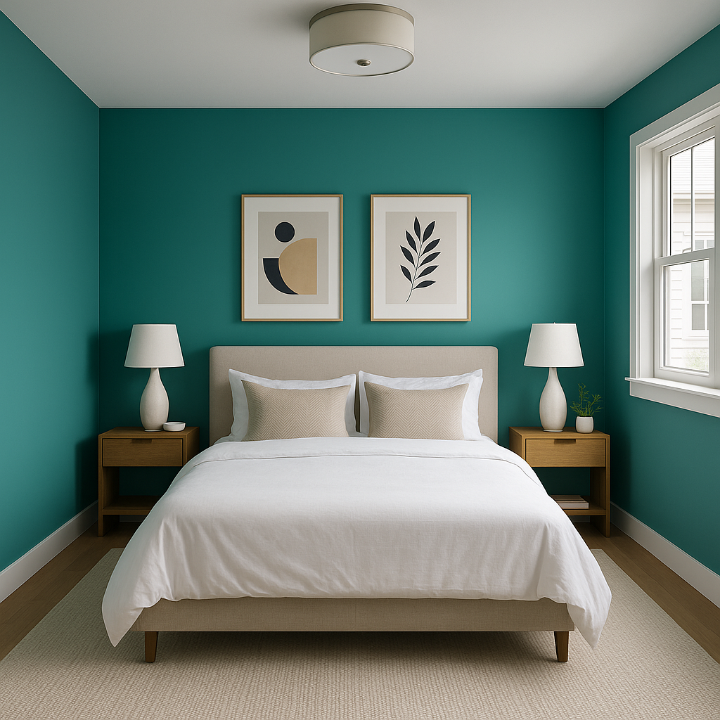
Bedrooms: Sea 657 is a popular choice for bedrooms because of its calming qualities. It creates a peaceful retreat, especially when paired with crisp white bedding and accents of soft gray or beige.
Bathrooms: Bring spa-like serenity to your bathroom with Sea 657. Its soothing blue-green tones work well with white subway tiles, marble countertops, and chrome or brushed nickel fixtures.
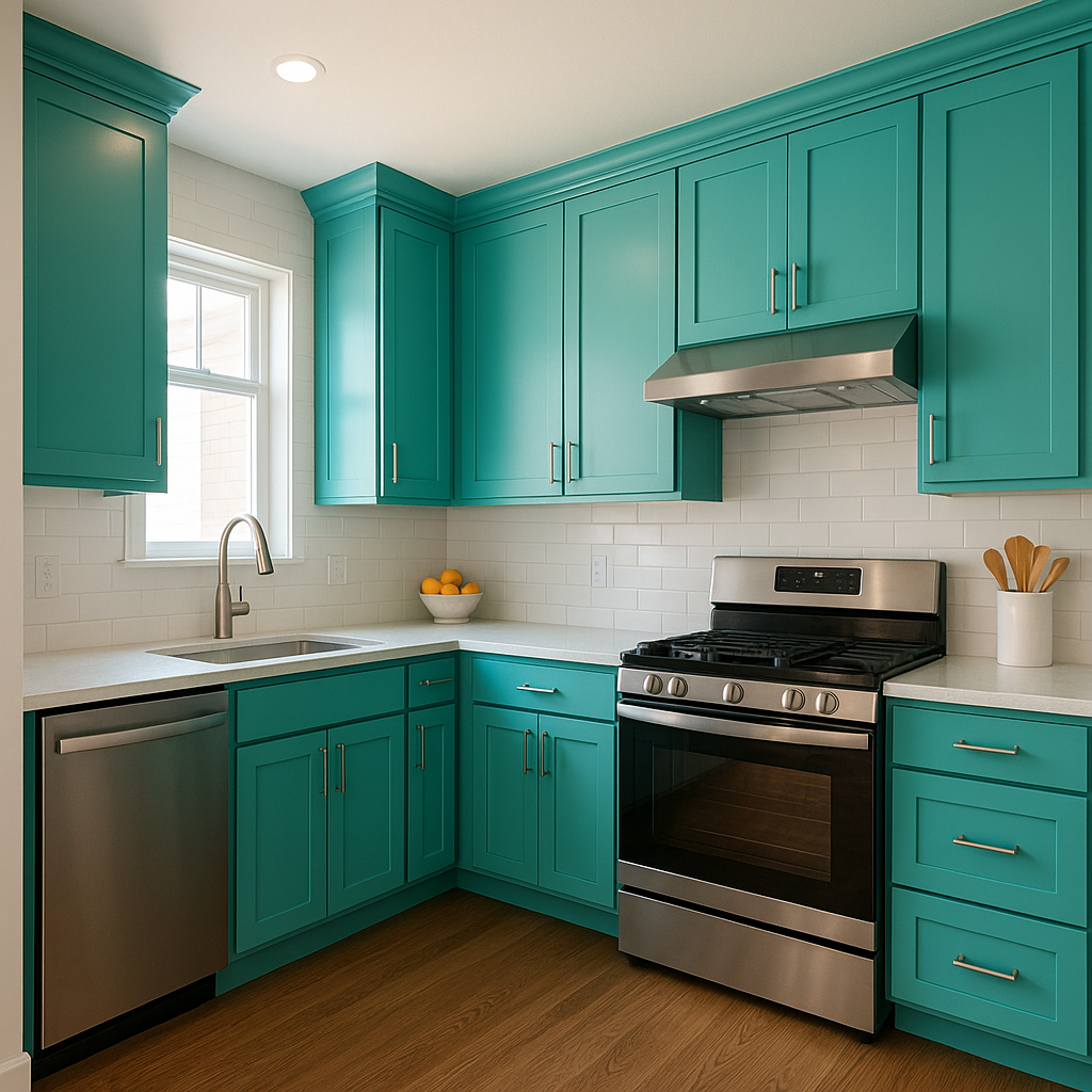
Kitchens: Add a unique touch to your kitchen by using Sea 657 for cabinets or an accent wall. Pair it with white countertops and backsplashes for a bright and cheerful space, or opt for darker hardware for a modern twist.
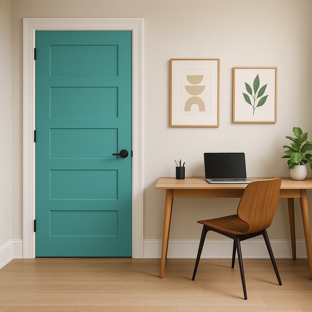
Home Offices: Create a productive yet tranquil workspace by introducing Sea 657 to your home office. Its muted tones encourage focus while keeping the environment uplifting.
Accent Walls and Furniture: If you're not ready to commit to painting an entire room, Sea 657 makes an excellent choice for accent walls or furniture pieces. Consider using it on a bookshelf, dresser, or console table to add a subtle pop of color.
When working with Benjamin Moore Sea 657, it's essential to consider the lighting in your space. Natural light will emphasize its blue-green qualities, making it feel more vibrant and airy. In artificial or dim lighting, its gray undertones will become more prominent, lending a subdued and sophisticated look. Always test a sample in your space before committing to the color, as lighting conditions can significantly impact how it appears.
Benjamin Moore Sea 657 is a timeless and versatile choice that brings a sense of calm and elegance to any room. Its balanced blend of blue, green, and gray undertones makes it an ideal option for a wide range of design styles, from coastal to modern. Whether used as a primary color or an accent, Sea 657 transforms interiors into tranquil spaces you'll love coming home to.
View Colors Only by Brand (No Imagery):
Sherwin-Williams
|
Benjamin-Moore
|
Behr
|
Valspar
Live on the Eastern Slope of Colorado and looking for a local painting professional, check out all our painting services and reach out for a free estimate.
Copyright © 2026 : Wild Fox Painting Inc. : 12435 Mead Way, Littleton, CO 80125


