Benjamin Moore Spring (591) is a delightful, nature-inspired green that captures the essence of a lush, rejuvenating season. With its soft yet vibrant energy, this hue brings the outdoors inside, offering a refreshing ambiance that feels both lively and tranquil. Spring (591) is a versatile color that can transform a variety of spaces, making it an excellent choice for homeowners and designers seeking a fresh, uplifting look.
Spring (591) is a balanced shade of green with subtle yellow undertones. These warm undertones create a sense of brightness and vitality, making it a more inviting color compared to cooler greens with blue undertones. The yellow influence ensures this shade never feels overly sharp or muted, giving it a sunny disposition that evokes feelings of renewal and growth. Its undertones make it a perfect candidate for rooms where a cheerful yet grounded atmosphere is desired.
Benjamin Moore Spring (591) pairs beautifully with a range of complementary and contrasting hues, allowing for endless design possibilities. Here are some suggestions for coordinating colors:
Neutrals:
Pair Spring (591) with soft neutrals like White Dove (OC-17) or Simply White (OC-117) to create a clean, crisp look that highlights the green’s vibrancy. These whites act as perfect backdrops, balancing the energy of Spring (591) while maintaining a light and airy feel.
Earthy Tones:
Combine it with warm earth tones like Rustic Taupe (996) or Kingsport Gray (HC-86) to create a grounded and organic palette. These colors will enhance the natural vibe of Spring (591), making it ideal for spaces inspired by nature.
Contrasting Colors:
For a bold and dynamic look, pair Spring (591) with complementary shades such as Golden Retriever (2165-30) or Caliente (AF-290). These contrasting hues add energy and visual interest while maintaining a cohesive design.
Soft Pastels:
To achieve a serene and dreamy aesthetic, coordinate Spring (591) with pastel tones like Pink Bliss (2093-70) or Lavender Mist (2070-60). The gentle interplay of these colors will create a soothing retreat.
Spring (591) is a highly adaptable color that works well in a variety of settings. Here are some ways to incorporate it into your home or office:
Spring (591) is perfect for living rooms and family spaces where a connection to nature can foster relaxation and comfort. Use it as a primary wall color and pair it with neutral furniture and natural wood finishes to create a warm and inviting atmosphere. Add accents in coordinating colors for a cohesive look.
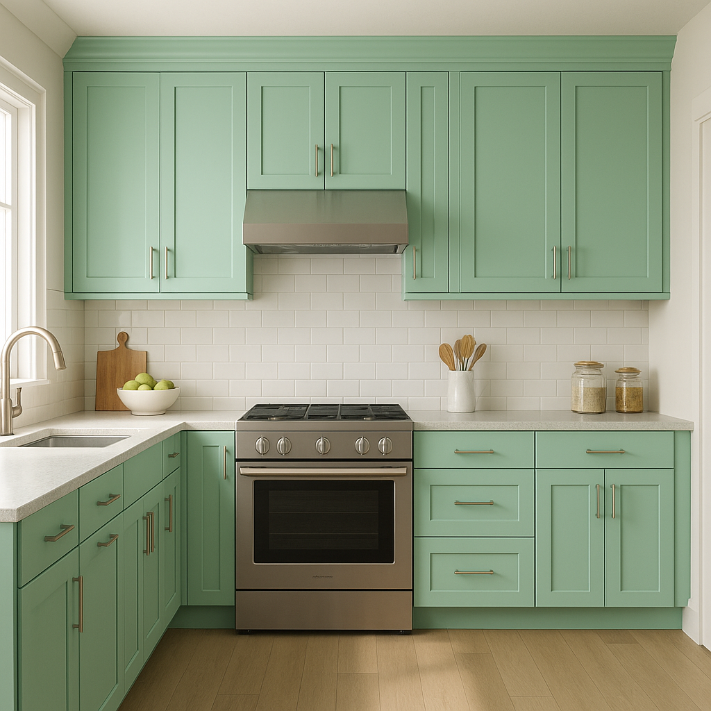
Bring a fresh, garden-inspired feel to your kitchen with Spring (591). It pairs wonderfully with white cabinetry, marble countertops, and natural wood floors. Add botanical elements or pops of contrasting colors like sunny yellows for a cheerful culinary space.
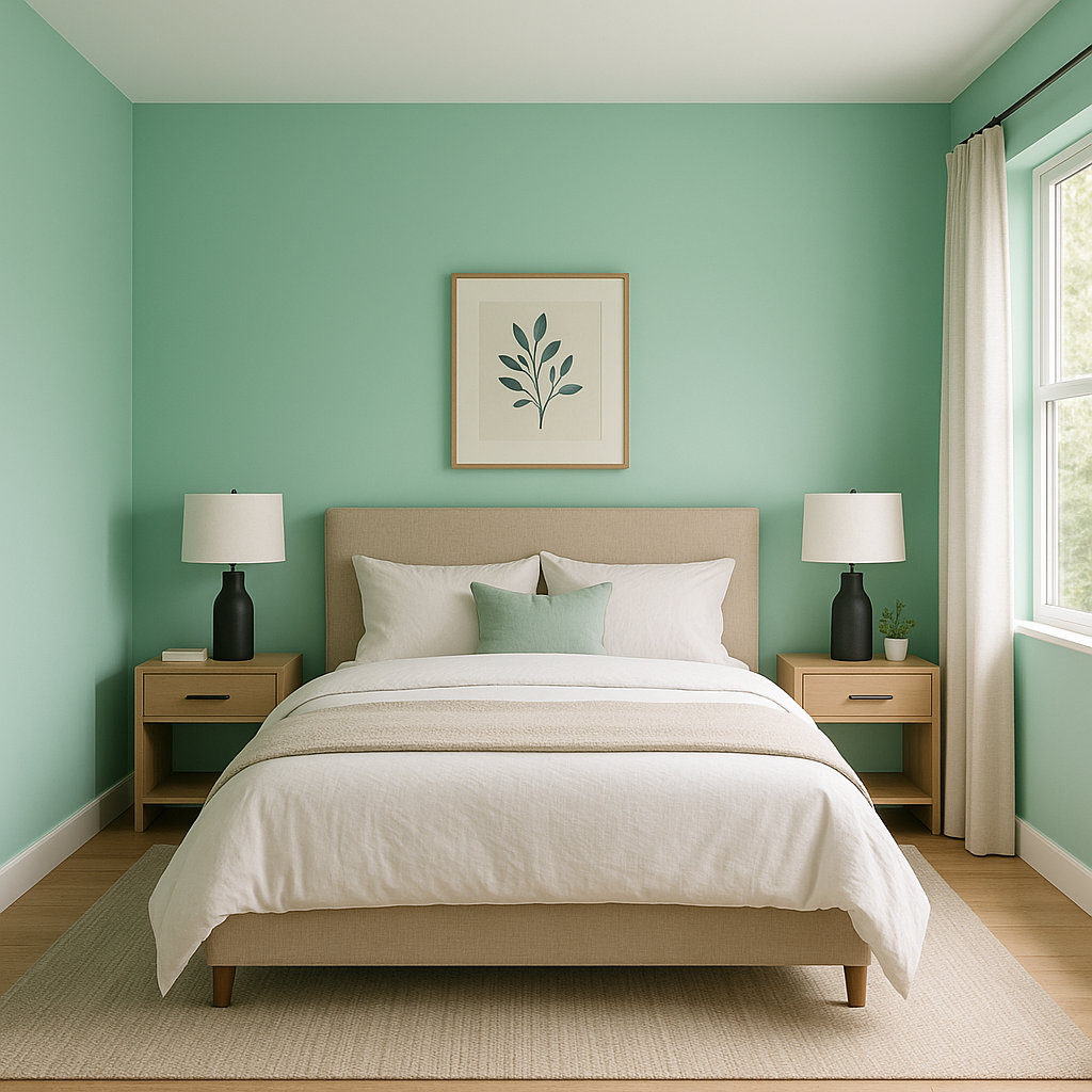
In bedrooms, Spring (591) encourages a serene environment while maintaining a vibrant character. Pair it with soft linens in neutral tones or pastels to create a restful retreat that feels connected to the outdoors.
Spring (591)’s cheerful vibe makes it an excellent choice for nurseries or playrooms. Its energetic yet soothing presence can inspire creativity and joy, especially when paired with playful accents in bright yellows or soft pinks.
For bathrooms, Spring (591) offers a spa-like quality that feels clean and refreshing. Pair it with crisp whites, metallic fixtures, and natural stone finishes for a space that feels rejuvenating and modern.
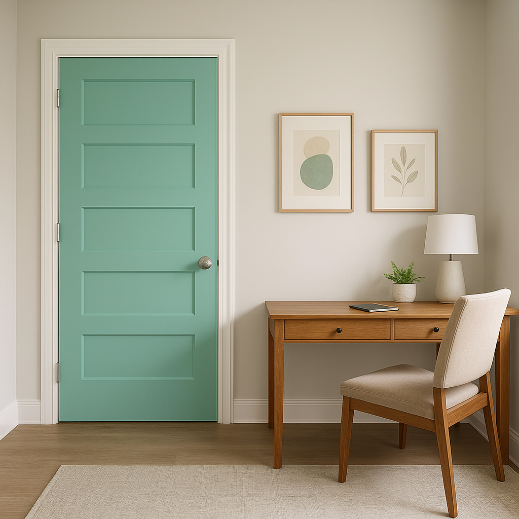
If you’re not ready to commit to a full room of green, Spring (591) works beautifully as an accent wall. Use it behind a bed’s headboard or in a dining area to create a focal point that breathes life into the space.
The way Spring (591) appears can vary based on lighting conditions. In natural light, its yellow undertones shine brightly, giving it a sunny and vibrant appearance. In artificial light, particularly warm lighting, its undertones may deepen, creating a cozier feel. Test swatches in your space to observe how the color interacts with different lighting throughout the day.
Benjamin Moore Spring (591) is more than just a paint color—it’s a celebration of renewal, vitality, and the beauty of springtime. With its versatile undertones, coordinating color options, and wide range of uses, it offers endless design opportunities to create spaces that feel alive and inspired. Whether you’re looking to energize your kitchen, add tranquility to your bedroom, or bring nature into your living spaces, Spring (591) is a vibrant choice that will elevate your interior design.
View Colors Only by Brand (No Imagery):
Sherwin-Williams
|
Benjamin-Moore
|
Behr
|
Valspar
Live on the Eastern Slope of Colorado and looking for a local painting professional, check out all our painting services and reach out for a free estimate.
Copyright © 2026 : Wild Fox Painting Inc. : 12435 Mead Way, Littleton, CO 80125


