Benjamin Moore Pistachio (561) is a delightful shade of light green that exudes a sense of freshness and vitality. Perfectly balancing soft warmth and vibrant energy, this hue is ideal for creating spaces that feel inviting yet lively. Whether you're designing a serene retreat or a playful living area, Pistachio offers versatile appeal that complements both modern and traditional aesthetics.
Pistachio has subtle yellow undertones that imbue it with a sunny, cheerful disposition. These warm undertones prevent the green from feeling overly cool or sterile, making it a more versatile choice. The slight hint of yellow adds depth and a touch of earthiness, ensuring it feels natural and grounding while maintaining its light and airy character. This combination of undertones makes Pistachio a fantastic choice for spaces that need a soothing yet uplifting atmosphere.
To bring out the best in Benjamin Moore Pistachio, pair it with complementary and contrasting colors that enhance its charm. Here are some excellent options for coordinating colors:
Pistachio is a versatile color that can be used in various spaces and design styles. Here are some creative applications for this refreshing hue:
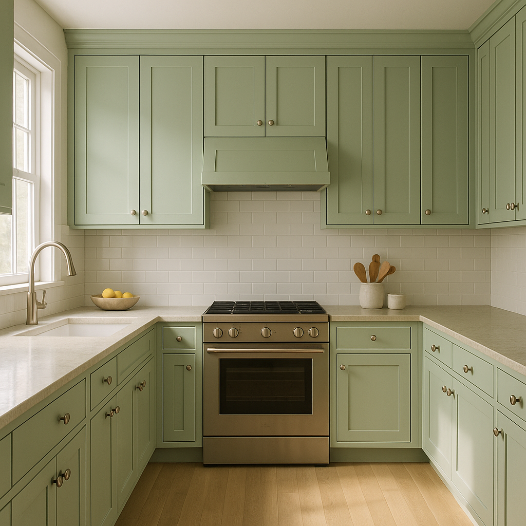
Pistachio’s fresh and lively vibe makes it a perfect choice for kitchens and dining areas. Use it on cabinetry for a whimsical yet sophisticated look, or paint the walls to create a cheerful ambiance. Pair it with brass or matte black hardware for a modern touch.
In living areas, Pistachio offers a soft pop of color that feels welcoming and serene. Combine it with neutral furniture and accents in warm wood tones for a cozy, balanced space. It’s especially suited to farmhouse, cottage, or Scandinavian design styles.
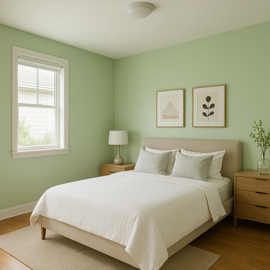
For a tranquil and uplifting bedroom, Pistachio is an excellent wall color choice. Its subtle yellow undertones make it feel warm and comforting, helping create a restful retreat. Pair it with crisp white bedding and soft pastel accents for a dreamy atmosphere.
Bring a spa-like feel to your bathroom with Pistachio. Its light green hue evokes nature and freshness, making it ideal for creating a calming space. Pair it with white subway tiles and brushed nickel fixtures for a clean, timeless look.
Pistachio’s playful yet gentle character makes it ideal for children’s spaces. Use it as a main wall color in nurseries, or combine it with pops of brighter colors like pink or orange for a fun and energetic playroom.
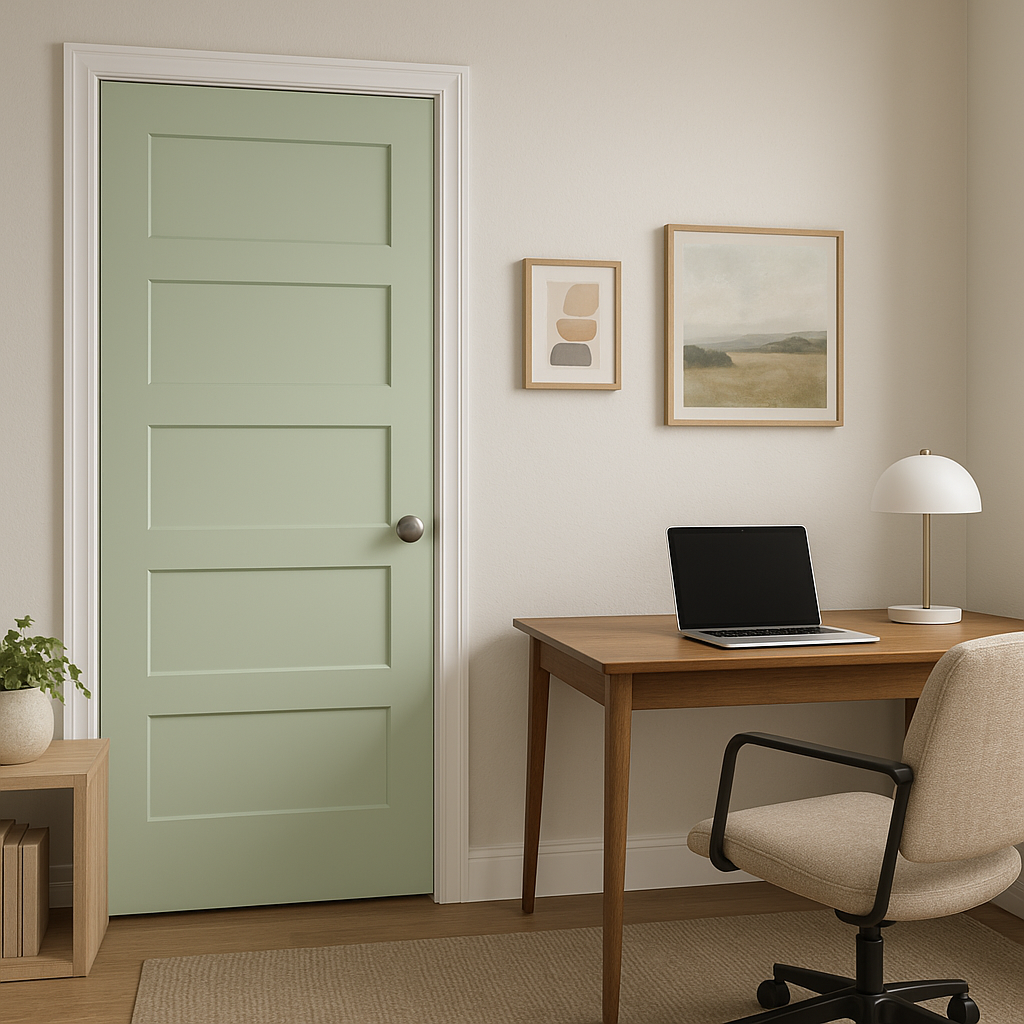
Pistachio isn’t just for interiors! Consider using it for exterior accents like shutters or doors to add a refreshing touch to your home’s façade. It pairs beautifully with creamy whites and natural stone textures.
Benjamin Moore Pistachio (561) embodies a sense of renewal and optimism. Its light green hue is reminiscent of springtime and new beginnings, making it ideal for spaces where you want to cultivate a positive and uplifting mood. This color works seamlessly in casual, traditional, and modern settings, proving its versatility across a range of design styles.
Benjamin Moore Pistachio (561) is a timeless yet playful color that can transform any room into a sanctuary of freshness and charm. Whether you're looking to create a calming environment or infuse energy into your design, this versatile green is sure to please.
View Colors Only by Brand (No Imagery):
Sherwin-Williams
|
Benjamin-Moore
|
Behr
|
Valspar
Live on the Eastern Slope of Colorado and looking for a local painting professional, check out all our painting services and reach out for a free estimate.
Copyright © 2026 : Wild Fox Painting Inc. : 12435 Mead Way, Littleton, CO 80125


