Benjamin Moore Glade (498) is a versatile, soft green that evokes the tranquility of a lush meadow or a quiet forest glade. This understated hue is perfect for creating a soothing and welcoming atmosphere in a variety of spaces. Its natural elegance makes it ideal for interiors that aim to feel grounded, harmonious, and connected to the beauty of the outdoors.
Glade (498) carries subtle gray undertones that temper its green base, lending it a muted, sophisticated quality. These undertones prevent the color from feeling overly vibrant or saturated, making it a fantastic choice for spaces where a calming ambiance is desired. The gray nuances allow Glade to adapt seamlessly to different lighting conditions, appearing slightly cooler in north-facing rooms and warmer in spaces bathed with natural sunlight.
Glade (498) pairs beautifully with a range of complementary and contrasting hues, allowing for versatile design options. Here are some recommendations for coordinating colors:
Neutral Pairings: Pair Glade with warm neutrals like Benjamin Moore White Dove (OC-17) or Edgecomb Gray (HC-173) for a timeless, balanced look. These soft neutrals highlight the green’s earthy qualities while maintaining a clean and fresh aesthetic.
Earthy Complements: Enhance the organic feel of Glade by combining it with deeper greens or browns, such as Benjamin Moore Tate Olive (HC-112) or Fairview Taupe (HC-85). These pairings create a grounded, nature-inspired palette perfect for rustic or transitional spaces.
Bold Accents: For a pop of contrast, consider pairing Glade with a saturated navy like Hale Navy (HC-154) or a rich terracotta such as Potters Clay (1221). These bold shades energize the space while retaining the sophistication of the overall design.
Soft Pastels: To achieve a fresh and airy look, pair Glade with delicate pastels such as Benjamin Moore Gray Cashmere (2138-60) or Pale Oak (OC-20). These gentle hues create a light, serene atmosphere that feels effortless.
Glade (498) is a versatile color that works beautifully across a range of design styles and applications. Here are some ideas for incorporating this serene green into your home:
Living Rooms: Use Glade on your walls to craft a cozy, inviting living space. Its muted green tones bring an element of nature indoors and pair wonderfully with natural wood furniture and textured fabrics like linen or wool.
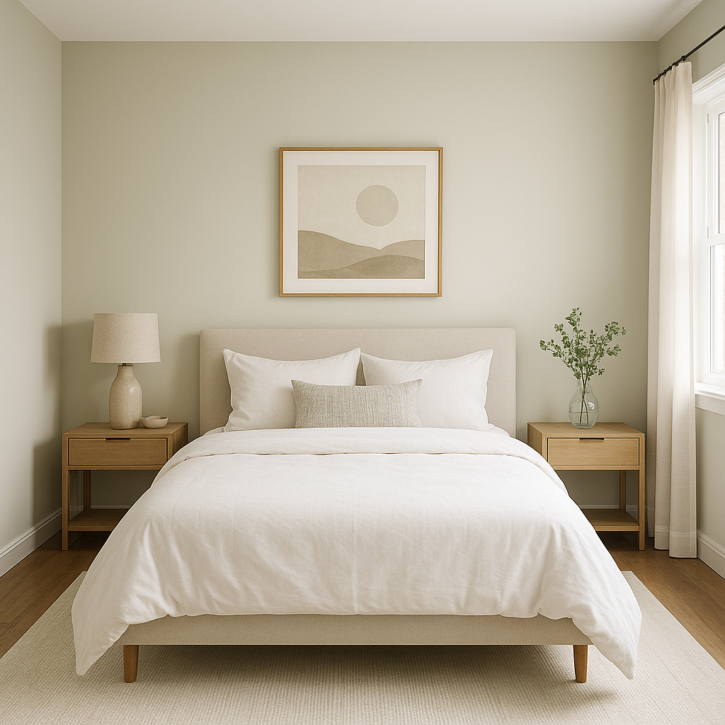
Bedrooms: Create a peaceful retreat by painting your bedroom walls with Glade. Its calming nature promotes relaxation, making it an excellent choice for a restful environment. Pair with soft white bedding and accents in muted gold or brass for a touch of elegance.
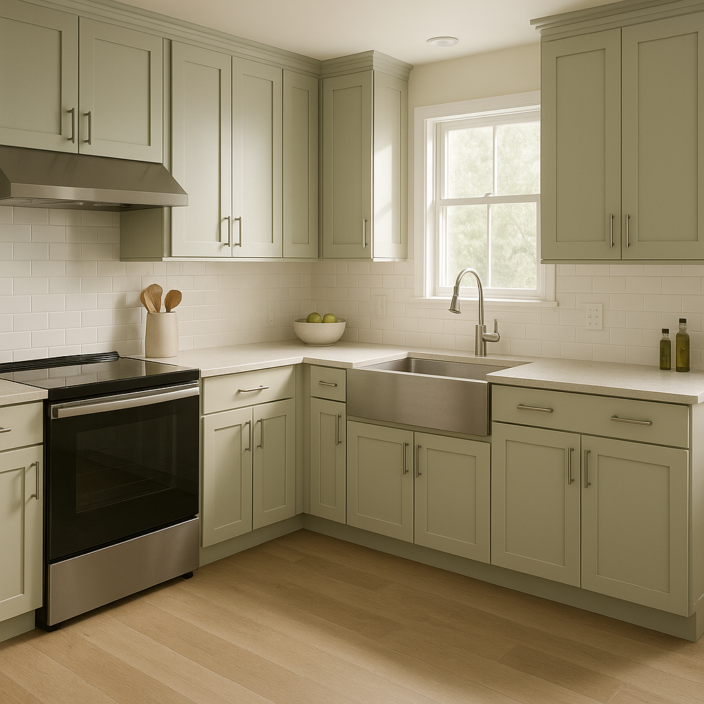
Kitchens: Glade can bring a fresh yet timeless look to your kitchen. Use it on cabinetry for a subtle pop of color, or as a wall shade paired with crisp white countertops and subway tiles for a modern farmhouse aesthetic.
Bathrooms: In bathrooms, Glade can help achieve a spa-like atmosphere. Pair it with white fixtures and natural stone accents to create a serene space that feels effortlessly chic.
Accent Walls: If you’re not ready to commit to green throughout an entire room, consider using Glade as an accent wall color. It works beautifully behind bookshelves, as a backdrop to artwork, or as a focal point in a reading nook.
The appearance of Glade (498) will shift depending on your lighting setup. In rooms with abundant natural light, the green will feel softer and brighter, while in dimmer spaces, the gray undertones will be more pronounced, giving it a moodier, more sophisticated quality. Consider testing this shade in different areas of your home to see how it interacts with your lighting before committing to a full application.
Benjamin Moore Glade (498) is a serene, adaptable green that balances nature-inspired beauty with understated elegance. Its muted undertones and ability to coordinate with a variety of palettes make it a go-to choice for homeowners and designers alike. Whether you're looking to create a calming retreat or breathe new life into your space, Glade offers the perfect balance of sophistication and warmth.
View Colors Only by Brand (No Imagery):
Sherwin-Williams
|
Benjamin-Moore
|
Behr
|
Valspar
Live on the Eastern Slope of Colorado and looking for a local painting professional, check out all our painting services and reach out for a free estimate.
Copyright © 2026 : Wild Fox Painting Inc. : 12435 Mead Way, Littleton, CO 80125


