Benjamin Moore Chamomile (397) is a soft, welcoming shade that brings a sense of warmth and serenity to any space. This muted yellow carries a timeless charm, making it a versatile choice for both traditional and contemporary interiors. Chamomile effortlessly bridges the gap between a subtle neutral and a cheerful accent, lending itself to a variety of design styles. Whether you’re creating a cozy living room, a sunny kitchen, or a serene bedroom retreat, this color’s gentle presence can transform your space into a haven of comfort and sophistication.
Chamomile (397) showcases a delicate blend of undertones that make it both intriguing and adaptable. Its primary base is a soft yellow, reminiscent of sunlit meadows or the gentle hue of chamomile flowers. This yellow has slight golden and creamy undertones, which add warmth and depth to the color without being overpowering. Unlike brighter yellows, Chamomile leans more toward a subdued, earthy tone, making it an excellent choice for homeowners looking to add a hint of color without overwhelming their space.
This shade’s muted nature ensures that it doesn’t veer into stark brightness or neon territory. Instead, the soft golden undertones give it an organic, natural feel that pairs beautifully with earthy palettes and rich textures.
Benjamin Moore Chamomile (397) works harmoniously with an array of complementary colors, allowing you to create cohesive and visually pleasing designs. Here are some coordinating colors to consider:
These coordinating colors work well in a variety of combinations, whether you’re aiming for a serene, monochromatic look or want to add bold accents for visual interest.
Chamomile (397) is versatile enough to work in nearly every room of the house, thanks to its warm yet understated nature. Here are some ideas for incorporating this shade into your interior design:
Use Chamomile as the main wall color in living rooms to create a welcoming and relaxed atmosphere. Pair it with warm wood furniture, natural textures, and white or cream accents for a cozy, farmhouse-inspired look. Add pops of green with indoor plants or painted furniture in sage tones for a refreshing touch.
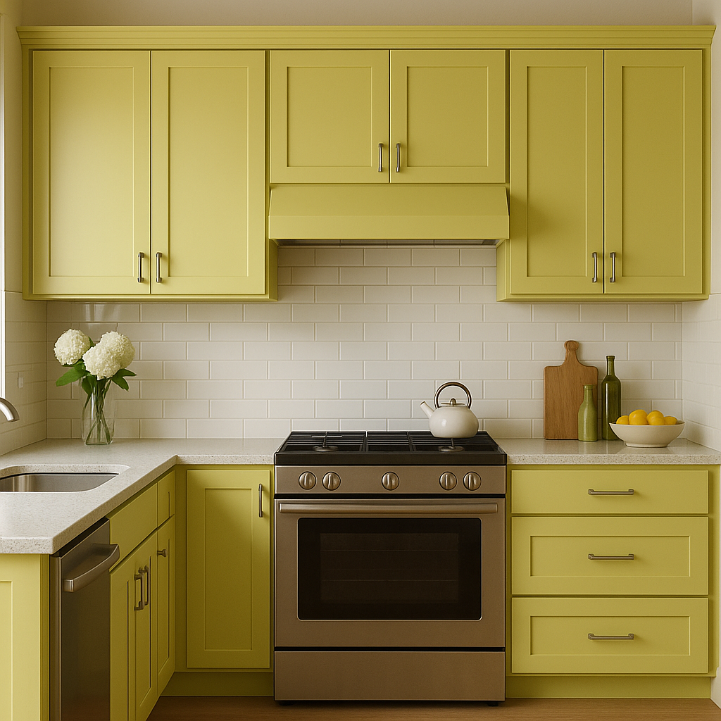
Chamomile is a perfect choice for kitchens and dining rooms, as its sunny undertones evoke feelings of comfort and cheer. Consider pairing it with white cabinetry, brass hardware, and natural wood finishes for a timeless yet modern aesthetic. For a bit more drama, add navy or charcoal accents in the form of upholstery or decor.
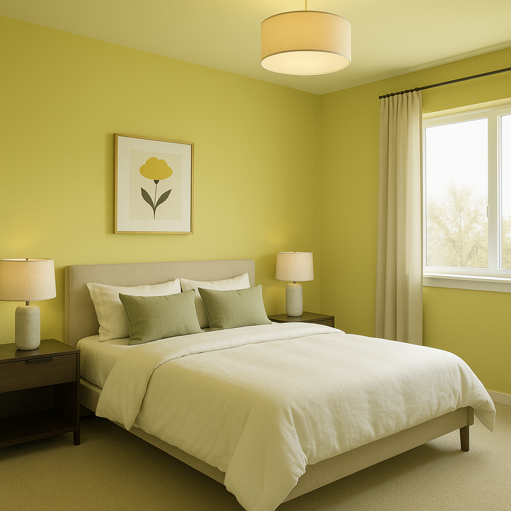
In bedrooms, Chamomile creates a cozy and restful retreat. Pair it with soft, neutral bedding and curtains in shades of ivory or gray for a tranquil vibe. Layer textures like knitted throws and linen pillows to enhance the warmth and depth of the space.
Chamomile can be used to add warmth to bathrooms without being too bold. Pair it with crisp white tiles and gold or brushed brass fixtures for a fresh yet inviting look. Adding artwork or accessories with botanical prints can further enhance the relaxing ambiance.
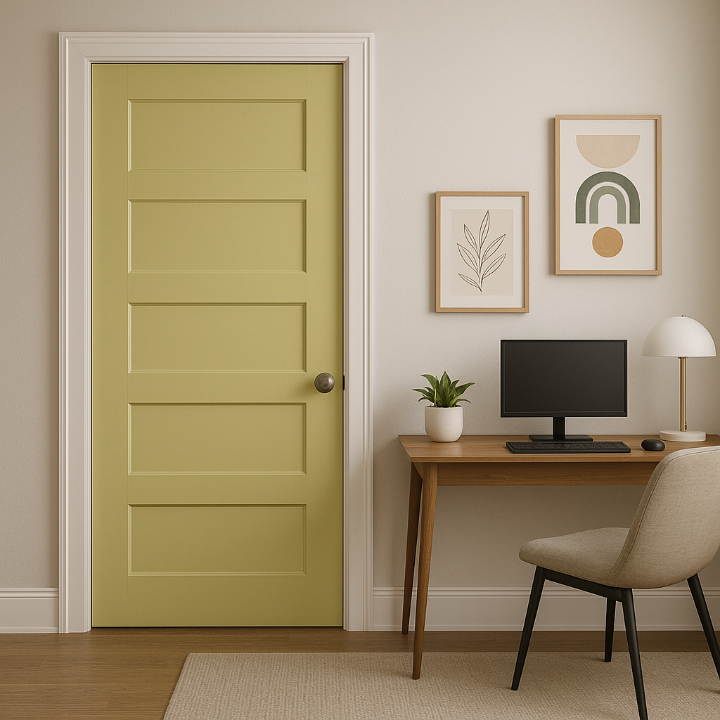
Chamomile works beautifully in entryways or hallways, where its soft tones make a welcoming first impression. Pair it with rich wood finishes and light neutral trim for a polished, classic appearance.
Benjamin Moore Chamomile (397) stands out as a warm yet versatile color that can effortlessly enhance the beauty of your home. Its subtle golden undertones make it easy to coordinate with a range of palettes, while its understated elegance ensures it remains timeless for years to come. Whether you’re designing a cozy retreat, a cheerful gathering space, or a serene sanctuary, Chamomile is a perfect choice to infuse warmth and sophistication into your interior design.
View Colors Only by Brand (No Imagery):
Sherwin-Williams
|
Benjamin-Moore
|
Behr
|
Valspar
Live on the Eastern Slope of Colorado and looking for a local painting professional, check out all our painting services and reach out for a free estimate.
Copyright © 2026 : Wild Fox Painting Inc. : 12435 Mead Way, Littleton, CO 80125


