Benjamin Moore Jonesboro (241) is a captivating color that effortlessly bridges the gap between sophistication and serenity. This versatile shade, part of Benjamin Moore's esteemed Classic Colors collection, is a subdued blue-green with a nuanced personality. Its ability to complement a range of design styles makes it a favorite among interior designers and homeowners alike.
Jonesboro (241) features a balanced mix of blue and green that leans slightly toward the cooler side of the spectrum. Its undertones are soft and muted, making it feel timeless and understated rather than bold or overpowering. The green undertones have a gentle earthy quality, while the blue brings a sense of calm and tranquility. These characteristics make Jonesboro a versatile choice for spaces that need a touch of color without overwhelming the overall design.
This shade avoids the overly saturated look of brighter teal or turquoise colors, settling instead into a quiet elegance. Depending on the lighting, Jonesboro can appear more green or more blue, allowing it to adapt beautifully to both natural and artificial light sources.
Benjamin Moore Jonesboro (241) pairs beautifully with a variety of complementary and contrasting colors, making it an excellent choice for creating layered and cohesive designs. Here are some suggestions for coordinating colors:
Neutral Pairings:
Soft Complementary Colors:
Darker Contrasts:
Warm Accents:
These combinations provide endless opportunities to customize your space, whether you're aiming for a modern aesthetic or a more traditional design.
Jonesboro (241) is a highly adaptable color that works well in almost any room of the house. Its calming yet sophisticated presence makes it ideal for the following applications:
Create a serene living space by using Jonesboro on the walls and complementing it with neutral upholstery and natural wood finishes. Add throw pillows and artwork in coordinating hues like soft gray or sage green for a cohesive look.
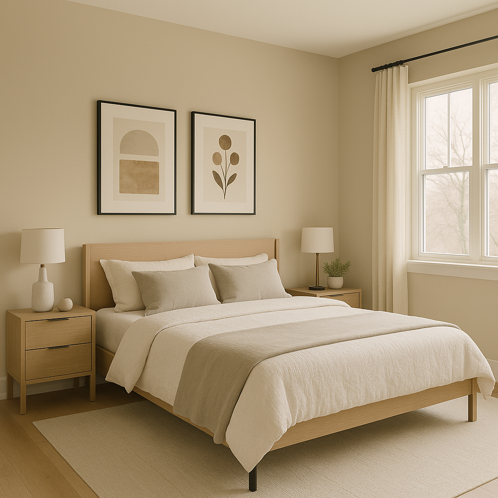
Jonesboro’s tranquil qualities make it perfect for bedrooms. Pair it with crisp white bedding and accents in muted blues or greens for a restful retreat. Consider using it on an accent wall to add depth without overwhelming the room.
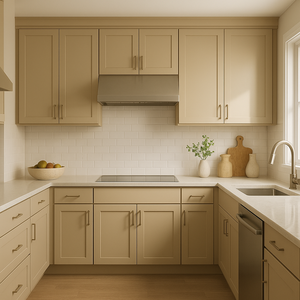
For a fresh and modern kitchen, use Jonesboro on cabinetry or as a wall color paired with white subway tiles and brushed nickel hardware. Its soothing tones create a welcoming atmosphere that’s perfect for entertaining.
Jonesboro’s cool undertones work beautifully in bathrooms, especially when paired with white and soft gray tiles. It evokes a spa-like feel, ideal for creating a refreshing and calming sanctuary.
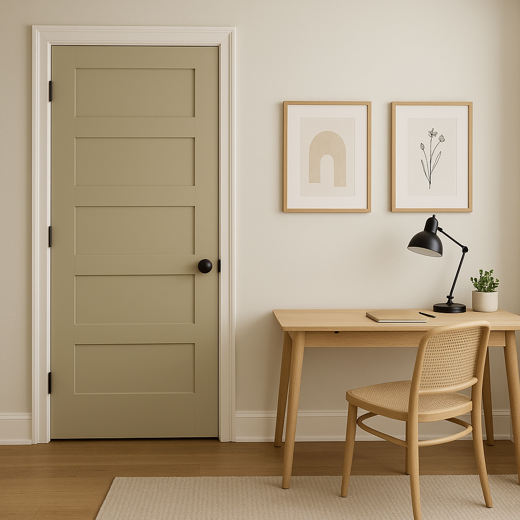
In a home office, Jonesboro fosters focus and creativity. Pair it with warm wood furniture and neutral accents for a balanced environment that encourages productivity.
Jonesboro also shines as an exterior color, bringing a touch of classic charm to homes. Pair it with white trim for a crisp, clean look, or deepen its richness with dark shutters in navy or charcoal gray.
Benjamin Moore Jonesboro (241) is a timeless choice that can adapt to a variety of design styles, from coastal to rustic to contemporary. Its muted blue-green tones evoke a sense of calm, making it ideal for spaces where relaxation or focus is key. Whether used as a standout wall color, a subtle backdrop, or an accent hue, Jonesboro brings an understated elegance that transforms any space into a haven of sophistication.
With its versatile nature and wide array of coordinating colors, Benjamin Moore Jonesboro (241) is more than just a paint color—it's an opportunity to elevate your home’s design and create spaces that feel both stylish and inviting.
View Colors Only by Brand (No Imagery):
Sherwin-Williams
|
Benjamin-Moore
|
Behr
|
Valspar
Live on the Eastern Slope of Colorado and looking for a local painting professional, check out all our painting services and reach out for a free estimate.
Copyright © 2026 : Wild Fox Painting Inc. : 12435 Mead Way, Littleton, CO 80125


