Benjamin Moore Winter (232) is a soft, understated gray that exudes elegance and versatility. Its muted tone makes it a perfect choice for creating a serene and sophisticated ambiance in both modern and traditional spaces. Winter’s delicate balance between warm and cool undertones allows it to adapt seamlessly to various environments, offering a timeless neutral that feels approachable yet polished.
Winter (232) has subtle blue undertones that lend it a cool, tranquil quality. These undertones prevent the gray from feeling flat or overly stark, giving it a refined softness that works beautifully in a wide range of lighting conditions. While its blue hints are understated, they become more pronounced in north-facing rooms or spaces with cooler natural light, creating a calm and airy atmosphere. In warmer lighting or south-facing rooms, Winter’s gray base takes center stage, offering a slightly cozier feel without losing its crispness.
Benjamin Moore Winter (232) pairs harmoniously with a variety of colors, making it a versatile choice for both monochromatic schemes and dynamic contrasts. Here are some coordinating color suggestions:
Whites and Off-Whites: Pair Winter with Benjamin Moore White Dove (OC-17) or Chantilly Lace (OC-65) for a clean, fresh look that highlights its soft gray tones. These whites provide subtle contrast while maintaining an overall neutral palette.
Deep Charcoal and Blacks: For a bold, modern feel, pair Winter with darker shades like Benjamin Moore Iron Mountain (2134-30) or Black Beauty (2128-10). These dramatic accents create depth and sophistication in any space.
Earthy Neutrals: Complement Winter’s tranquil gray with warmer neutrals like Benjamin Moore Edgecomb Gray (HC-173) or Revere Pewter (HC-172) for a balanced, harmonious aesthetic.
Soft Blues and Greens: Enhance Winter’s cool undertones by pairing it with Benjamin Moore Palladian Blue (HC-144) or Gray Cashmere (2138-60). These serene hues create a cohesive, calming palette perfect for bedrooms or bathrooms.
Accent Colors: For a pop of color, consider pairing Winter with deep jewel tones like Benjamin Moore Hale Navy (HC-154) or rich burgundy shades. These accents inject personality while maintaining a sophisticated vibe.
Winter’s adaptable nature makes it suitable for a wide array of applications, from walls to accents and even cabinetry. Here are some ideas for incorporating this versatile gray into your home:
Living Rooms: Use Winter (232) to create a calming foundation in living spaces. Pair it with plush furnishings in soft neutrals and metallic accents for an upscale yet inviting atmosphere.
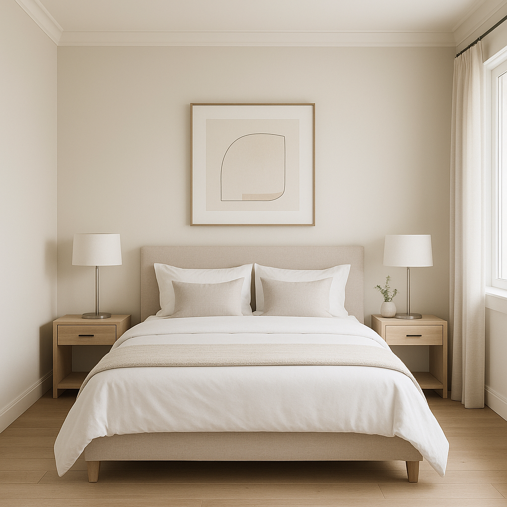
Bedrooms: Winter’s soothing undertones make it a perfect choice for bedrooms, promoting relaxation and tranquility. Pair it with crisp white bedding and pale blue accessories to enhance its tranquil vibe.
Bathrooms: Transform bathrooms into spa-like retreats with Winter on the walls. Complement it with white tiles, polished chrome fixtures, and ocean-inspired accents for a fresh, serene look.
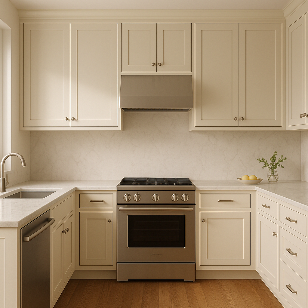
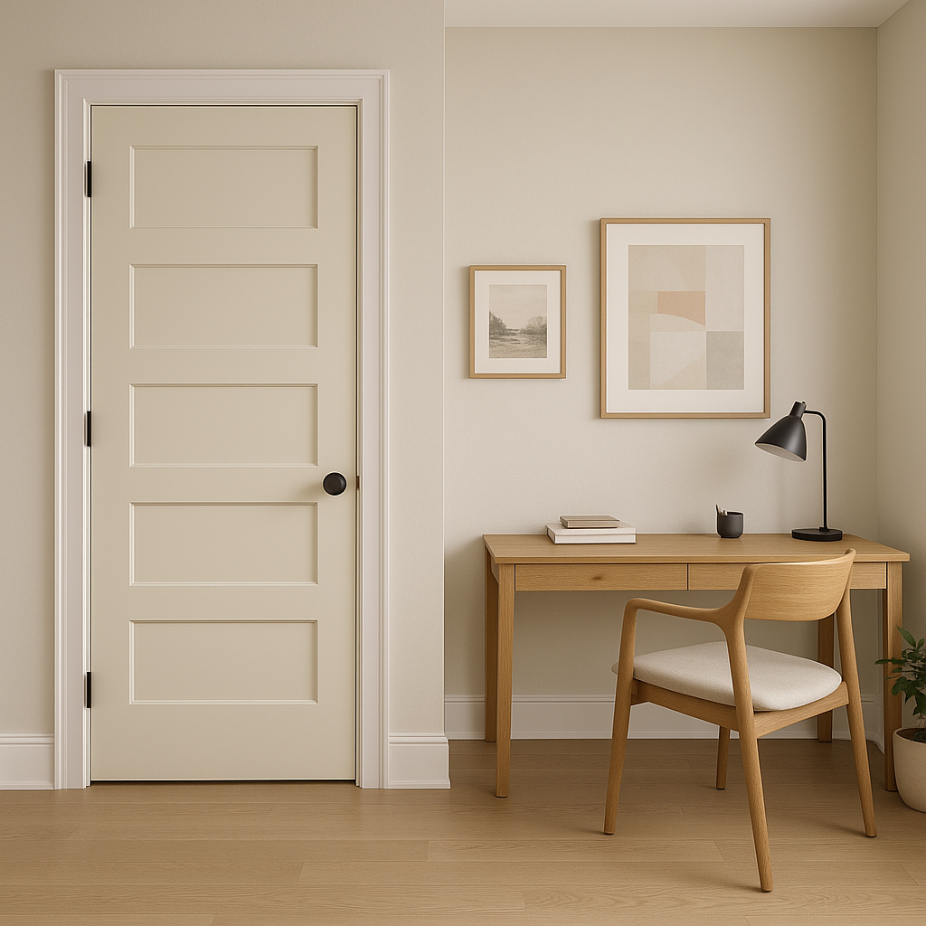
Home Offices: Winter’s understated elegance fosters focus and creativity, making it ideal for a productive workspace. Pair it with deep navy or charcoal accents for a refined and professional aesthetic.
Open Floor Plans: Winter’s neutral quality allows it to serve as a unifying color in open-concept spaces. Its subtle cool undertones add depth without overpowering the architecture or furnishings.
Accent Walls and Trim: Use Winter as a sophisticated accent color on a feature wall or as trim alongside lighter neutral walls. Its muted tone provides a striking yet subtle contrast.
Benjamin Moore Winter (232) is the epitome of versatility and understated elegance. Its ability to shift between warm and cool tones depending on lighting and pair beautifully with a wide range of colors makes it an ideal choice for homeowners and designers alike. Whether you’re looking to create a tranquil retreat or a polished, contemporary space, Winter (232) offers the perfect balance of sophistication and adaptability.
View Colors Only by Brand (No Imagery):
Sherwin-Williams
|
Benjamin-Moore
|
Behr
|
Valspar
Live on the Eastern Slope of Colorado and looking for a local painting professional, check out all our painting services and reach out for a free estimate.
Copyright © 2026 : Wild Fox Painting Inc. : 12435 Mead Way, Littleton, CO 80125


