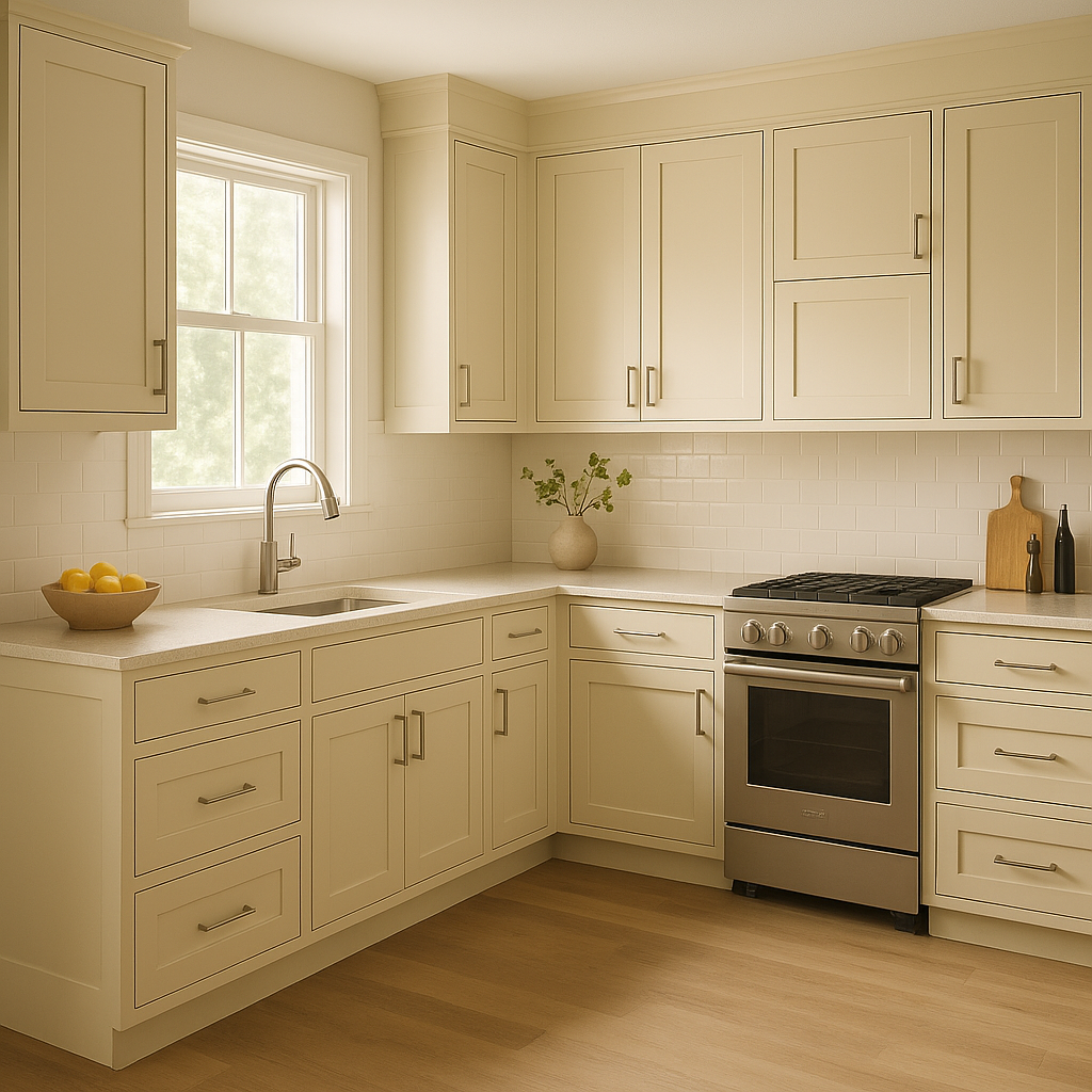
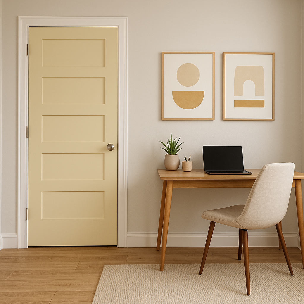
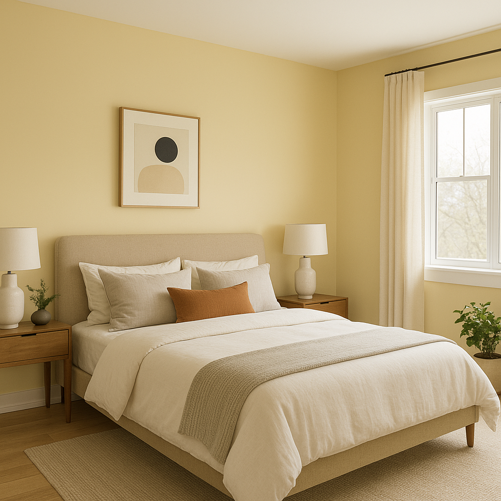
Benjamin Moore Hampton (2150-50) is a rich, sophisticated tan that offers a timeless warmth to any space. This mid-range neutral captures the essence of understated elegance, making it a popular choice for designers seeking a refined, yet approachable color. Its balance of earthy tones and subtle richness ensures it can adapt beautifully to various design styles, from classic traditional to modern contemporary. Whether you're revamping a living room, creating a cozy bedroom retreat, or refreshing a workspace, Hampton offers a versatile canvas that complements a wide range of interiors.
Hampton (2150-50) is characterized by its warm undertones, which lean toward a soft caramel or light beige. While it appears as a true tan in many lighting conditions, its undertones can shift slightly depending on the surrounding elements and the amount of natural or artificial light in the space. In brighter settings, Hampton takes on a lighter, airy quality, while in dimmer or moodier spaces, its deeper, earthy warmth becomes more pronounced. This dynamic nature allows Hampton to feel cozy and inviting without overwhelming the senses.
To achieve a cohesive and polished look, Hampton pairs beautifully with a variety of complementary colors. Here are some suggestions to inspire your palette:
Whites and Off-Whites: Pair Hampton with crisp whites like Benjamin Moore Chantilly Lace (OC-65) or softer, creamier options like White Dove (OC-17) for a clean and classic aesthetic. These combinations enhance Hampton’s warmth and create a balanced contrast.
Rich Browns and Chocolates: Deep colors like Benjamin Moore Mink (2112-10) or Kendall Charcoal (HC-166) amplify Hampton’s earthy undertones, bringing depth and richness to a design.
Muted Greens: Sage tones such as Benjamin Moore Saybrook Sage (HC-114) or October Mist (1495) create a serene, organic pairing that complements Hampton’s natural warmth. This combination is ideal for spaces inspired by nature or those aiming for a calming effect.
Dusty Blues and Grays: For a more modern or coastal-inspired vibe, pair Hampton with muted blues like Benjamin Moore Boothbay Gray (HC-165) or a smoky gray like Smoke (2122-40). These cooler tones provide a striking contrast while maintaining balance.
Hampton’s versatility makes it suitable for a variety of applications and design scenarios. Below are some ideas for integrating this timeless tan into your interiors:
Living Rooms and Family Rooms: Hampton creates a welcoming environment for communal spaces. Its warm undertones make it an excellent backdrop for layered textures, natural wood furniture, and cozy textiles.
Bedrooms: As a soothing, grounding color, Hampton is perfect for bedrooms. Pair it with soft linens and warm lighting to craft a peaceful retreat that encourages relaxation.
Dining Areas: Hampton works beautifully in dining rooms, where its earthy richness fosters a sense of intimacy and warmth. Accents like dark wood furniture or metallic finishes can elevate the overall look.
Home Offices: For a professional yet inviting workspace, Hampton provides a neutral backdrop that encourages focus while maintaining a sense of comfort.
Hallways and Entryways: Hampton enhances transitional spaces like hallways or foyers, offering a polished look that connects rooms effortlessly.
Exteriors: Hampton is also a fantastic option for exterior applications, such as siding or trim. Its balanced tones complement natural landscapes and architectural details, making it a standout choice for curb appeal.
As with any paint color, lighting plays a critical role in how Hampton appears in your space. It tends to feel brighter and more neutral in rooms with ample natural light, while artificial lighting or shadows can deepen its tan and caramel-like qualities. To ensure Hampton works seamlessly in your home, test it with paint swatches in different lighting conditions and times of day.
Benjamin Moore Hampton (2150-50) is more than just a neutral; it’s a versatile and enduring choice that brings warmth, elegance, and a sense of grounded sophistication to any environment. Whether used as a primary wall color or as part of a curated palette, Hampton is sure to elevate your design with its timeless charm.
View Colors Only by Brand (No Imagery):
Sherwin-Williams
|
Benjamin-Moore
|
Behr
|
Valspar
Live on the Eastern Slope of Colorado and looking for a local painting professional, check out all our painting services and reach out for a free estimate.
Copyright © 2026 : Wild Fox Painting Inc. : 12435 Mead Way, Littleton, CO 80125


