Benjamin Moore Classic (2109-10) is a rich, sophisticated deep neutral that exudes warmth and elegance. Perfectly straddling the line between brown and gray, this color offers a timeless appeal that works effortlessly in a variety of interior spaces. Its velvety depth makes it a versatile choice for creating a cozy atmosphere or adding a grounding element to a room’s design. Whether you’re designing a modern space or a traditional one, Classic delivers understated drama with its luxurious tone.
One of the most intriguing aspects of Classic is its nuanced undertones. This shade features subtle cool gray undertones that prevent it from feeling overly warm or muddy, while hints of brown lend it a grounding earthiness. These undertones make it adaptable to both cooler and warmer palettes, ensuring it harmonizes beautifully with a wide range of colors and textures. In certain lighting conditions, you may notice a faint taupe-like quality, which adds depth and character to the hue.
Benjamin Moore Classic pairs seamlessly with a curated selection of coordinating colors, allowing you to customize the mood of your space. Here are some suggestions for complementary shades:
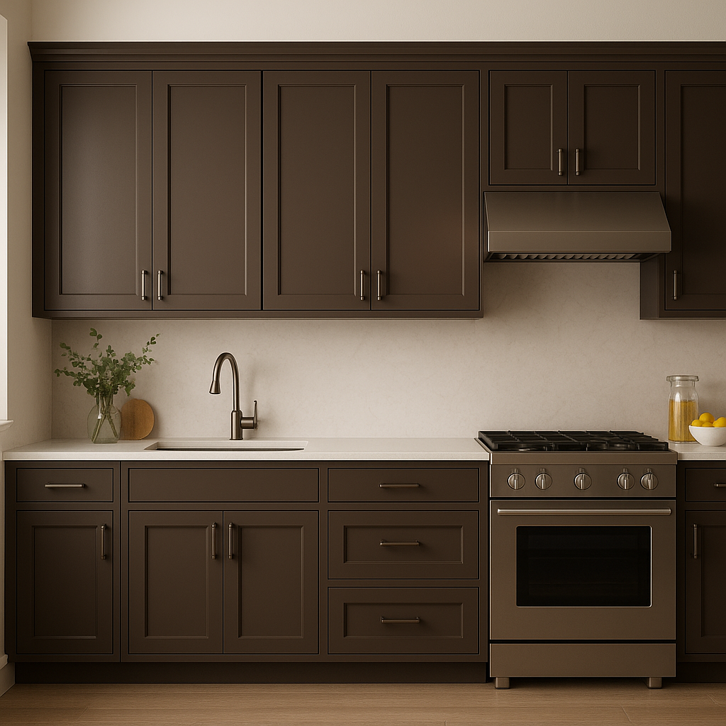
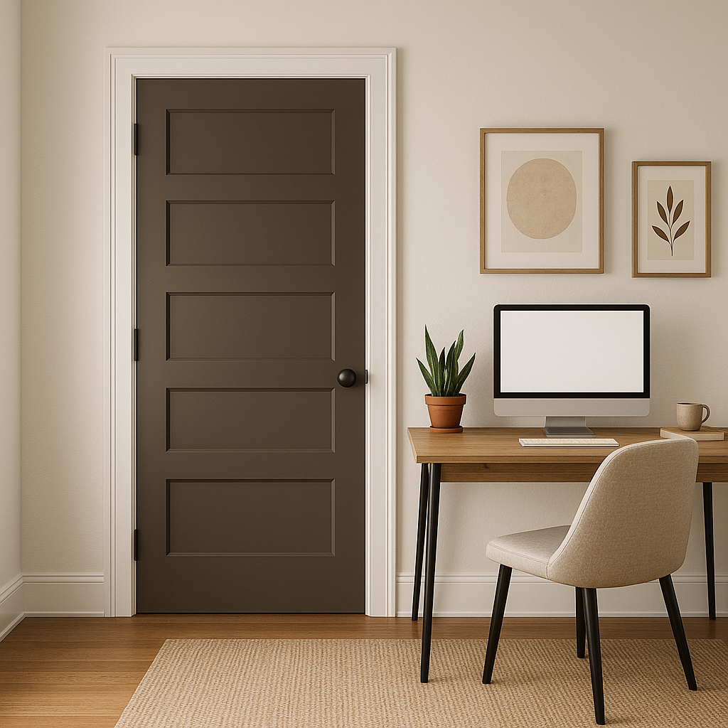
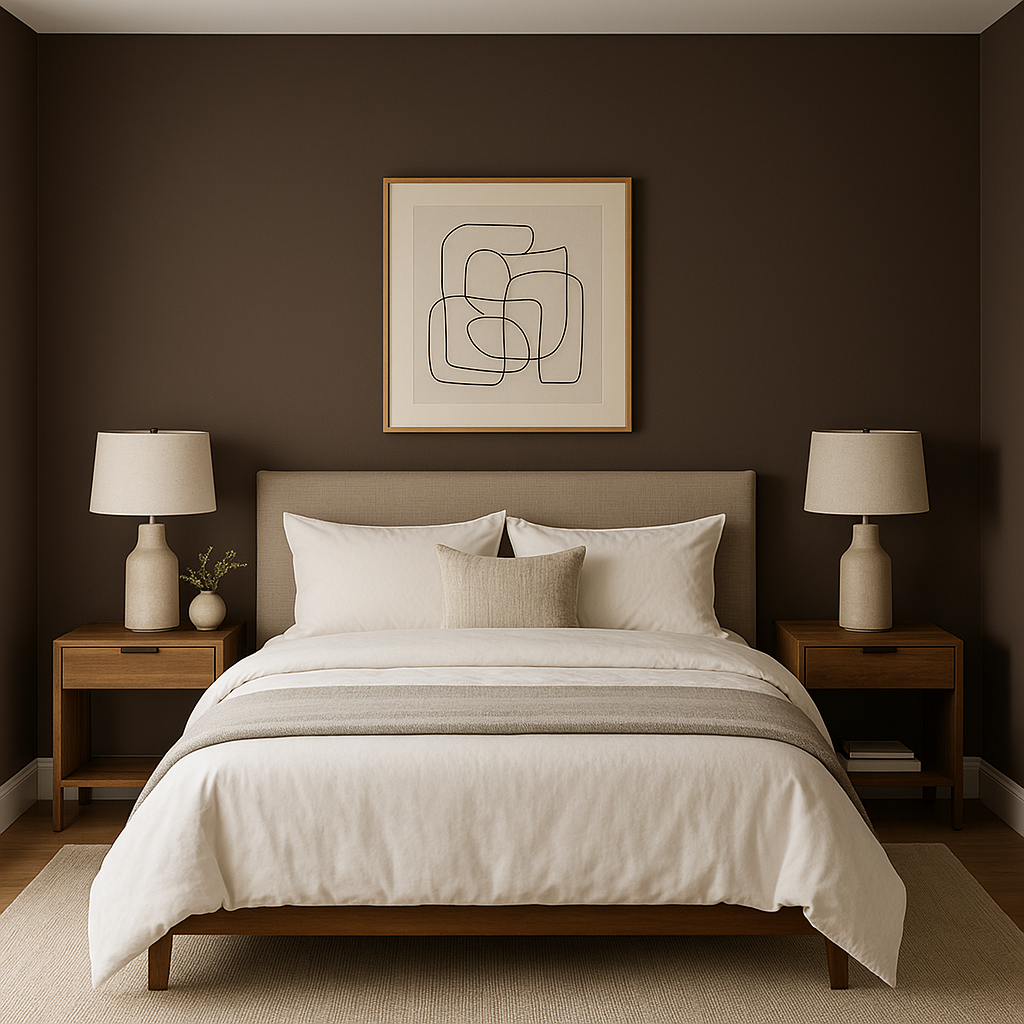
Benjamin Moore Classic is a versatile shade that lends itself to a vast array of applications throughout the home. Its depth and neutrality create visual interest without overwhelming the space. Here are some ways to use this color effectively:
As with any paint color, lighting plays a significant role in how Benjamin Moore Classic (2109-10) appears in your space. In rooms with ample natural light, its gray undertones come forward, giving it a cooler appearance. In spaces with warm artificial lighting, the brown undertones become more pronounced, lending it a cozier, warmer feel. Testing Classic in your space under different lighting conditions is essential to fully appreciate its subtle shifts in tone.
Benjamin Moore Classic (2109-10) is the epitome of timeless elegance. Whether you use it as a main wall color, an accent hue, or a sophisticated finish for furniture, this deep neutral brings depth, warmth, and character to your interior design. Its adaptability and nuanced undertones ensure it remains a favorite for homeowners and designers alike.
View Colors Only by Brand (No Imagery):
Sherwin-Williams
|
Benjamin-Moore
|
Behr
|
Valspar
Live on the Eastern Slope of Colorado and looking for a local painting professional, check out all our painting services and reach out for a free estimate.
Copyright © 2026 : Wild Fox Painting Inc. : 12435 Mead Way, Littleton, CO 80125


