Benjamin Moore Butternut (2095-30) is a rich, golden brown that exudes warmth, depth, and sophistication. This striking hue is perfect for creating spaces that feel inviting and grounded while offering a bold, statement-making aesthetic. Whether you’re designing a cozy living room, a dramatic dining area, or adding flair to an accent wall, Butternut brings a sense of timeless charm and earthy elegance.
Butternut is a complex shade with warm undertones of amber and subtle hints of orange. These undertones contribute to its vibrant yet grounded personality, making it a versatile choice for a variety of interior styles. The golden undertones ensure the color remains warm and luminous, avoiding any muddy or overly dark appearance. This rich hue has the ability to shift slightly depending on lighting conditions, appearing more golden in natural light and more earthy in dimmer, artificial lighting.
Crafting a harmonious color palette with Butternut is effortless thanks to its versatile undertones. Here are some coordinating color suggestions:
Neutrals: Pair Butternut with soft, creamy whites like Benjamin Moore White Dove (OC-17) or Benjamin Moore Navajo White (OC-95) for a balanced and airy look. These lighter neutrals help tone down the intensity of Butternut while creating a sense of openness.
Earthy Greens: Complement the warmth of Butternut with muted greens such as Benjamin Moore Saybrook Sage (HC-114) or Benjamin Moore Gloucester Sage (HC-100). These natural tones enhance the earthy feel of the color and evoke a connection to nature.
Deep Charcoals and Browns: For a dramatic and sophisticated pairing, consider rich, dark hues like Benjamin Moore Kendall Charcoal (HC-166) or Benjamin Moore Mink (2112-10). These deeper tones amplify the color's warmth and create a bold, layered effect.
Rustic Reds and Oranges: Amplify the vibrancy of Butternut with complementary shades like Benjamin Moore Terra Cotta Tile (2090-30) or Benjamin Moore Rust (2166-20). This pairing works beautifully in bohemian or eclectic designs.
Accents of Gold or Brass: Metallic accents, especially gold or brass finishes, enhance the golden undertones of Butternut, adding a touch of glamour and visual interest.
Butternut is a versatile shade that can be used in a variety of ways to transform your space. Here are some ideas to inspire your design:
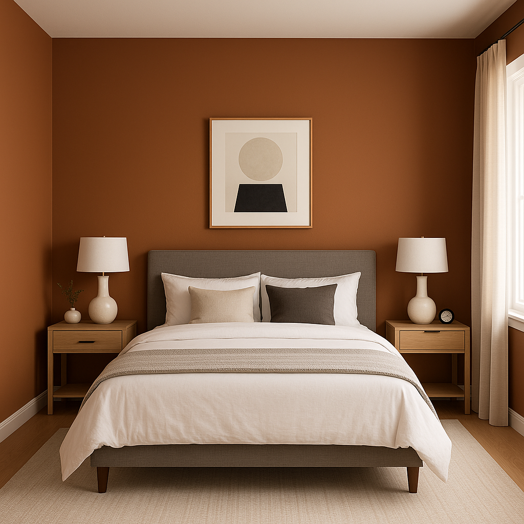
Butternut is a perfect choice for creating a feature wall. Whether in a living room, dining space, or bedroom, its bold yet warm nature draws the eye while anchoring the room’s design. Pair it with lighter colors or neutrals on surrounding walls for contrast and balance.
Infuse your living space with a sense of comfort and style by using Butternut on walls or in accent furniture. Its rich warmth creates a relaxing ambiance, especially when paired with plush textures like velvet or chunky knits.
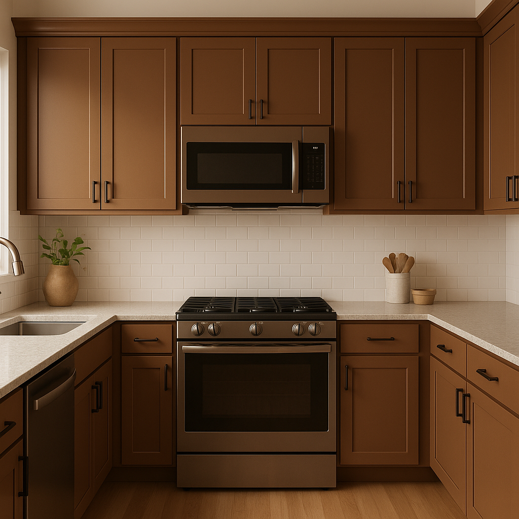
For a farmhouse or rustic-inspired kitchen, Butternut is an excellent choice for cabinetry, walls, or even a feature backsplash. It works beautifully with natural wood tones and brass hardware for a look that feels timeless yet unique.
If you’re looking to create a bedroom that feels cocoon-like and inviting, Butternut delivers. Pair it with soft cream bedding and natural wood furniture for a serene yet bold retreat.
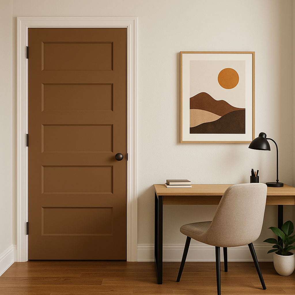
Its vibrant undertones make Butternut a great addition to eclectic or bohemian designs. Use it as an accent color on furniture, doors, or moldings to bring a burst of personality and charm.
Lighting plays a significant role in how Butternut appears in your space. In rooms with abundant natural light, the color’s golden undertones shine through, creating a lively and warm atmosphere. In spaces with dimmer or artificial lighting, it takes on a deeper, earthier tone that feels cozy and grounded. Be sure to test Butternut in your space under different lighting conditions to ensure it achieves the desired effect.
Benjamin Moore Butternut (2095-30) is a bold yet approachable color that balances vibrancy with warmth. Its golden undertones make it a versatile choice for a variety of design styles, from rustic and traditional to modern and eclectic. Whether used as the main color or as an accent, Butternut brings character and depth to any space, making it a standout option for those looking to add a touch of sophistication and warmth to their home.
View Colors Only by Brand (No Imagery):
Sherwin-Williams
|
Benjamin-Moore
|
Behr
|
Valspar
Live on the Eastern Slope of Colorado and looking for a local painting professional, check out all our painting services and reach out for a free estimate.
Copyright © 2026 : Wild Fox Painting Inc. : 12435 Mead Way, Littleton, CO 80125


