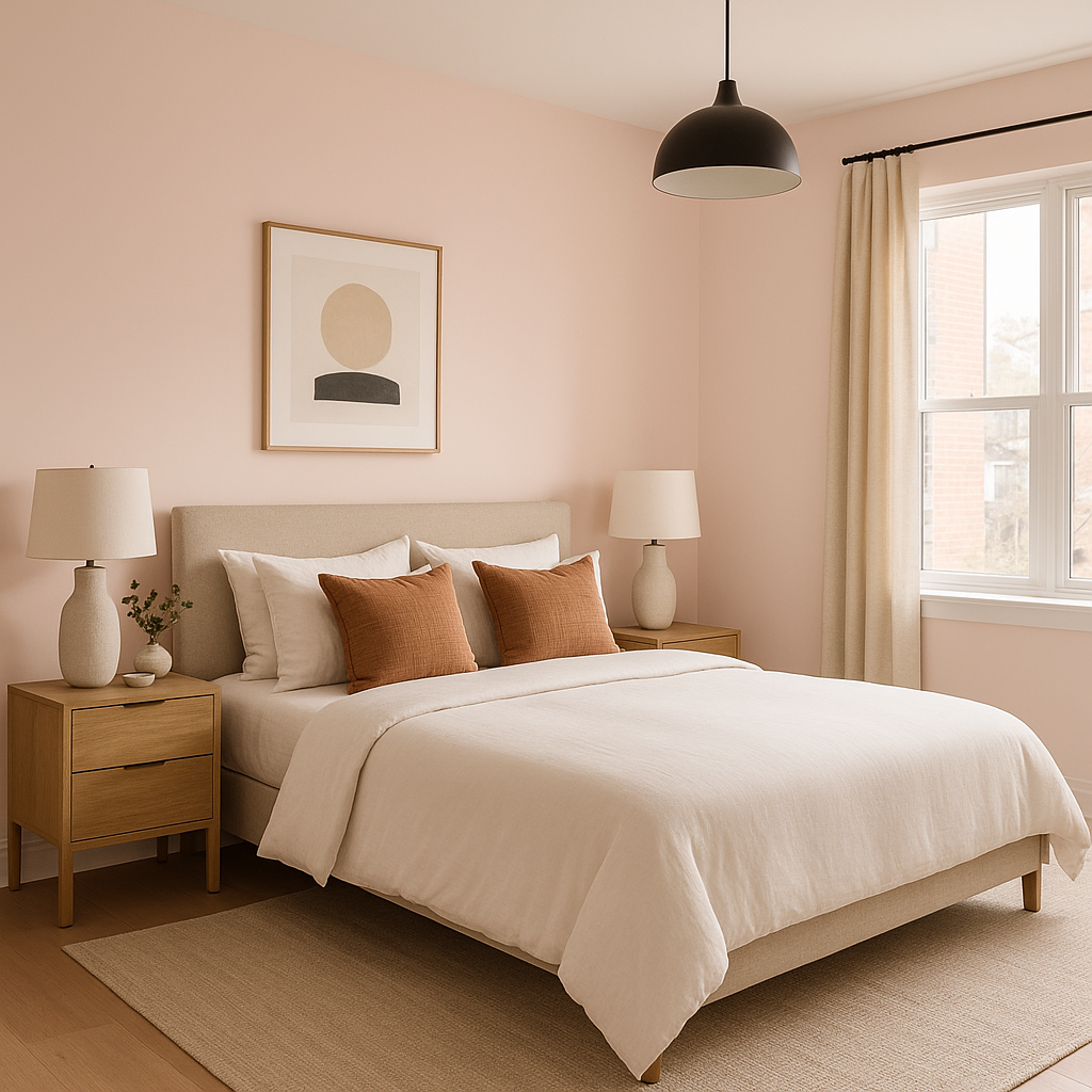
Benjamin Moore Pleasant (2094-60) is a soft, charming pink that radiates warmth and elegance. This versatile shade feels like a gentle embrace, effortlessly balancing sophistication and playfulness. Whether you're crafting a serene sanctuary or adding a touch of whimsy to your design, Pleasant is a color that can transform a space with its inviting aura.
Pleasant (2094-60) has subtle undertones of peach and blush, giving it a warm and slightly earthy quality. These undertones prevent the pink from feeling overly sweet or juvenile, making it a refined choice for both traditional and contemporary interiors. It offers just enough vibrancy to feel fresh, yet remains understated enough to create a calming atmosphere.
To bring out the best in Pleasant, consider pairing it with colors that harmonize or contrast beautifully with its warm, muted pink tone. Here are some recommendations:
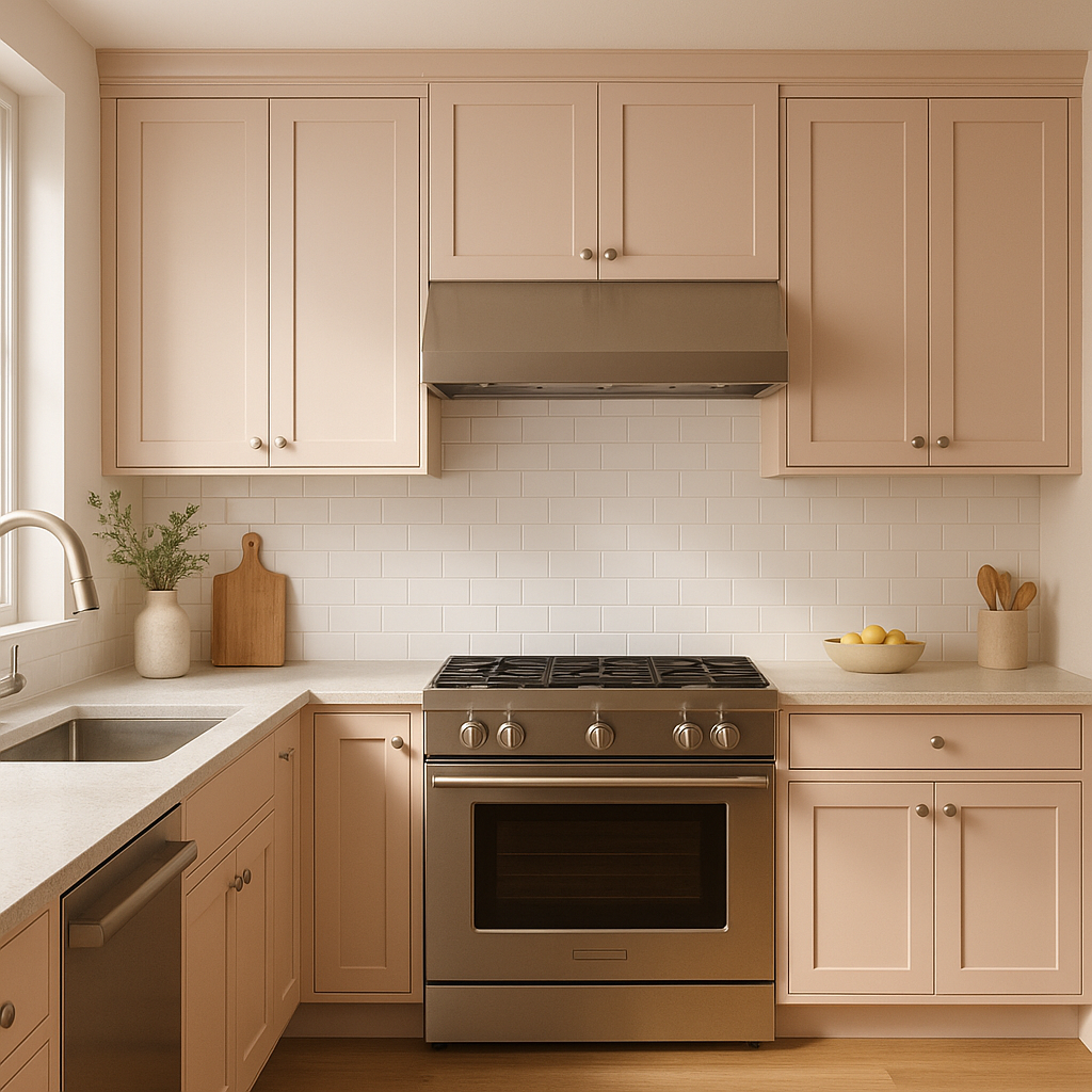
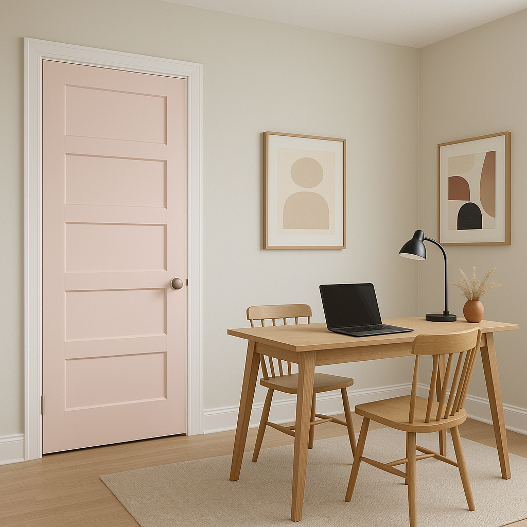
Pleasant (2094-60) is a versatile shade that works beautifully across a variety of spaces. Its delicate and inviting nature allows it to shine in different applications:
Benjamin Moore Pleasant evokes a feeling of warmth, cheer, and quiet sophistication. It’s a color that can bridge the gap between modern and classic styles, making it suitable for a wide range of design aesthetics. Whether used as the main event or as an accent, Pleasant (2094-60) brings a sense of harmony and comfort to any space.
By thoughtfully pairing it with complementary shades and using it strategically in your home, Pleasant can elevate your interior design while creating an atmosphere of refined tranquility.
View Colors Only by Brand (No Imagery):
Sherwin-Williams
|
Benjamin-Moore
|
Behr
|
Valspar
Live on the Eastern Slope of Colorado and looking for a local painting professional, check out all our painting services and reach out for a free estimate.
Copyright © 2026 : Wild Fox Painting Inc. : 12435 Mead Way, Littleton, CO 80125


