Benjamin Moore Burnt (2094-10) is a striking deep red-brown paint color that exudes richness, warmth, and sophistication. Perfect for creating dramatic, enveloping spaces, Burnt adds a sense of grounded elegance to any interior. Whether you're designing a cozy library, an intimate dining room, or a moody accent wall, this color commands attention while offering a timeless appeal.
Burnt (2094-10) is not your average dark red—it carries complex undertones of brown and subtle hints of terracotta. These warm, earthy undertones make it versatile and approachable while retaining its bold personality. The brown base softens the intensity of the red, ensuring the color feels luxurious rather than overwhelming. The result is a hue that evokes feelings of comfort and sophistication, reminiscent of leather-bound books or aged mahogany.
This depth of character allows Burnt to pair beautifully with both traditional and contemporary design styles. It can take on a rustic charm when paired with natural textures or lean modern when complemented by sleek metallics.
Benjamin Moore Burnt shines when paired with complementary or contrasting colors that enhance its richness. Below are some ideas for coordinating hues:
Neutral Pairings: For a balanced and harmonious look, pair Burnt with warm neutrals like Benjamin Moore Manchester Tan (HC-81) or White Dove (OC-17). These colors help lighten the mood and create a classic, understated palette.
Earthy Complements: Enhance the natural warmth of Burnt by incorporating earthy greens like Tate Olive (HC-112) or muted gold tones such as Showtime (244). These combinations work beautifully in traditional spaces or rustic-inspired interiors.
Dramatic Contrast: If you're looking to make a bold statement, pair Burnt with cool grays like Gray Owl (OC-52) or deep charcoals like Kendall Charcoal (HC-166). The contrast highlights Burnt’s richness, making it pop against cooler, more subdued shades.
Metallic Accents: For a touch of glamour, complement Burnt with metallic finishes like brushed gold, copper, or antique brass. These accents elevate the color’s warm undertones and add a sense of luxury.
Burnt is a versatile color with the ability to transform spaces into cozy retreats or bold, dramatic showcases. Here are some ways you can incorporate it into your home:
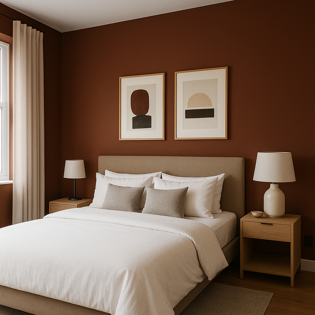
Accent Walls: Use Burnt as an accent color in living rooms, dining areas, or bedrooms to create a focal point. Pair it with lighter neutral walls to let it stand out without overwhelming the space.
Dining Rooms: This rich hue is perfect for dining rooms, where it sets a luxurious and intimate tone. Combine it with a chandelier and upholstered dining chairs to create an elegant atmosphere.
Libraries and Studies: Burnt lends itself beautifully to traditional libraries and studies. Pair it with dark wood furniture and leather accents for a classic, Old-World feel.
Cozier Spaces: Create a warm and inviting atmosphere in smaller areas such as powder rooms or reading nooks. The depth of Burnt makes these spaces feel intimate and enveloping.
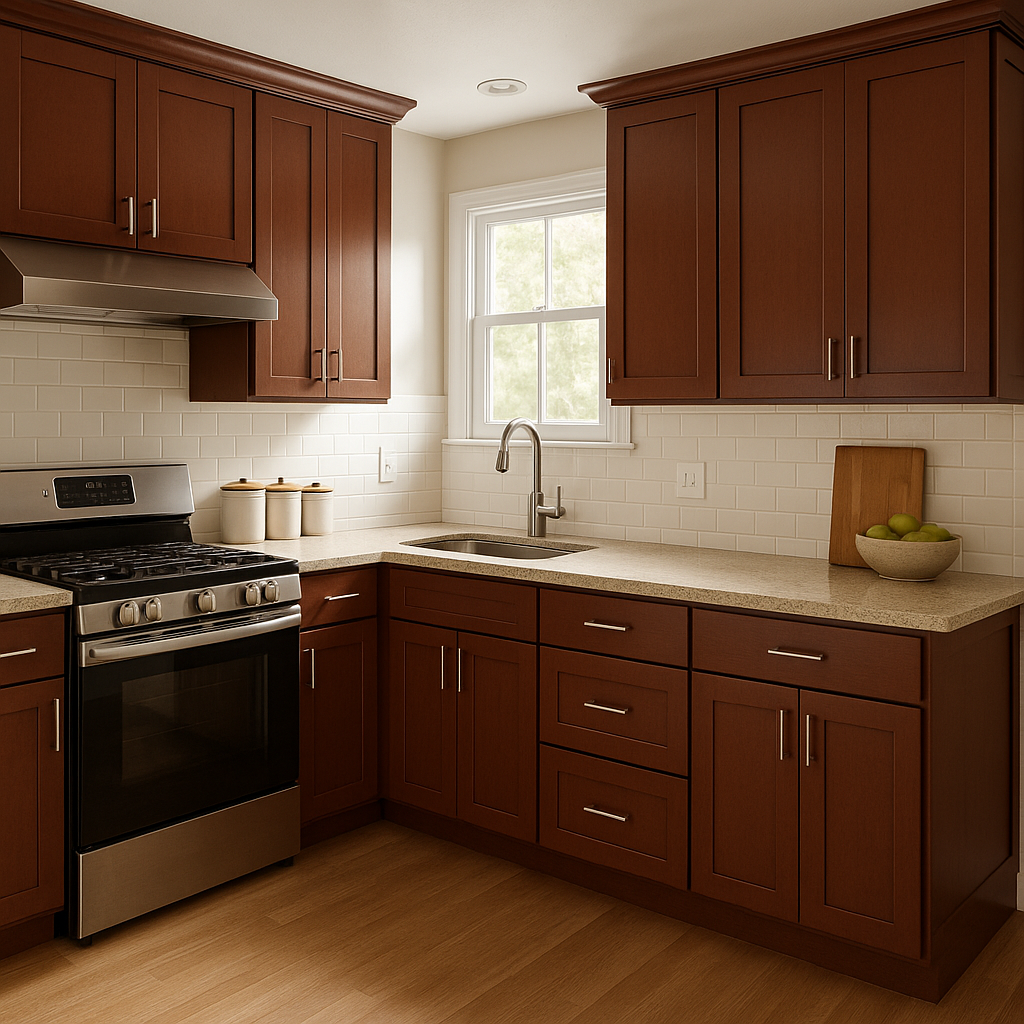
Kitchen Cabinetry: For those looking to step away from conventional cabinet colors, Burnt offers a rich option that pairs beautifully with marble countertops and brass hardware.
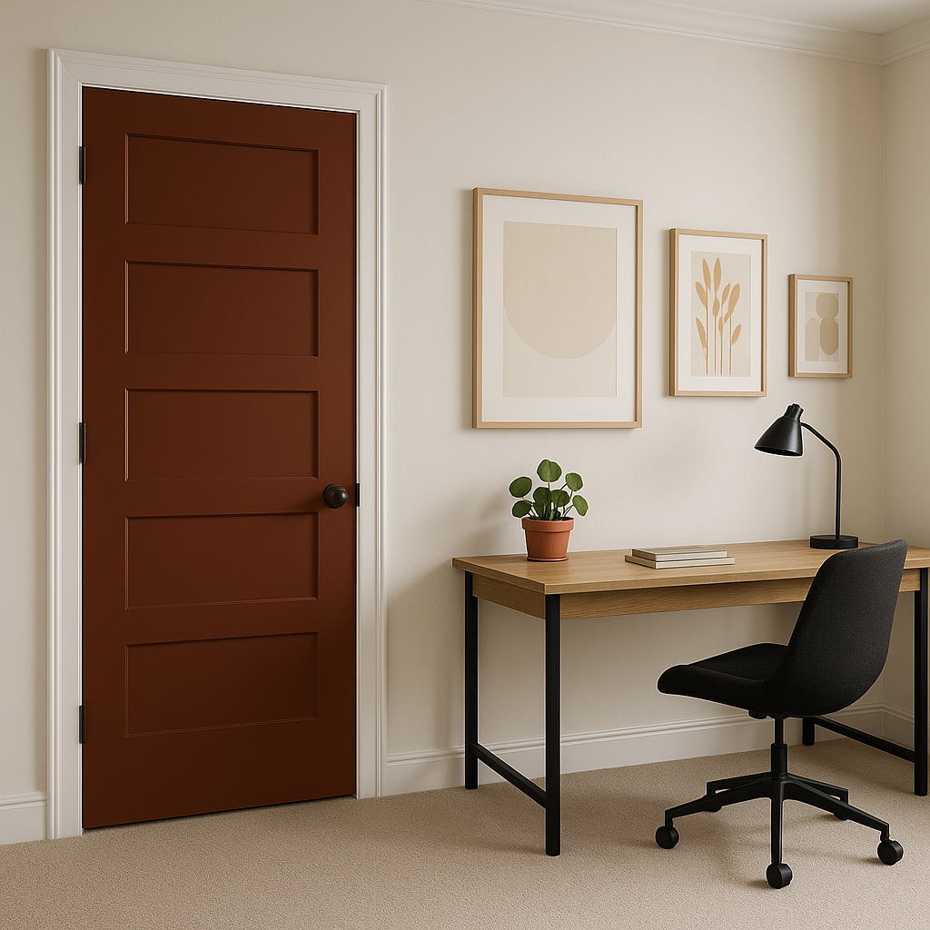
Exterior Applications: While primarily used indoors, Burnt can also be incorporated into exterior design for a bold front door or shutters, adding a sophisticated and welcoming touch to your home’s exterior.
When designing with Burnt, focus on balancing the depth of the color with lighter or more neutral tones to avoid creating a space that feels overly heavy. Incorporate textures such as linen, leather, or velvet to enhance the richness of the hue. Layering it with natural materials like wood or stone further emphasizes its earthy undertones, creating a cohesive and inviting look.
Benjamin Moore Burnt (2094-10) is a color that makes a statement while maintaining an air of refined elegance. Whether used sparingly or as a central design element, its versatility and timeless appeal make it a standout choice for those seeking a bold yet approachable hue.
View Colors Only by Brand (No Imagery):
Sherwin-Williams
|
Benjamin-Moore
|
Behr
|
Valspar
Live on the Eastern Slope of Colorado and looking for a local painting professional, check out all our painting services and reach out for a free estimate.
Copyright © 2026 : Wild Fox Painting Inc. : 12435 Mead Way, Littleton, CO 80125


