Benjamin Moore Pink (2093-70) is a delicate, soft blush tone that exudes a sense of understated charm and timeless elegance. As part of Benjamin Moore’s expansive palette, this hue is perfect for creating interiors that feel light, airy, and inviting. Its subtle yet impactful presence lends itself to a wide range of design applications, from serene bedrooms to cheerful nurseries, and even sophisticated living spaces.
Benjamin Moore Pink (2093-70) is a versatile pastel with warm undertones that lean slightly toward peach, making it feel warm and cozy rather than overtly cool or stark. This gentle warmth ensures the shade never feels overly sweet or saccharine, striking the perfect balance between playfulness and sophistication. The nuanced undertones make it adaptable to various lighting conditions, subtly shifting between a creamy blush in natural daylight and a soft, romantic pink under artificial light.
Pairing Benjamin Moore Pink (2093-70) with complementary hues can enhance its beauty while creating a harmonious color scheme. Here are some coordinating colors to consider:
Benjamin Moore Pink (2093-70) is a versatile color that can adapt to a variety of design styles and settings. Whether you're aiming for a romantic, feminine aesthetic or a modern, minimalist vibe, this hue delivers. Here are some of its most effective uses:
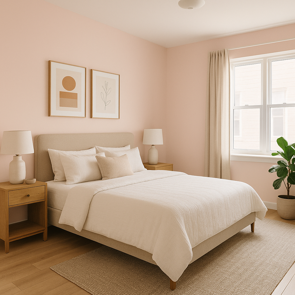
The soft and soothing nature of Benjamin Moore Pink makes it ideal for bedrooms, especially those designed to evoke a sense of tranquility and relaxation. Pair it with crisp white linens, plush textures, and natural wood furniture for a cozy yet chic retreat. In nurseries, its gentle warmth fosters a nurturing and cheerful environment, making it perfect for welcoming your little one.
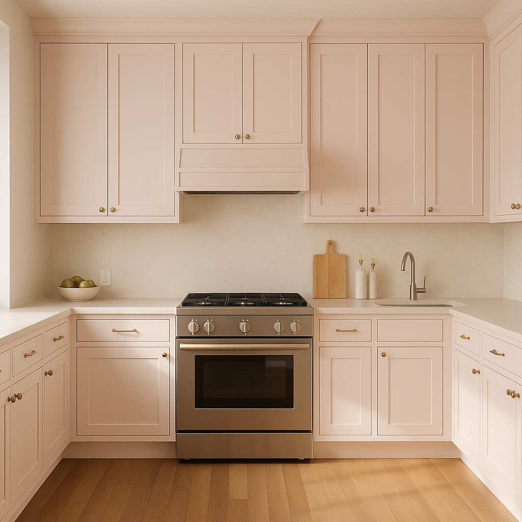
To infuse a living room with a subtle yet distinct charm, Benjamin Moore Pink can be used as an accent wall or as the primary wall color in smaller spaces. Pair it with mid-century modern furniture or vintage-inspired décor for a stylish twist.
Pink (2093-70) shines in powder rooms or bathrooms, where its blush tones can create a spa-like environment. Consider pairing it with subway tiles in white or gray and brass fixtures for a fresh and polished look.
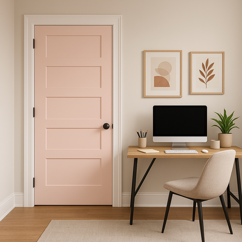
If you're hesitant about committing to an all-pink room, Benjamin Moore Pink works beautifully as an accent color. Use it on furniture pieces, cabinetry, or even as a backdrop in shelving units to add personality without overwhelming the space.
This blush hue is incredibly versatile, complementing a variety of design styles:
Benjamin Moore Pink (2093-70) is highly responsive to lighting, so consider the natural and artificial light sources in your space before committing to this color. In well-lit rooms with ample natural light, it appears airy and cheerful, while in dimmer spaces, its peachy undertones become more pronounced, creating a cozy and intimate effect.
Benjamin Moore Pink (2093-70) is a versatile, warm blush tone that effortlessly blends femininity with sophistication. Its gentle undertones make it adaptable to various lighting conditions and design styles, while its potential pairings with neutrals, grays, greens, and metallics ensure endless versatility. Whether used as a primary wall color, an accent shade, or a subtle touch in furnishings, this hue brings a timeless elegance to any space. Perfect for bedrooms, nurseries, living rooms, and bathrooms, Benjamin Moore Pink is a soft yet impactful choice for elevating interiors with warmth and charm.
View Colors Only by Brand (No Imagery):
Sherwin-Williams
|
Benjamin-Moore
|
Behr
|
Valspar
Live on the Eastern Slope of Colorado and looking for a local painting professional, check out all our painting services and reach out for a free estimate.
Copyright © 2026 : Wild Fox Painting Inc. : 12435 Mead Way, Littleton, CO 80125


