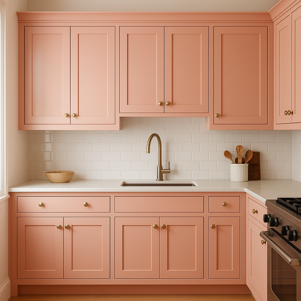
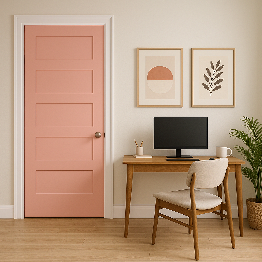
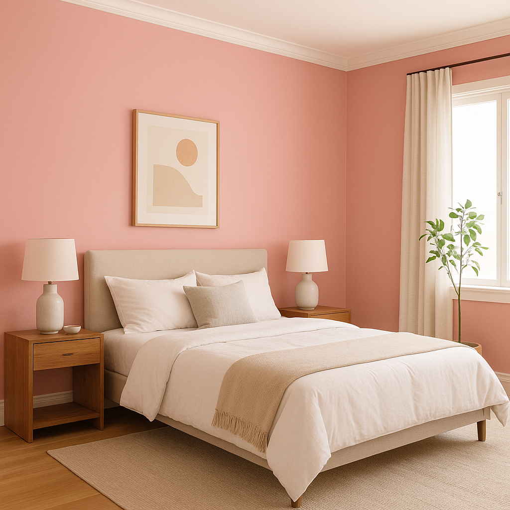
Benjamin Moore Strawberry (2090-60) is a cheerful and uplifting pink that brings a sense of charm and energy to any interior. This captivating hue is reminiscent of fresh strawberries ripened under the summer sun, making it a perfect choice for spaces that need a playful yet refined touch. Its medium intensity ensures it stands out, while its softness makes it versatile enough for a variety of design applications.
Strawberry (2090-60) has warm red undertones infused with a delicate hint of coral. These undertones give the color depth and a slightly earthy richness, preventing it from feeling overly saccharine or juvenile. The warmth of the color ensures it complements other shades seamlessly, while the subtle coral notes add a modern flair.
Benjamin Moore Strawberry pairs beautifully with a range of coordinating colors, allowing for both bold and subtle design schemes. Here are a few suggestions:
Benjamin Moore Strawberry (2090-60) is versatile enough to fit into a variety of design styles, from whimsical and eclectic to modern and sophisticated. Here are some ways to incorporate this delightful hue:
Strawberry (2090-60) works seamlessly across a variety of aesthetics:
Benjamin Moore Strawberry (2090-60) is a unique color that strikes a perfect balance between boldness and elegance. Its warm undertones, versatile coordinating options, and broad range of uses make it a standout choice for any interior design project. Whether you’re looking to energize a space or create a cozy retreat, Strawberry is sure to deliver sweetness and charm.
View Colors Only by Brand (No Imagery):
Sherwin-Williams
|
Benjamin-Moore
|
Behr
|
Valspar
Live on the Eastern Slope of Colorado and looking for a local painting professional, check out all our painting services and reach out for a free estimate.
Copyright © 2026 : Wild Fox Painting Inc. : 12435 Mead Way, Littleton, CO 80125


