Benjamin Moore Autumn (2087-40) is a rich, earthy red that exudes warmth, depth, and timeless sophistication. This color is reminiscent of the vibrant tones found in fall foliage, evoking a sense of comfort and coziness. Its unique balance between boldness and subtlety makes it a versatile choice for both residential and commercial spaces, adding a touch of elegance to any interior.
The undertones of Autumn lean towards a muted brown and terracotta base, which gives the color its distinct earthy character. While primarily a red hue, the soft brown undertones temper its intensity, creating a grounded and approachable feel. This combination of red and brown undertones makes Autumn a welcoming color that harmonizes beautifully with natural elements and other warm tones.
Benjamin Moore Autumn pairs effortlessly with a variety of complementary and contrasting colors, allowing for creative freedom in design. Some coordinating colors to consider:
Benjamin Moore Autumn is an ideal choice for spaces where warmth and character are desired. Its versatility allows it to shine in a variety of applications:
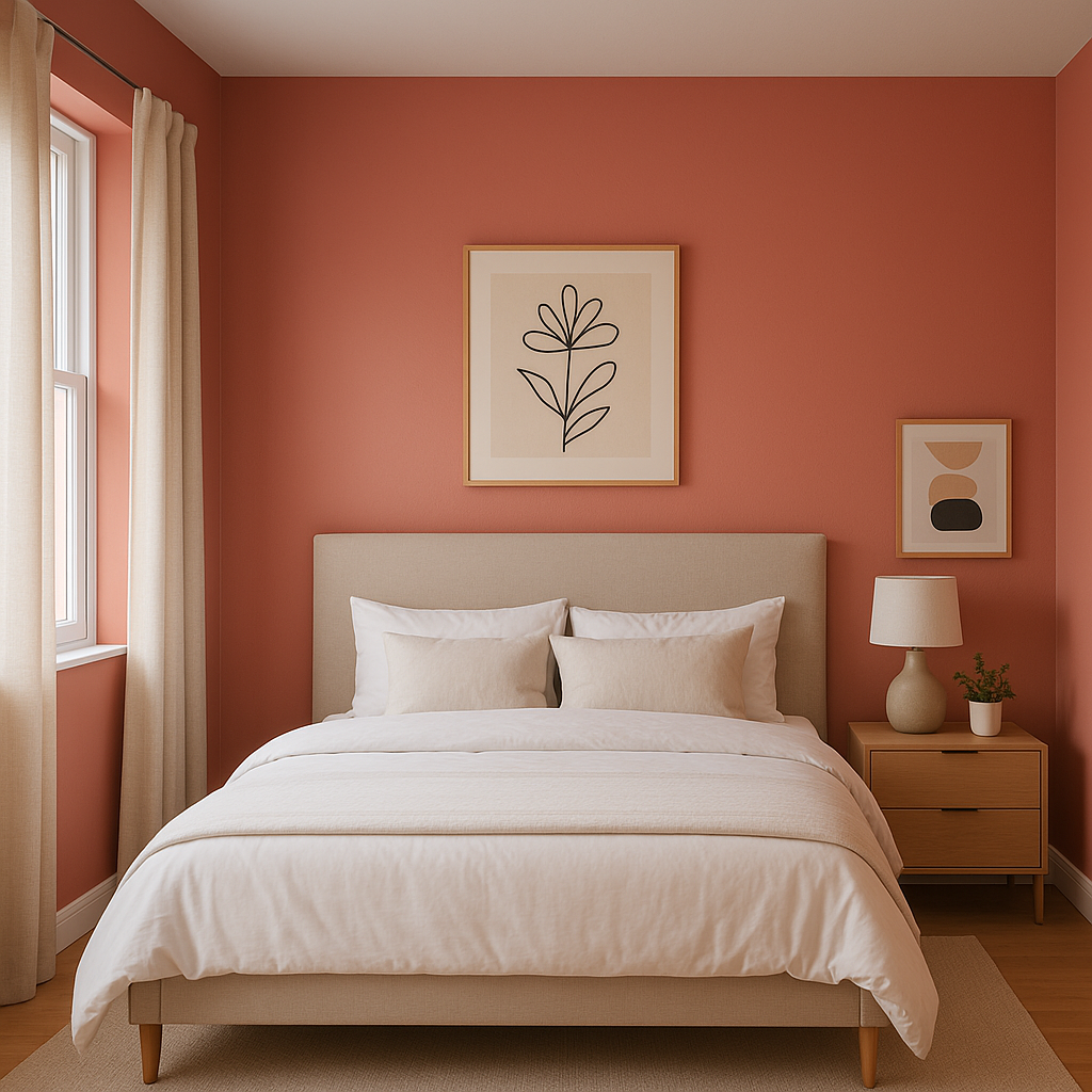
Autumn makes a stunning choice for an accent wall. Whether in a living room, bedroom, or dining area, its bold yet earthy tone draws the eye and creates a focal point without overwhelming the space. Pair it with lighter surrounding walls for a balanced and cohesive look.
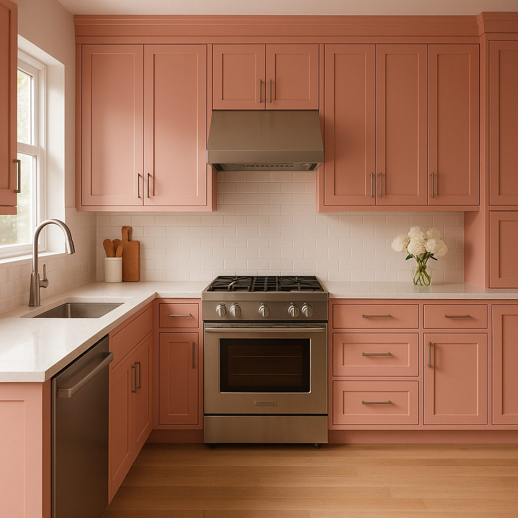
This warm red is perfect for kitchens and dining rooms, as it fosters a sense of intimacy and encourages conversation. Use Autumn on cabinetry or walls, and pair it with wooden furniture or countertops for a cozy, farmhouse-inspired vibe.
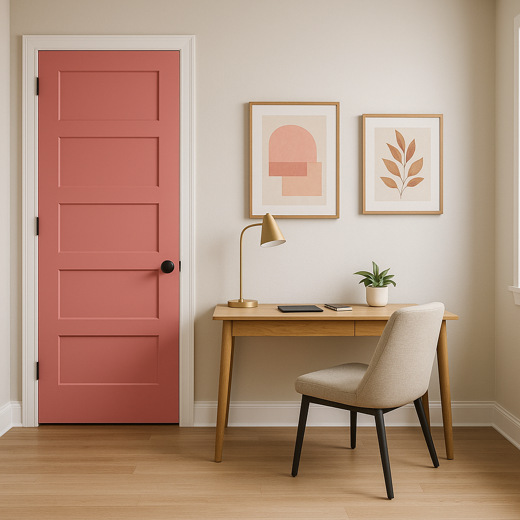
Transform your entryway or hallway with Autumn to create a welcoming atmosphere. Its rich, inviting hue sets the tone for the rest of your home, making guests feel immediately at ease.
Autumn works exceptionally well in rustic or traditional design schemes. Pair it with exposed wood beams, brick accents, or vintage furniture for a classic, timeless look.
In commercial settings such as restaurants, cafes, or boutique stores, Autumn adds a sense of sophistication and warmth that enhances the customer experience. Its earthy undertones create a memorable, inviting ambiance.
Benjamin Moore Autumn (2087-40) responds beautifully to different lighting conditions. In spaces with ample natural light, the color appears brighter and more vibrant, showcasing its red tones. In dim or artificial lighting, the brown undertones become more pronounced, lending a cozy and subdued feel. To ensure the desired effect, test Autumn in your space under varying lighting conditions.
Benjamin Moore Autumn is more than just a paint color—it's a statement of warmth, comfort, and timeless style. Whether used in small doses or as the primary hue in your design, it brings a sense of grounded elegance that feels fresh yet enduring. Perfect for those looking to infuse their interiors with a touch of seasonal charm or year-round coziness, Autumn is a hue that stands the test of time.
View Colors Only by Brand (No Imagery):
Sherwin-Williams
|
Benjamin-Moore
|
Behr
|
Valspar
Live on the Eastern Slope of Colorado and looking for a local painting professional, check out all our painting services and reach out for a free estimate.
Copyright © 2026 : Wild Fox Painting Inc. : 12435 Mead Way, Littleton, CO 80125


