Benjamin Moore Strawberry (2085-50) is an energetic and juicy shade of red that brings a lively, spirited charm to any space. Reminiscent of ripe, sun-kissed strawberries freshly picked from the vine, this color radiates warmth and confidence. Strawberry is a bold yet approachable hue, perfect for those who want to add a pop of personality and excitement to their home.
Strawberry (2085-50) leans on the warmer side of the red spectrum, featuring subtle pink undertones that lend the shade a playful softness. These undertones prevent the color from feeling overly intense or aggressive, making it versatile enough to use in a variety of settings. The pink hints also give the shade a touch of romance and charm, balancing its dynamic energy with a softer appeal.
Benjamin Moore Strawberry pairs beautifully with a variety of hues, offering flexibility in creating striking color schemes. Here are some coordinating shades to consider:
Strawberry is a versatile and statement-making color that works well in various applications throughout the home. Here are some creative ways to incorporate this vibrant shade into your interior design:
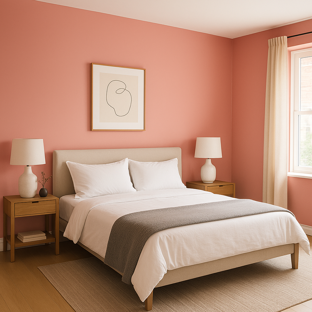
Strawberry is perfect for creating a bold accent wall in living rooms, dining rooms, or bedrooms. Its vibrant warmth immediately draws the eye and can act as a focal point in an otherwise neutral space. Pair it with light-colored trim for a crisp, polished finish.
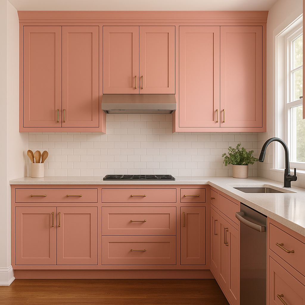
Bring energy and passion into your kitchen or dining room with Strawberry. Use it on cabinetry, a backsplash, or even as a wall color to evoke feelings of warmth and conviviality—perfect for spaces where people gather to share meals and conversation.
The playful undertones of Strawberry make it a fantastic choice for playrooms, craft rooms, or home offices. It inspires creativity and joy, helping to energize and uplift the atmosphere of the space.
If you’re not ready to commit to large areas of Strawberry, consider using it on furniture or accessories. A painted dresser, side table, or set of chairs in this shade can add an instant burst of color and personality to a room. Pair with coordinating textiles, such as throw pillows or curtains, to tie the look together.
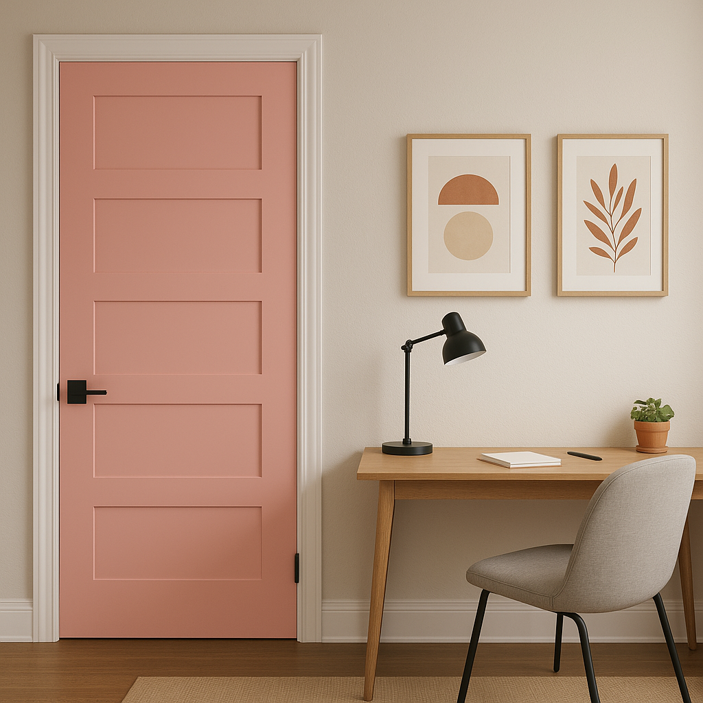
On the exterior, Strawberry makes a striking statement as a front door color. Its cheerful, inviting appearance is sure to boost curb appeal and create a warm welcome for guests. Pair it with neutral siding and white trim for a classic look, or combine it with darker hues for a more contemporary aesthetic.
Benjamin Moore Strawberry brings a sense of joy, vibrancy, and enthusiasm to any room. It’s a color that encourages optimism and creativity, making it ideal for spaces where energy and positivity are key. Whether used as an accent or as the main color, Strawberry has the power to transform a room into a lively and dynamic environment.
This hue is exceptionally versatile, complementing a wide variety of design styles, from eclectic bohemian to modern farmhouse. Its warm undertones and playful nature make it equally suited for family-friendly spaces and sophisticated, statement-making interiors.
Embrace the bold beauty of Benjamin Moore Strawberry (2085-50) in your next design project—it’s a shade that promises to invigorate and delight.
View Colors Only by Brand (No Imagery):
Sherwin-Williams
|
Benjamin-Moore
|
Behr
|
Valspar
Live on the Eastern Slope of Colorado and looking for a local painting professional, check out all our painting services and reach out for a free estimate.
Copyright © 2026 : Wild Fox Painting Inc. : 12435 Mead Way, Littleton, CO 80125


