Benjamin Moore Blackberry (2069-20) is a strikingly rich, deep purple that exudes elegance, mystery, and timeless sophistication. Perfect for creating bold, dramatic spaces, this saturated hue is ideal for homeowners and designers looking to make a statement. Whether used as an accent or a primary color, Blackberry transforms interiors with its unique blend of depth and vibrancy.
Blackberry is a complex shade with subtle undertones that add to its allure. Its base is a luxurious purple, but it carries hints of plum and black, lending it a velvety richness. These undertones make the color feel grounded and moody, giving it a sense of opulence while avoiding overly bright or juvenile purple tones. The black undertone ensures that the hue stays sophisticated and refined, making it a versatile choice for both modern and traditional spaces.
Pairing Blackberry with complementary shades can elevate its beauty and create balanced, harmonious designs. Here are a few coordinating colors to consider:
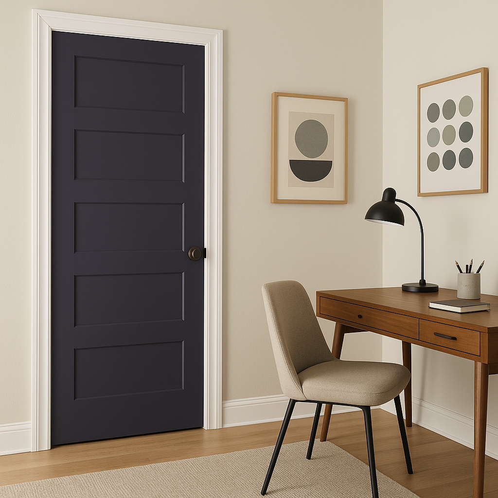
Blackberry is a bold color that works well in spaces where drama and sophistication are desired. Its versatility allows it to be used in a variety of applications:
If you’re looking to add a focal point to a room, Blackberry is an excellent choice for an accent wall. Use it in living rooms or bedrooms to create a cozy, intimate atmosphere while letting other lighter colors balance the space.
This rich purple is perfect for dining spaces, where its luxurious tone can enhance the ambiance and create a sense of refinement. Pair it with metallics like gold or brass for an elevated, glamorous look.
Small spaces, like powder rooms, are ideal for experimenting with bold colors like Blackberry. Its dramatic flair can make a small room feel like a jewel box, especially when paired with bright whites and reflective surfaces.
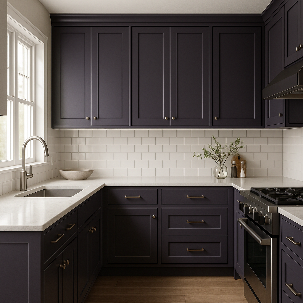
Blackberry can add a modern twist to cabinetry or furniture. Consider using it on kitchen islands, built-ins, or freestanding furniture pieces to make them stand out.
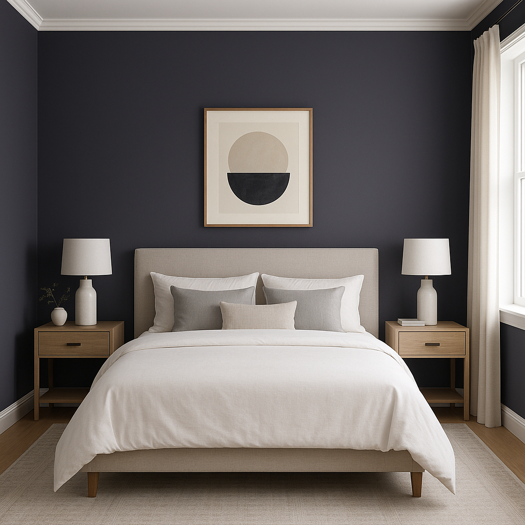
For a serene yet moody retreat, Blackberry works beautifully in bedrooms. Pair it with soft linens and lighter-colored furniture for a balanced look that feels luxurious yet inviting.
To ensure Blackberry achieves its full potential, consider its lighting and surrounding elements. In spaces with ample natural light, its undertones appear more vibrant, while in dimly lit areas, its darker, velvety side takes center stage. Pair it with finishes like wood, stone, or metal, depending on the desired aesthetic.
Benjamin Moore Blackberry (2069-20) is the ultimate choice for those seeking a color that combines drama, elegance, and versatility. Its rich undertones, coordinating color options, and wide range of uses make it a standout hue for both bold and understated interiors alike.
View Colors Only by Brand (No Imagery):
Sherwin-Williams
|
Benjamin-Moore
|
Behr
|
Valspar
Live on the Eastern Slope of Colorado and looking for a local painting professional, check out all our painting services and reach out for a free estimate.
Copyright © 2026 : Wild Fox Painting Inc. : 12435 Mead Way, Littleton, CO 80125


