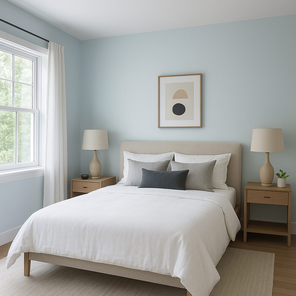
Benjamin Moore Harbor (2062-70) is a captivating soft blue-gray that evokes the tranquil essence of misty coastal mornings. This delicate shade captures a sense of calm and understated elegance, making it an excellent choice for homeowners and designers seeking to bring serenity and timeless sophistication into their spaces. Its versatility allows it to seamlessly complement a variety of interior styles, from coastal chic to modern minimalist and even transitional designs.
Harbor (2062-70) features cool undertones that lean toward blue with a whisper of gray. These undertones give the color its soft, muted quality, making it feel refined and soothing rather than overly vibrant or bold. The gray infusion tempers the blue, ensuring that Harbor remains versatile and avoids appearing too saturated or overwhelming in any room.
This perfect balance of blue and gray gives Harbor its ability to adapt to various lighting conditions, shifting slightly in tone depending on the time of day and the amount of natural or artificial light in the space. In bright daylight, Harbor may feel airier and more ethereal, while under dim lighting, it can take on a moodier and cozier appearance.
Benjamin Moore Harbor pairs beautifully with a wide range of coordinating colors, making it a versatile choice for any interior design palette. Here are a few suggestions to create a cohesive and stunning look:
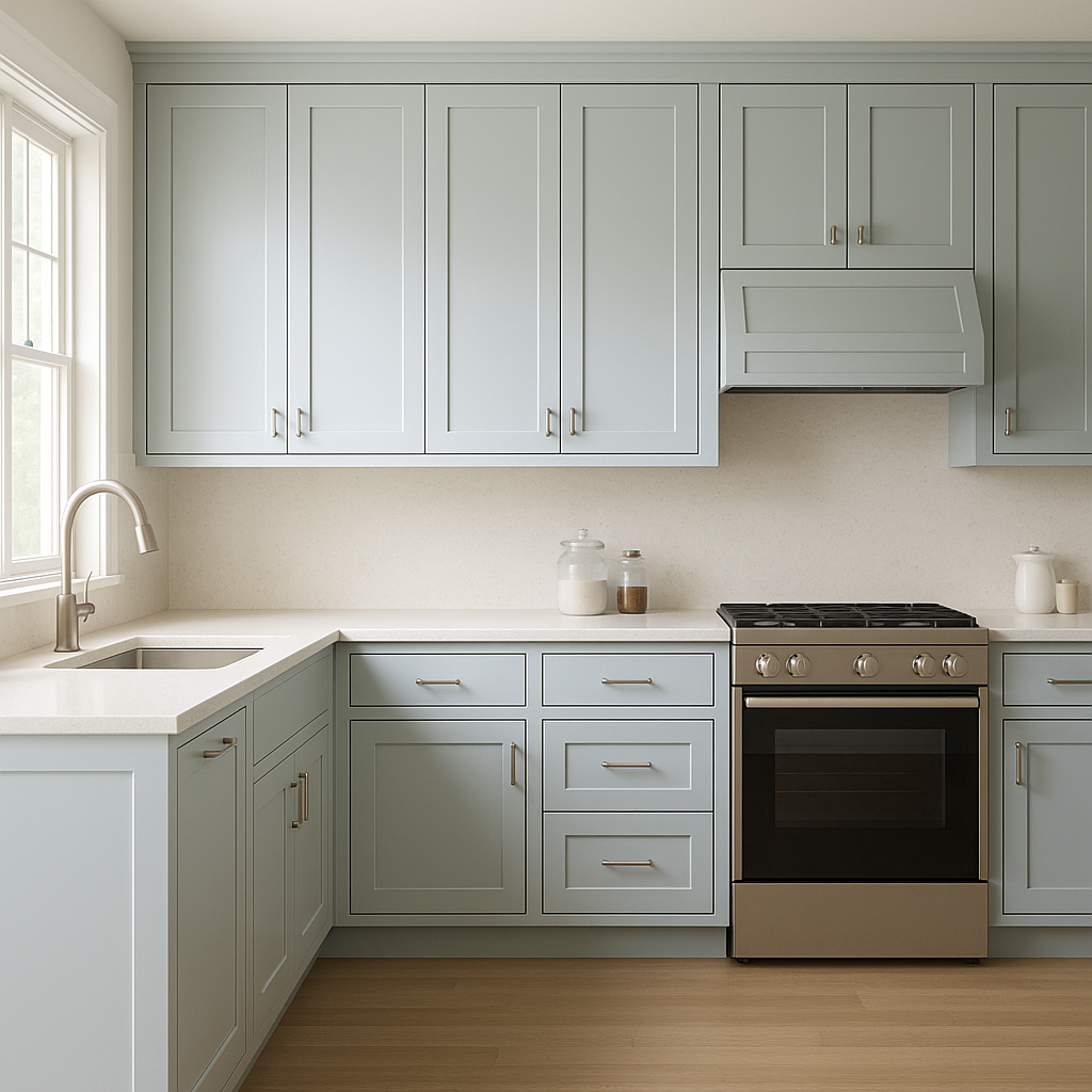
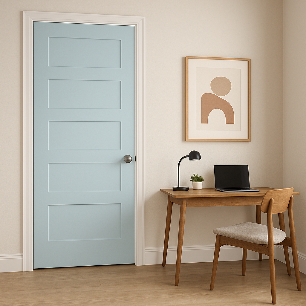
Harbor (2062-70) is an incredibly versatile color, making it suitable for a wide variety of applications throughout your home. Its understated elegance lends itself to both expansive and intimate spaces, creating a sense of calm and sophistication wherever it’s used.
Benjamin Moore Harbor (2062-70) is more than just a paint color—it’s a mood, a feeling, and a design statement. Its soft blue-gray tones evoke peace and tranquility, while its versatility ensures it can adapt to any style or space. Whether you’re designing a coastal escape, a modern sanctuary, or a transitional haven, Harbor brings a timeless touch of elegance to your home.
With its ability to complement a wide range of hues and its suitability for almost any room, Benjamin Moore Harbor is a go-to color for creating spaces that feel calm, sophisticated, and effortlessly stylish.
View Colors Only by Brand (No Imagery):
Sherwin-Williams
|
Benjamin-Moore
|
Behr
|
Valspar
Live on the Eastern Slope of Colorado and looking for a local painting professional, check out all our painting services and reach out for a free estimate.
Copyright © 2026 : Wild Fox Painting Inc. : 12435 Mead Way, Littleton, CO 80125


