Benjamin Moore Toronto (2060-40) is a striking and vibrant shade of blue that instantly commands attention. This bold hue is perfect for those who crave color that makes a statement while bringing energy and personality to any space. Its rich saturation leans toward the cooler side of the spectrum, offering a dynamic yet sophisticated tone that works beautifully in both modern and eclectic interiors.
Toronto (2060-40) features cool undertones that verge on electric, making it a true standout among other blues. Its icy depth gives it a contemporary edge, while the slight hint of violet undertone adds complexity and intrigue. These subtle undertones prevent the color from feeling flat or overly traditional, making it an excellent choice for spaces where vibrancy and refinement coexist.
When working with Benjamin Moore Toronto, you’ll want to pair it with complementary shades that enhance its boldness while grounding the overall design. Some coordinating options include:
These coordinating colors allow you to create versatile palettes, whether you're designing a minimalist space with pops of color or a layered, eclectic room with a mix of bold and neutral tones.
Benjamin Moore Toronto is a versatile shade that can be used in various ways, depending on your design goals:
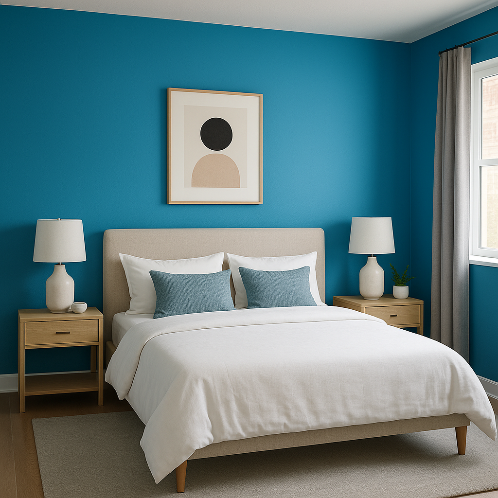
Toronto (2060-40) excels as an accent wall color. Its vibrancy draws the eye and creates a focal point, making it ideal for spaces like living rooms, bedrooms, or home offices. Pair it with neutral walls and decor to ensure it stands out without overwhelming the room.
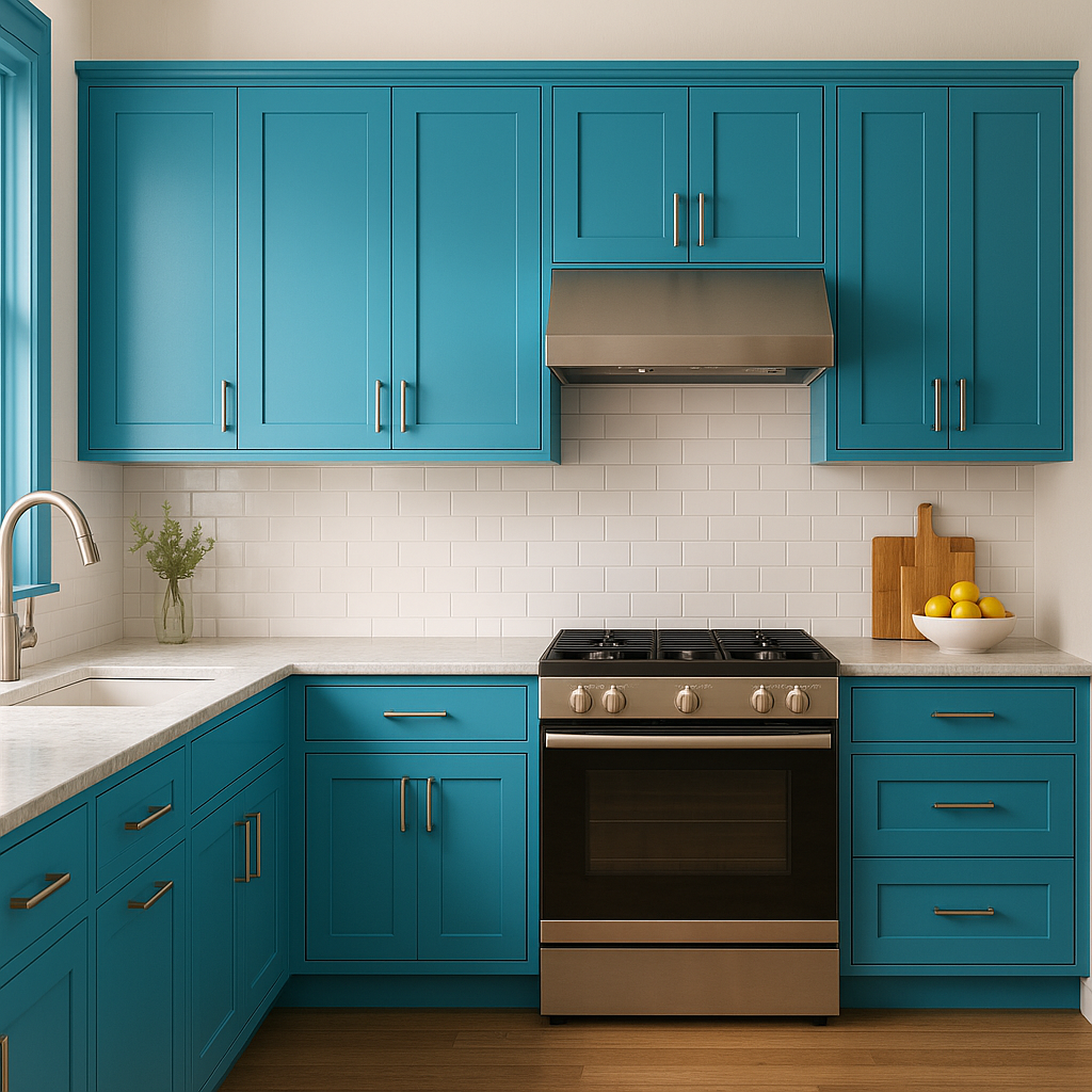
Bold blues like Toronto are trending in furniture and cabinetry design. Use it to revamp kitchen cabinets, bathroom vanities, or even a statement bookshelf to add a pop of color to traditionally understated areas.
This electrifying blue is perfect for creative spaces such as art studios, playrooms, or media rooms, where energy and inspiration are essential. Toronto encourages creativity and liveliness, making it an excellent choice for these environments.
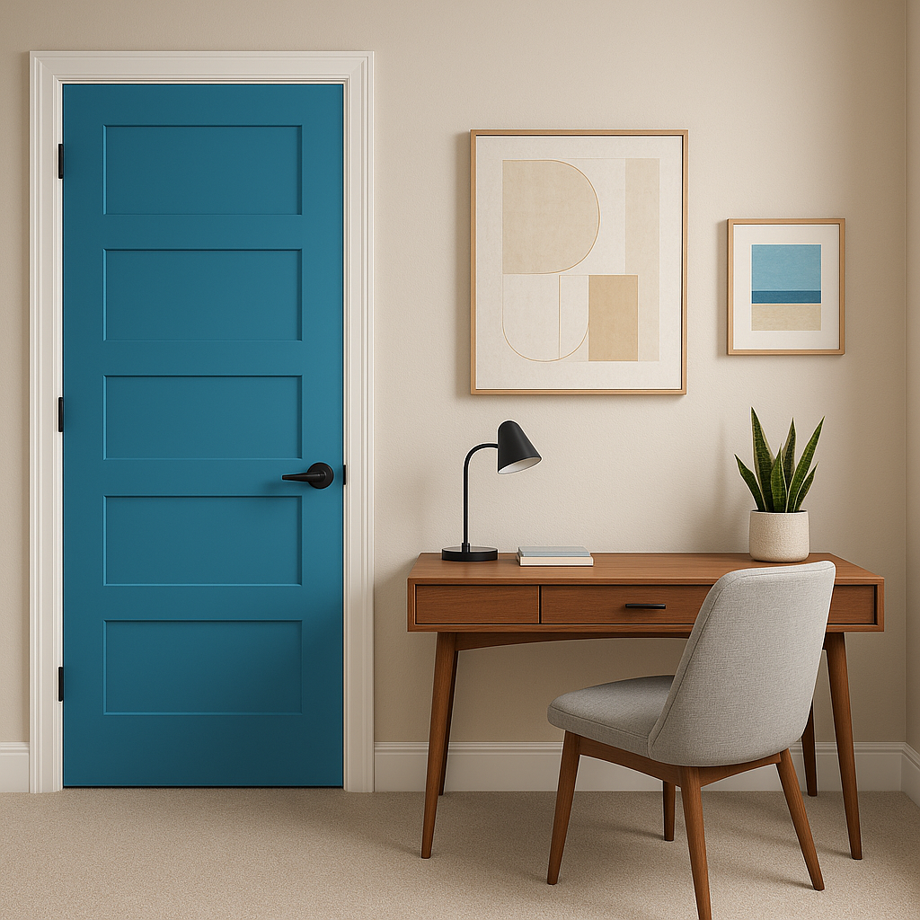
Toronto is not confined to interiors. It can be used to create a striking exterior accent, such as a front door or shutters, especially when paired with crisp whites or deep grays to frame its vibrancy beautifully.
When incorporating Toronto (2060-40) into your design, balance is key. Because this color is so bold, it pairs best with neutrals and muted tones to prevent the space from feeling overwhelming. Incorporate natural textures like wood or woven materials to soften the look and add warmth. Metallic accents, especially brushed nickel or silver, work beautifully to complement Toronto's cool undertones.
Benjamin Moore Toronto (2060-40) is a daring and energizing choice that brings life to any space. Whether you’re using it as a bold accent or the centerpiece of your design, its depth and vibrancy make it a memorable addition to your color palette.
View Colors Only by Brand (No Imagery):
Sherwin-Williams
|
Benjamin-Moore
|
Behr
|
Valspar
Live on the Eastern Slope of Colorado and looking for a local painting professional, check out all our painting services and reach out for a free estimate.
Copyright © 2026 : Wild Fox Painting Inc. : 12435 Mead Way, Littleton, CO 80125


