Benjamin Moore Tear (2053-60) is a delicate, light blue hue that captures the ethereal essence of a clear sky after a gentle rain. This soft, muted shade evokes a sense of tranquility, making it a perfect choice for spaces where calmness and serenity are desired. Tear is versatile and understated, allowing it to blend seamlessly into a variety of design styles, from coastal chic to modern minimalism.
Tear is a cool-toned color with soft gray undertones that give it a refined and sophisticated edge. The subtle infusion of gray prevents the blue from feeling overly bright or overpowering, making it a fantastic choice for rooms where a relaxed and airy atmosphere is preferred. These undertones also ensure that Tear pairs beautifully with both neutral and bolder color palettes, offering flexibility for creative interior design projects.
The versatility of Tear allows it to complement a wide range of coordinating shades, whether you're designing a monochromatic space or creating contrast with complementary tones.
Neutral Pairings:
Bold Accents:
Complementary Colors:
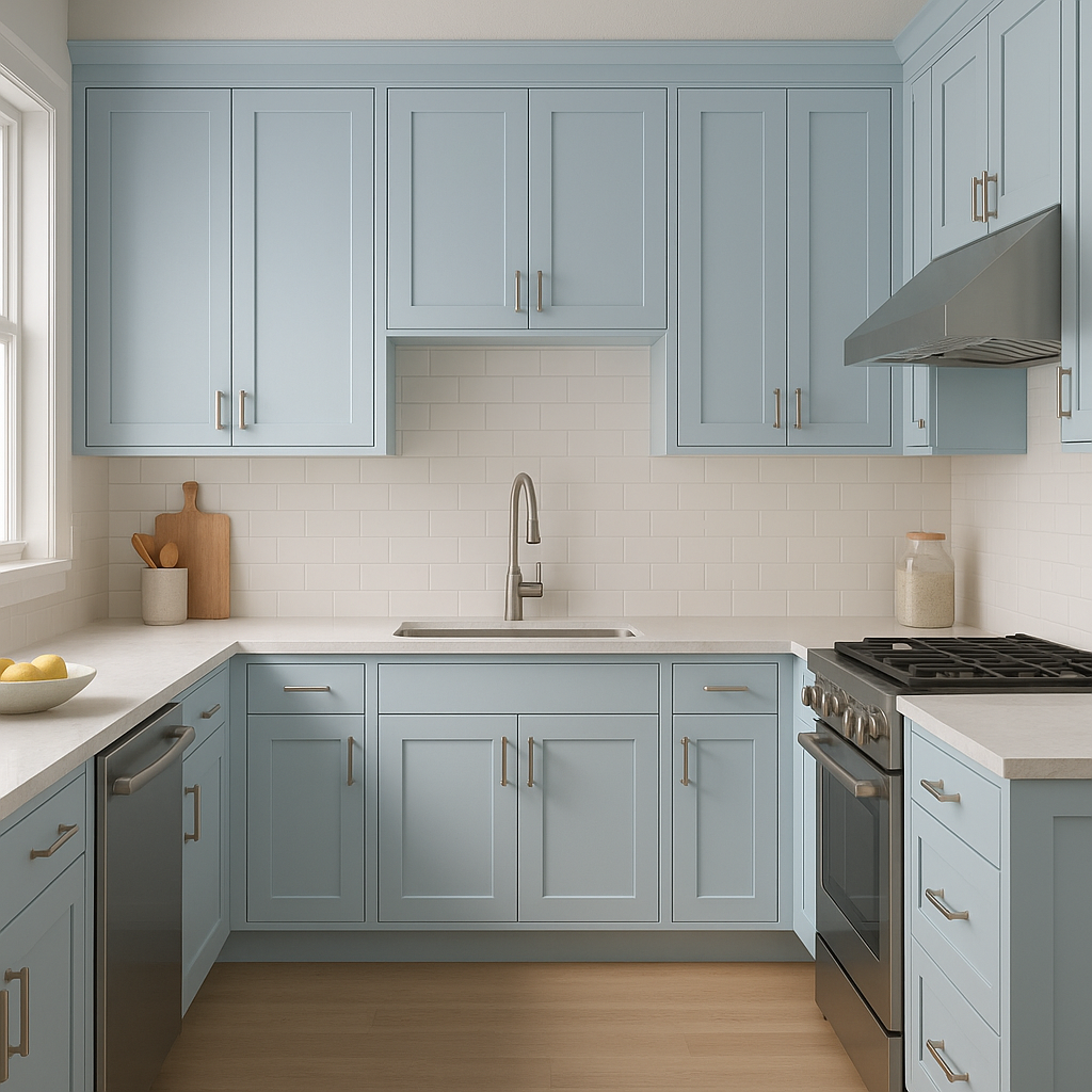
Tear's soft and calming qualities make it an excellent choice for spaces where relaxation and comfort are key. Here are some ideas for incorporating this serene shade into your home:
Living Rooms:
Create an inviting atmosphere by using Tear on the walls and pairing it with cream-colored furniture and natural wood accents. Add navy throw pillows or rugs for a sophisticated touch.
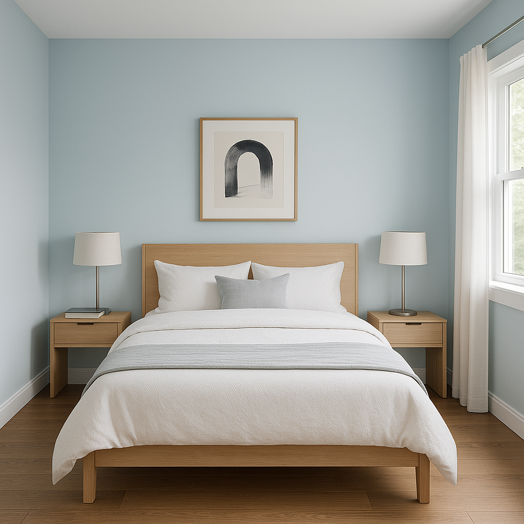
Bedrooms:
Tear is an ideal color for bedrooms, as its cool tones promote relaxation and restful sleep. Pair it with crisp white linens, soft gray curtains, and brushed nickel accents for a polished look.
Bathrooms:
Transform your bathroom into a spa-like retreat by painting the walls in Tear. Complement the color with white subway tiles, chrome fixtures, and soft gray towels.
Nurseries:
Tear’s gentle blue hue is perfect for a baby’s room, offering a soothing and gender-neutral option. Combine it with pastel pinks, mint greens, or buttery yellows for a playful yet serene space.
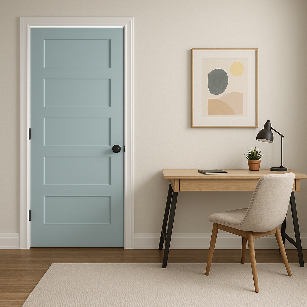
Home Offices:
Foster focus and productivity by using Tear in your workspace. Pair it with sleek white furniture and pops of greenery to create an environment that feels fresh and invigorating.
Benjamin Moore Tear (2053-60) strikes the perfect balance between softness and sophistication, making it a timeless choice for homeowners and designers alike. Its versatility, calming undertones, and compatibility with a wide range of palettes make it a standout option for any room in your home. Whether you're looking to create a serene retreat or a fresh, modern aesthetic, Tear delivers understated elegance with ease.
View Colors Only by Brand (No Imagery):
Sherwin-Williams
|
Benjamin-Moore
|
Behr
|
Valspar
Live on the Eastern Slope of Colorado and looking for a local painting professional, check out all our painting services and reach out for a free estimate.
Copyright © 2026 : Wild Fox Painting Inc. : 12435 Mead Way, Littleton, CO 80125


