Benjamin Moore Prairie (2038-30) is an evocative, earthy green that effortlessly bridges the gap between nature-inspired tranquility and versatile sophistication. This medium-toned hue carries an inviting warmth, allowing it to feel grounded yet fresh in nearly any design setting. Whether you’re crafting a rustic retreat or a serene modern space, Prairie is a color that brings a sense of calm and understated elegance to the room.
The undertones of Prairie lean into a balanced yellow-gold warmth, giving the green a slightly sunlit appearance. These subtle warm undertones make Prairie more versatile than cooler greens, allowing it to harmonize beautifully with both traditional and contemporary palettes. It’s a color that feels connected to nature, like grass kissed by golden sunlight, making it an excellent choice for creating spaces that feel alive yet soothing.
Benjamin Moore Prairie pairs seamlessly with a range of complementary and contrasting colors, making it a dream for designers looking to build a cohesive palette. Here are some ideal coordinating colors:
Neutral Pairings: For a harmonious and serene look, pair Prairie with warm neutrals like Benjamin Moore White Dove (OC-17) or Benjamin Moore Edgecomb Gray (HC-173). These lighter hues balance Prairie’s earthy richness, creating a fresh and airy aesthetic.
Bold Contrasts: To create a dynamic and dramatic space, consider pairing Prairie with deep, saturated hues like Benjamin Moore Hale Navy (HC-154) or Benjamin Moore Black Forest Green (HC-190). These darker tones emphasize Prairie’s warmth while adding depth and intrigue.
Natural Complements: Enhance Prairie’s earthy feel by coordinating it with warm browns and golden tones like Benjamin Moore Tate Olive (HC-112) or Benjamin Moore Golden Straw (2152-50). These combinations evoke the natural beauty of meadows and woodlands.
Soft Accent Colors: For a more playful or romantic look, add soft blush or peach tones like Benjamin Moore Peach Cloud (2169-60) or Benjamin Moore Soft Fern (2144-40) to complement Prairie’s warmth without overpowering its subtle charm.
Prairie’s versatile nature makes it suitable for a variety of interior and exterior applications. Here’s how you can incorporate this stunning green into different spaces:
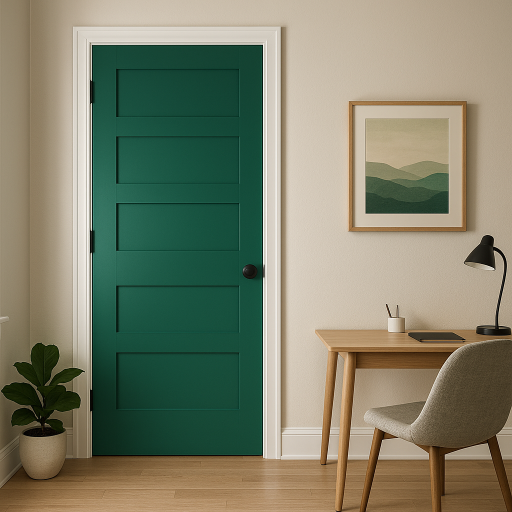
Prairie works beautifully in living rooms and family rooms, creating a cozy yet refreshing atmosphere. It pairs well with wood furniture, woven textures, and natural fibers, making it ideal for spaces that embrace organic design elements. Use it on the walls to anchor the room or as an accent color on built-in shelving or cabinetry.
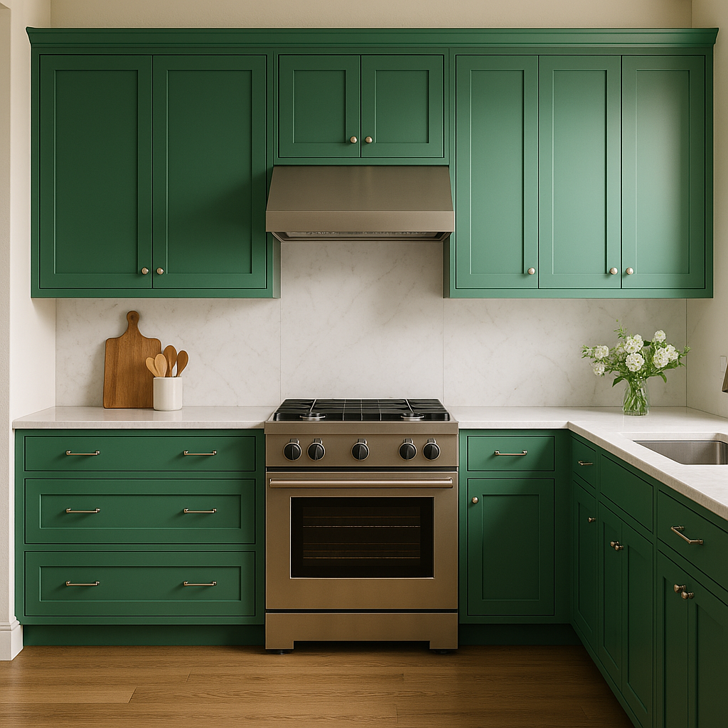
In kitchens, Prairie can be used to enhance cabinetry or as a wall color to complement natural stone countertops and wood flooring. Its earthy undertones make it an excellent choice for farmhouse-inspired kitchens or dining areas that aim for a warm, inviting vibe.
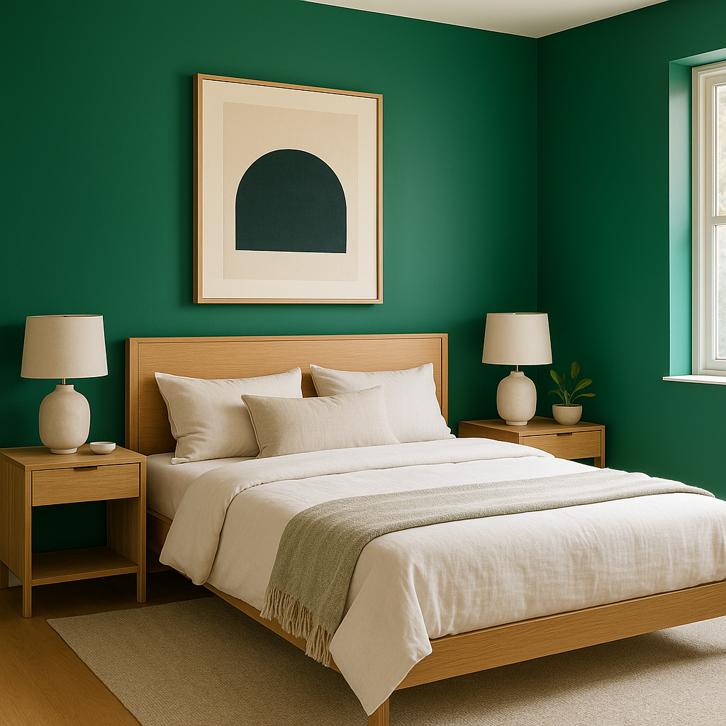
Prairie can create a serene retreat in the bedroom, especially when paired with soft linen bedding and warm metallic accents. Use it as an accent wall behind the bed or paint the entire room for an enveloping, spa-like feel.
For bathrooms, Prairie evokes a connection to nature, making it a perfect choice for spaces that incorporate natural materials like stone and wood. Pair it with crisp whites for fixtures or tiles to maintain a clean and airy aesthetic.
On home exteriors, Prairie’s natural warmth works wonderfully as a siding or trim color. It pairs beautifully with stone facades, brick accents, and landscaping elements, blending seamlessly with the outdoors. Combine it with a lighter neutral like Benjamin Moore Swiss Coffee (OC-45) for trim to achieve a refined yet approachable curb appeal.
Benjamin Moore Prairie is a color that feels timeless yet adaptable, perfect for those who want to bring nature’s beauty indoors. Its warm undertones and versatile green hue allow it to shine in both bold and subdued palettes, making it a dependable choice for any design project. Whether you're looking to create a serene sanctuary or a dynamic focal point, Prairie offers the perfect blend of earthiness and elegance for your interior or exterior spaces.
View Colors Only by Brand (No Imagery):
Sherwin-Williams
|
Benjamin-Moore
|
Behr
|
Valspar
Live on the Eastern Slope of Colorado and looking for a local painting professional, check out all our painting services and reach out for a free estimate.
Copyright © 2026 : Wild Fox Painting Inc. : 12435 Mead Way, Littleton, CO 80125


