Benjamin Moore's Pale (2029-60) is a delicate and soothing shade of green that brings a subtle yet refreshing energy to any space. This soft, airy hue is perfect for those seeking a calming atmosphere with a touch of nature-inspired charm. Its understated elegance makes it a versatile choice for a variety of interior design styles, ranging from modern minimalist to classic traditional.
What makes Pale so intriguing is its gentle undertones of blue. These cool undertones give the shade a tranquil, almost ethereal quality, reminiscent of a light morning mist settling over a serene meadow. While the green is the dominant hue, the subtle blue undertones help temper its brightness, resulting in a color that feels balanced and easy on the eyes.
Depending on the lighting in your space, Pale can shift its appearance slightly. In natural light, it leans toward a fresh, leafy green, while in artificial lighting, the blue undertones can become more pronounced, adding a soft and dreamy quality. This color’s chameleon-like nature makes it adaptable and dynamic, ensuring it always feels interesting without being overpowering.
Benjamin Moore Pale pairs beautifully with a variety of other hues, allowing you to create a cohesive and visually appealing palette. Here are some coordinating colors to consider:
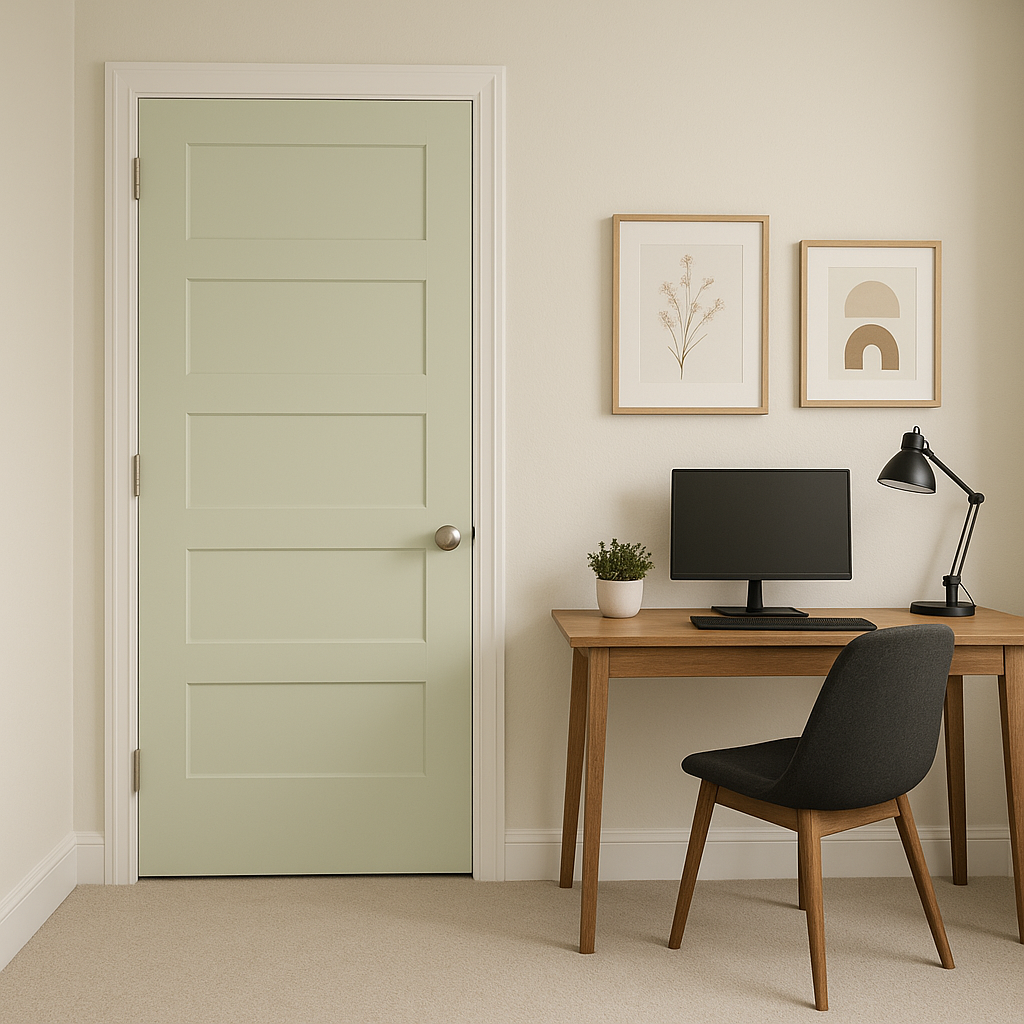
The versatility and calming nature of Pale make it a wonderful choice for a wide range of rooms and design applications. Here are some popular ways to incorporate this shade into your home:
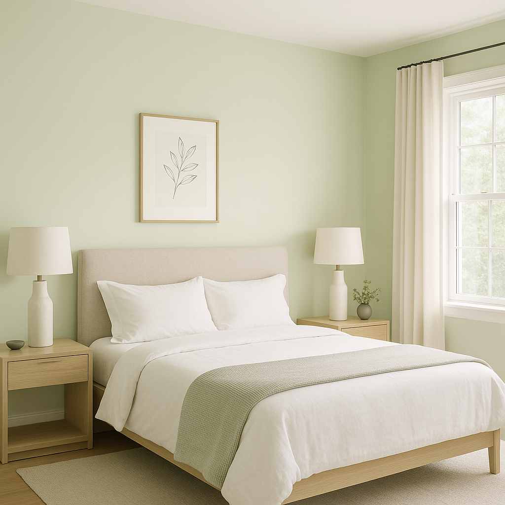
Pale is an excellent option for bedrooms, where its tranquil tones can help create a restful and serene environment. Pair it with soft linens and natural textures like rattan or wood for a cozy, retreat-like feel.
Bring a spa-like vibe to your bathroom by using Pale on the walls or cabinetry. Complement it with white subway tiles and silver or chrome fixtures for a clean, polished look.
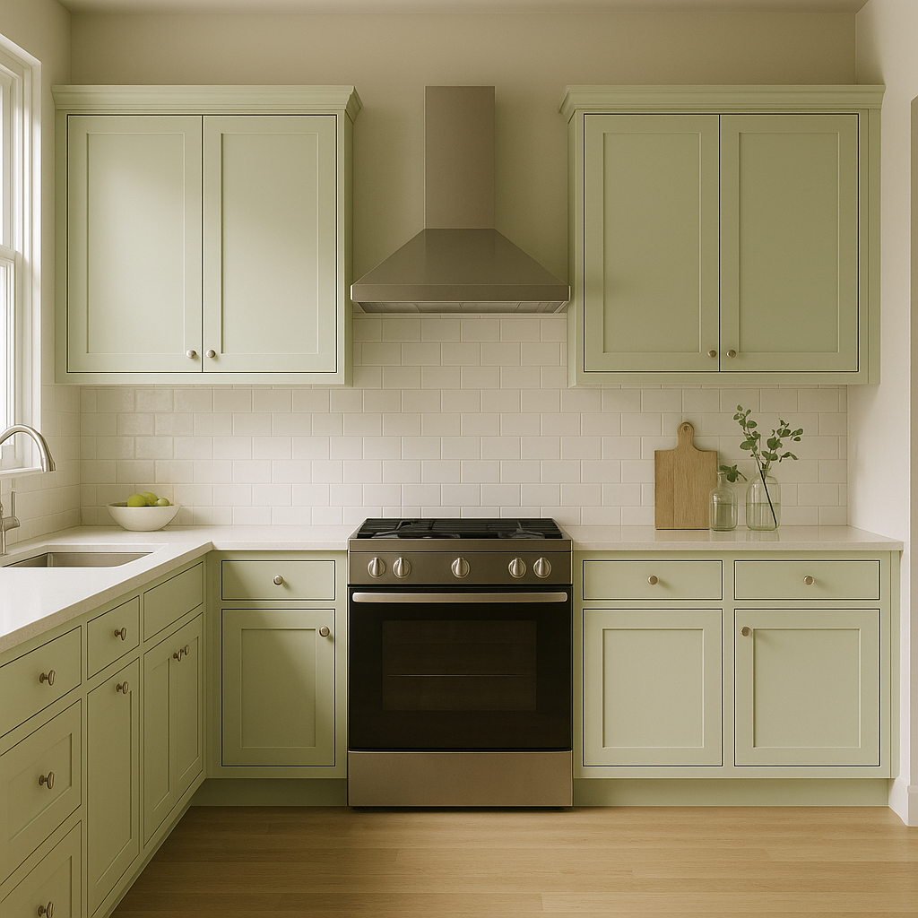
For a fresh and lively kitchen, consider painting your cabinets or walls in Pale. Pair it with brass hardware and natural stone countertops for a blend of modern and organic aesthetics.
In living spaces, Pale can serve as a refreshing backdrop that works well with various accent colors. Add pops of coral, mustard, or navy in your decor for a playful yet sophisticated vibe.
The soft and nurturing quality of Pale makes it a delightful choice for nurseries. Its gender-neutral tone allows you to mix and match decor elements easily, creating a peaceful space for your little one.
Benjamin Moore Pale (2029-60) is more than just a color—it's a mood. Its gentle green hue, tempered by serene blue undertones, makes it the perfect choice for spaces where calmness and clarity are desired. Whether you're refreshing a single room or designing an entire home, this versatile shade offers endless possibilities for creating a space that feels inviting, tranquil, and timeless.
View Colors Only by Brand (No Imagery):
Sherwin-Williams
|
Benjamin-Moore
|
Behr
|
Valspar
Live on the Eastern Slope of Colorado and looking for a local painting professional, check out all our painting services and reach out for a free estimate.
Copyright © 2026 : Wild Fox Painting Inc. : 12435 Mead Way, Littleton, CO 80125


