Benjamin Moore Provence (2021-60) is an enchanting, medium-toned blue-green that evokes the quiet beauty of the French countryside. This color, named after the iconic region of Provence, blends a soothing softness with a subtle vibrancy that feels fresh and inviting. Its calming yet invigorating presence makes it a versatile choice for a variety of spaces, effortlessly balancing elegance with approachability.
Provence is a blue-green hue with distinct gray undertones, giving it a slightly muted and sophisticated quality. The gray undertones prevent it from feeling overly bright or saturated, allowing it to maintain a refined, grounded presence. Depending on the lighting, Provence might reveal more of its blue side in cooler, shaded spaces or lean into its green warmth in sunlight or under warm-toned artificial light. This chameleon-like adaptability ensures that Provence feels harmonious in a wide range of interiors.
Benjamin Moore Provence pairs beautifully with both neutrals and bolder hues, making it a versatile option for crafting cohesive color schemes. Here are some coordinating colors to consider:
Neutral Pairings:
Bold Accents:
Soft Complements:
Provence’s tranquil yet lively nature makes it an excellent choice for a variety of interior and exterior applications. Its versatility shines in both traditional and contemporary design styles, and it brings a touch of warmth to any room it graces.
Provence creates a serene and welcoming atmosphere, making it perfect for living rooms or family spaces. Pair it with soft white trim and natural wood accents to enhance its relaxed charm.
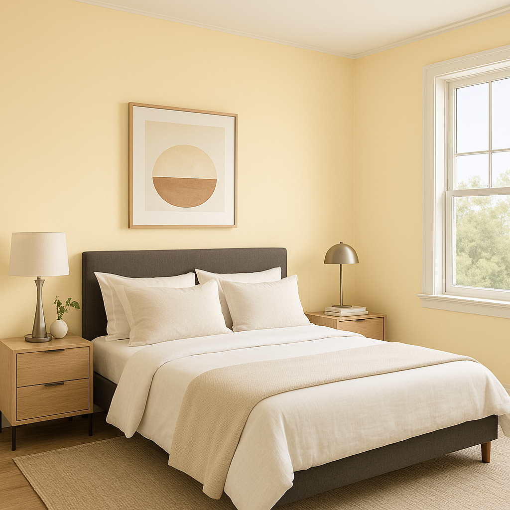
As a calming shade, Provence is a natural fit for bedrooms. Its soothing blue-green tones promote restfulness, while its subtle vibrancy keeps the space from feeling dull. Combine it with plush textiles, warm whites, and soft lighting for a cozy retreat.
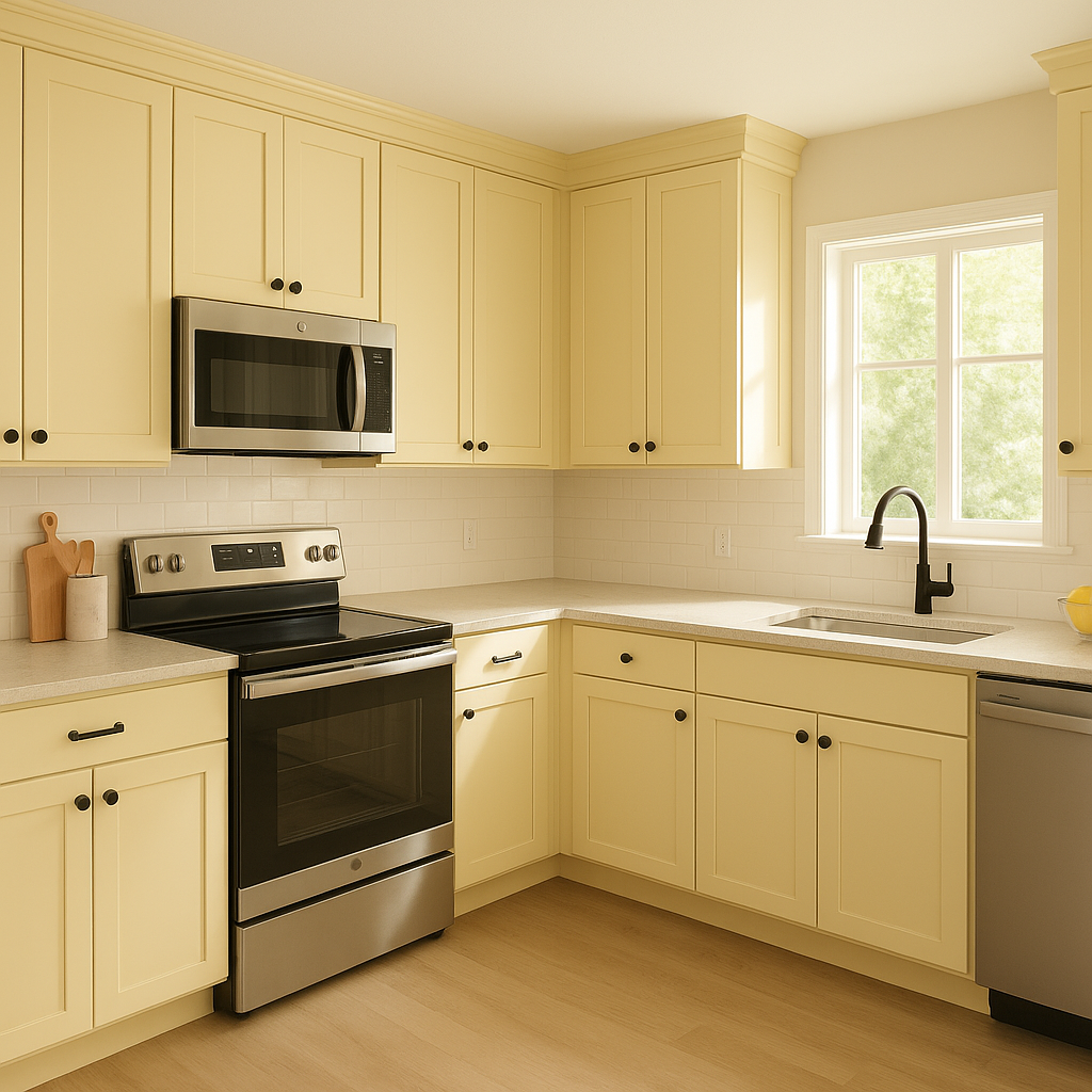
In kitchens, Provence adds a touch of rustic charm, particularly when paired with white cabinetry, brass hardware, and butcher block countertops. For dining spaces, it creates an inviting ambiance, perfect for intimate gatherings or everyday meals.
Provence works beautifully in bathrooms, evoking the serenity of a spa. Pair it with white subway tiles, polished chrome fixtures, and soft gray or beige accents for a timeless look.
For exteriors, Provence offers a fresh alternative to traditional blues or greens. Use it on shutters, front doors, or siding to create a welcoming, classic curb appeal. Pair it with crisp white trim and natural stone for a cohesive, balanced look.
The appearance of Benjamin Moore Provence can vary based on lighting conditions. In spaces with ample natural light, it will lean more vibrant and show off its blue-green brilliance. In dimmer spaces or artificial lighting, its gray undertones become more pronounced, giving it a softer, more subdued look. Always test a sample in your space to see how it interacts with your specific lighting.
Benjamin Moore Provence (2021-60) is a color that feels timeless yet fresh, making it an ideal choice for those who want to bring a sense of serenity and subtle sophistication to their home. Whether used as a statement wall, an all-over paint color, or an accent, Provence’s unique blend of blue, green, and gray creates a balanced and harmonious environment that resonates with both traditional and modern sensibilities.
This effortlessly chic hue has the versatility to transform any space into a tranquil haven, making it a thoughtful and enduring choice for your next design project.
View Colors Only by Brand (No Imagery):
Sherwin-Williams
|
Benjamin-Moore
|
Behr
|
Valspar
Live on the Eastern Slope of Colorado and looking for a local painting professional, check out all our painting services and reach out for a free estimate.
Copyright © 2026 : Wild Fox Painting Inc. : 12435 Mead Way, Littleton, CO 80125


