Benjamin Moore Pan (181) is a sophisticated neutral that effortlessly bridges the gap between understated warmth and cool refinement. This soft, beige-gray hue is cherished by interior designers for its adaptability and ability to create serene, inviting spaces. Whether you're crafting a minimalist retreat or enhancing traditional elegance, Pan (181) offers a harmonious backdrop that complements a wide range of styles and palettes.
Pan (181) features subtle undertones that enhance its versatility. Its gentle beige base is delicately balanced with cool gray notes, giving it a chameleon-like quality. These undertones allow the color to shift depending on lighting conditions, making it appear warmer in natural sunlight and cooler under artificial lighting. This dynamic blend of warm and cool undertones ensures that Pan (181) feels neither too stark nor overly creamy, making it a perfect neutral for spaces that require both comfort and sophistication.
Pan (181) pairs beautifully with a variety of hues, thanks to its balanced undertones. Here are some coordinating colors that complement its charm:
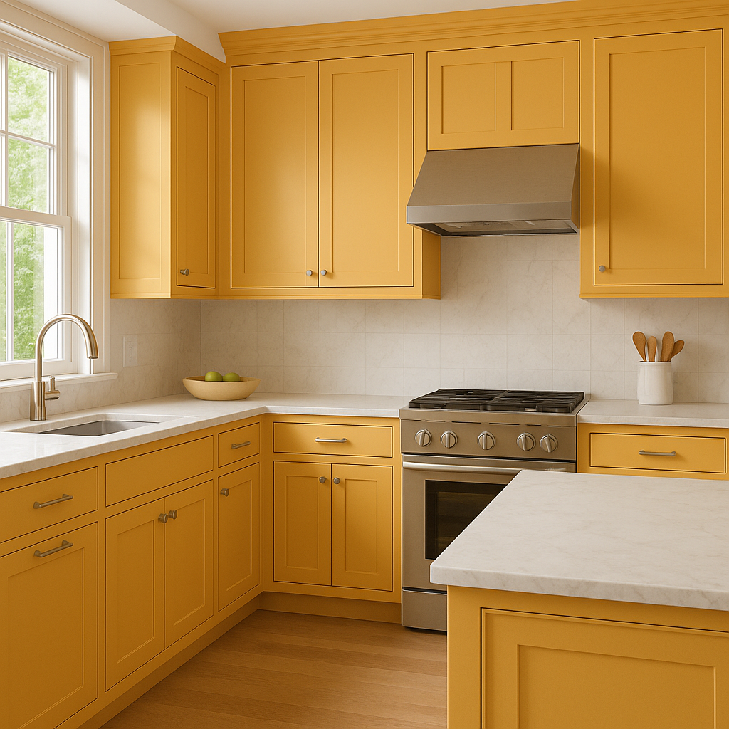
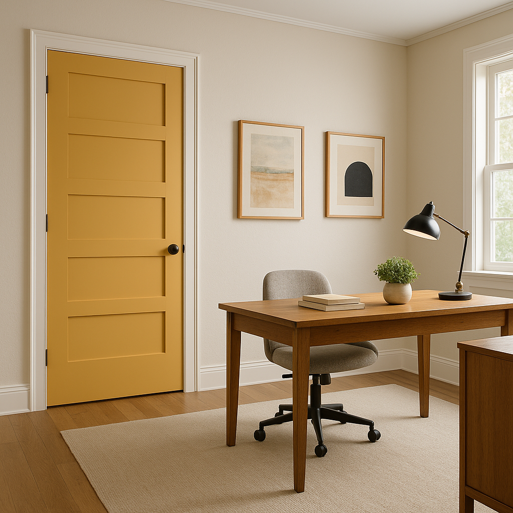
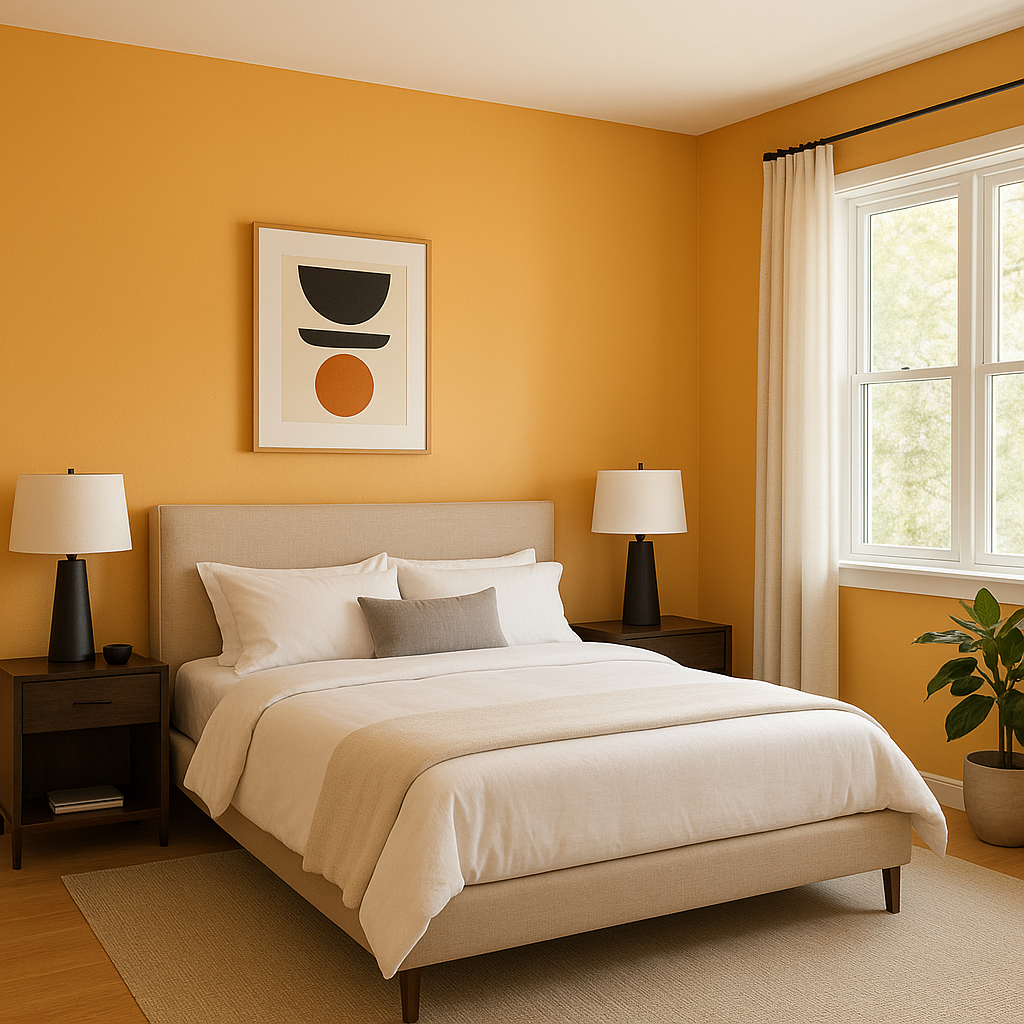
Pan (181) is a color that thrives in a variety of settings, from residential to commercial interiors. Its understated elegance makes it a go-to choice for walls, trim, and even cabinetry. Here are some ways to use Pan (181) in your space:
With its balanced undertones, adaptability, and timeless appeal, Benjamin Moore Pan (181) is truly a designer’s delight. Its ability to complement a range of styles and colors makes it an ideal choice for both small and large spaces. From cozy bedrooms to sophisticated living areas, Pan (181) delivers a sense of understated luxury that enhances your interior design vision.
View Colors Only by Brand (No Imagery):
Sherwin-Williams
|
Benjamin-Moore
|
Behr
|
Valspar
Live on the Eastern Slope of Colorado and looking for a local painting professional, check out all our painting services and reach out for a free estimate.
Copyright © 2026 : Wild Fox Painting Inc. : 12435 Mead Way, Littleton, CO 80125


