Benjamin Moore Polar (1674) is a sophisticated neutral paint color that strikes a perfect balance between warm and cool tones. This shade is ideal for creating serene and inviting spaces, making it a popular choice for homeowners and designers alike. Its subtle complexity allows it to shine in both modern and traditional interiors, offering versatility and elegance that is hard to match.
Polar (1674) is a soft gray with nuanced undertones that lean towards blue and violet. These cool undertones lend the color a fresh, airy quality, making it an excellent choice for spaces where you want to evoke a sense of calm and tranquility. Despite its cooler leanings, Polar is not overly icy, maintaining a gentle warmth that prevents it from feeling stark or sterile.
The blue undertones make it particularly suited for rooms with natural light, as the interplay between light and color enhances its subtle character. However, in spaces with limited light, Polar can take on a slightly deeper tone, emphasizing its richness and depth.
Pairing Benjamin Moore Polar with complementary colors can help you craft a harmonious and visually appealing palette. Consider these coordinating colors for your design scheme:
These coordinating shades allow you to tailor your design to a range of aesthetics, from coastal-inspired retreats to urban chic interiors.
Polar’s versatility makes it an excellent choice for a variety of applications within the home. Whether you’re refreshing a single room or designing an entire house, this timeless hue adapts effortlessly to different spaces:
Polar creates a welcoming and polished atmosphere in living rooms, offering a neutral backdrop that complements a wide range of furniture styles and textiles. Pair it with plush fabrics, metallic accents, or natural wood tones for a balanced and inviting space.
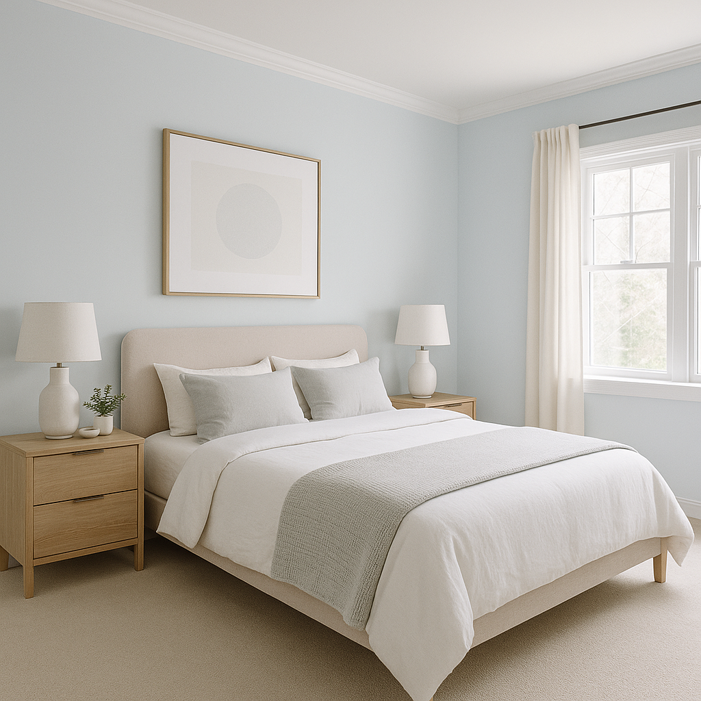
The calming undertones of Polar make it ideal for bedrooms, where relaxation is key. Use it on walls and pair it with crisp white linens, soft blues, or muted greens for a tranquil retreat.
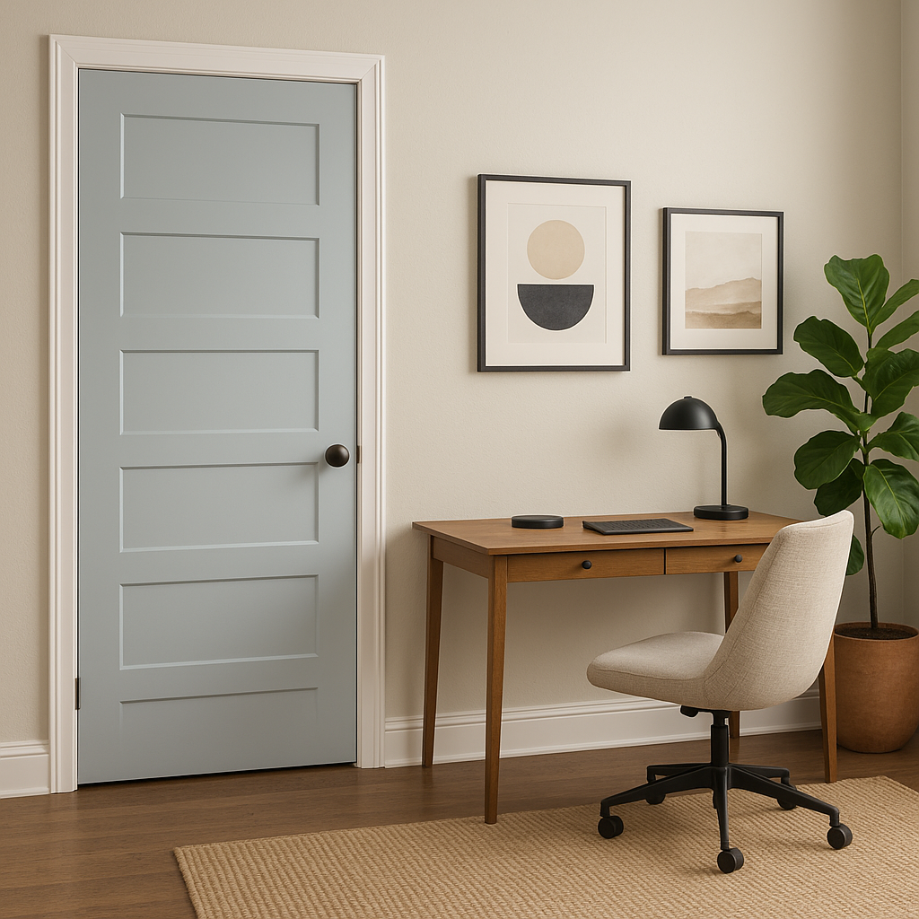
Polar’s understated elegance makes it a smart choice for home offices. Its cool undertones promote focus and clarity, while its neutrality allows for easy pairing with bold colors or natural materials.
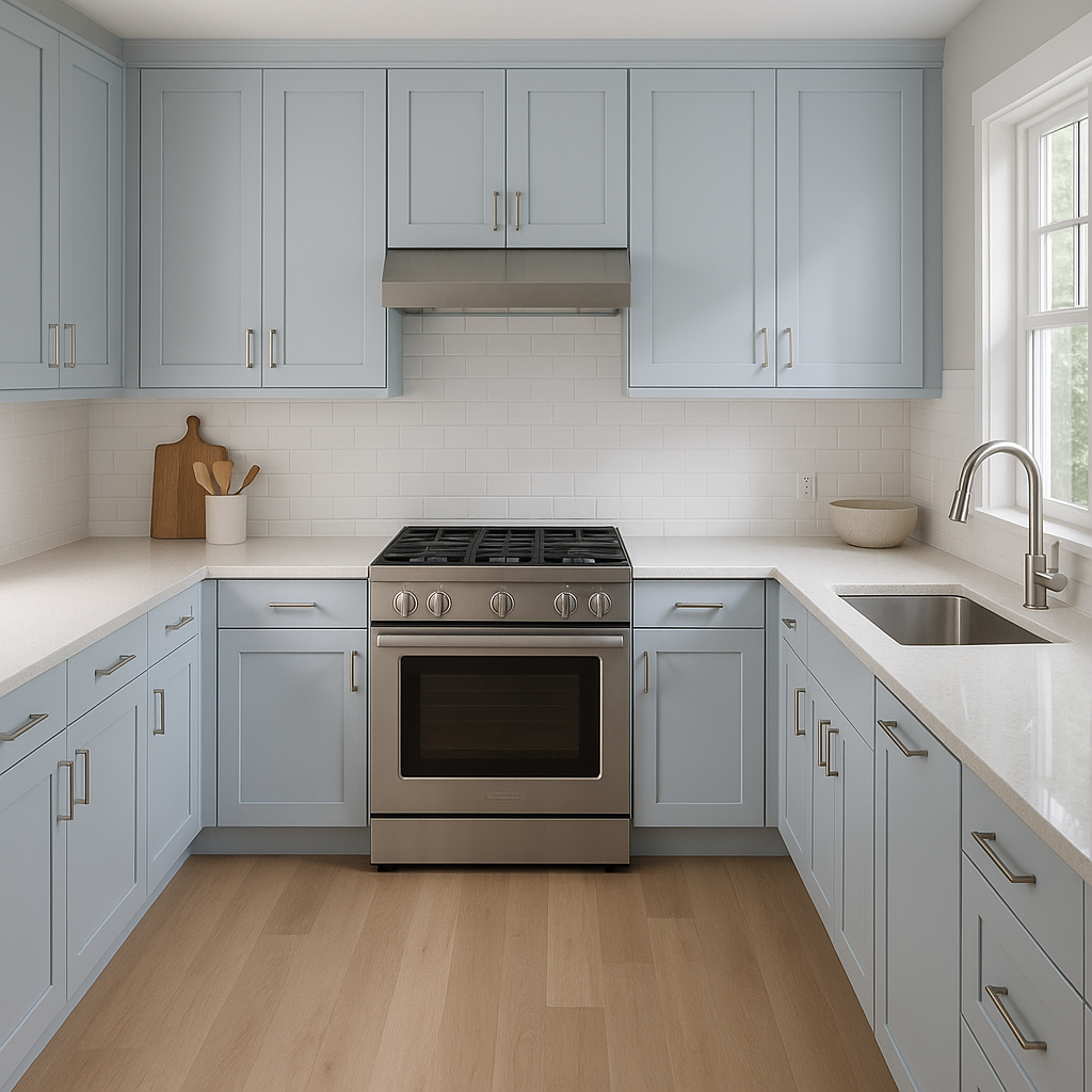
For kitchens, Polar works wonderfully on cabinets or walls, especially when paired with white quartz countertops or stainless steel appliances. In dining areas, it provides a subtle backdrop that enhances the warmth of wood furniture or the sparkle of glass accents.
In bathrooms, Polar’s cool undertones evoke a spa-like ambiance. Pair it with white tiles, brushed nickel fixtures, and soft blue or green accents for a serene and clean aesthetic.
Polar’s refined gray tone translates beautifully to exterior spaces as well. Use it for siding or trim to create a timeless look that complements stone, brick, or wooden architectural elements.
Benjamin Moore Polar (1674) is more than just a neutral—it’s a versatile canvas that allows your creativity to shine. Whether you’re looking for a subtle backdrop for bold décor choices or a serene color to ground your design, Polar delivers. Its sophisticated blend of undertones ensures it adapts seamlessly to different lighting conditions and design styles, making it a reliable choice for any project.
With its elegant undertones, coordinating color options, and broad usability, Benjamin Moore Polar (1674) is a standout neutral that promises timeless beauty and lasting impact in your home.
View Colors Only by Brand (No Imagery):
Sherwin-Williams
|
Benjamin-Moore
|
Behr
|
Valspar
Live on the Eastern Slope of Colorado and looking for a local painting professional, check out all our painting services and reach out for a free estimate.
Copyright © 2026 : Wild Fox Painting Inc. : 12435 Mead Way, Littleton, CO 80125


