Benjamin Moore Providence (1636) is a classic mid-tone gray that exudes understated elegance and versatility. With its perfectly balanced hue, this paint color serves as a refined backdrop for both traditional and contemporary interiors. Whether you're crafting a serene living space or a polished office, Providence (1636) offers a timeless neutrality that complements a variety of decor styles.
Providence (1636) has subtle blue undertones, lending the gray a cool, calming quality. These faint blue notes ensure the color feels airy and fresh rather than overly heavy or stark. The undertones make Providence ideal for spaces where light plays a central role, enhancing its ability to shift slightly depending on the surrounding lighting conditions. In natural daylight, the blue undertones are more pronounced, offering a crisp and serene ambiance, while in artificial lighting, it transforms into a soft and sophisticated gray.
To create a harmonious palette with Providence (1636), pair it with complementary shades that either accentuate its cool undertones or provide a contrasting warmth. Here are some excellent coordinating colors:
For a pop of color, consider adding touches of muted greens or soft blush pinks to create a refreshing contrast.
Providence (1636) is versatile enough to work in a range of spaces, thanks to its sophisticated neutrality. Here are some suggestions for where this color truly shines:
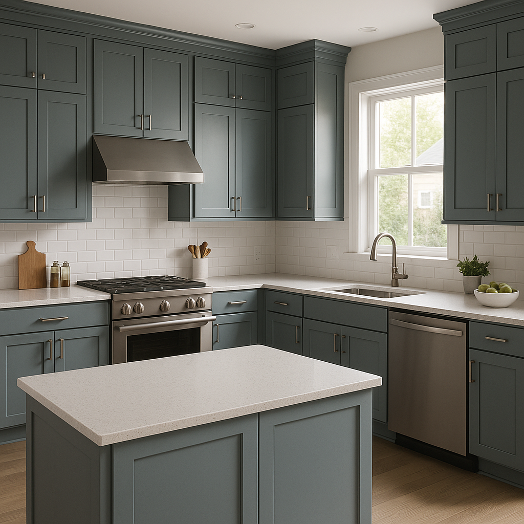
Providence (1636) creates a calm and collected atmosphere for communal spaces like living rooms. Pair it with light-colored furniture and natural wood accents to maintain its airy feel. Throw pillows or rugs in navy or emerald green can add depth and personality.
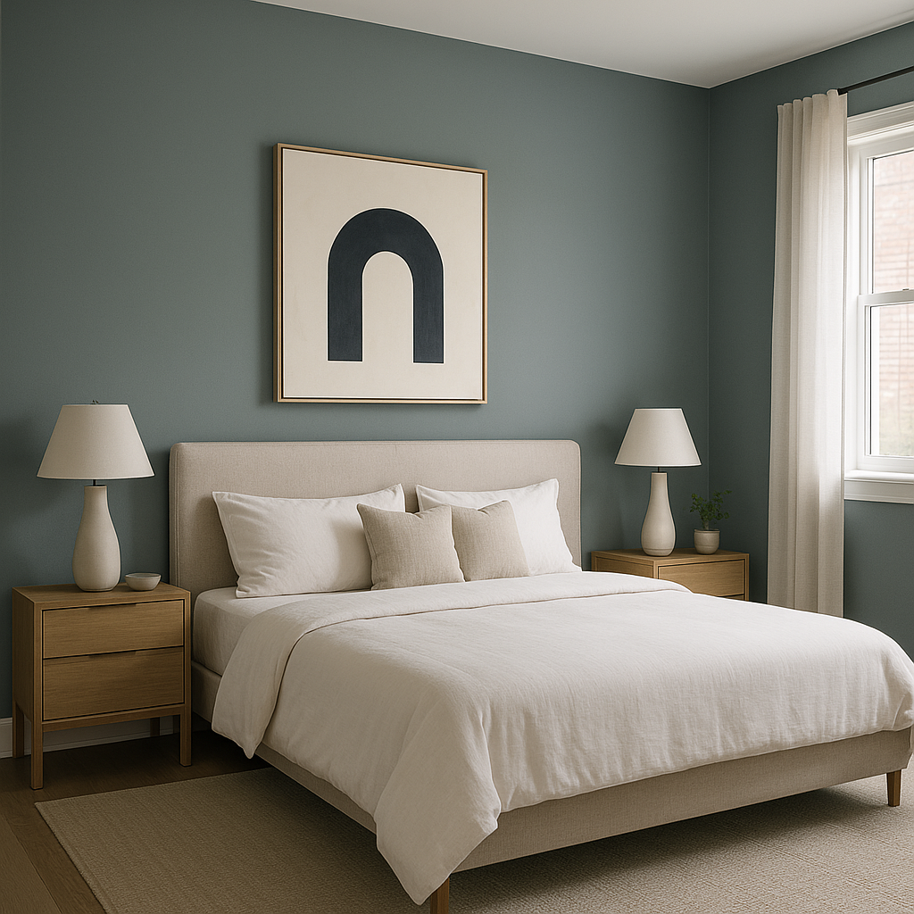
Infuse bedrooms with tranquility by using Providence on the walls. Its cool undertones promote relaxation and work beautifully with white bedding and soft lighting. Consider adding metallic accents, such as brass or brushed nickel, for a touch of modern elegance.
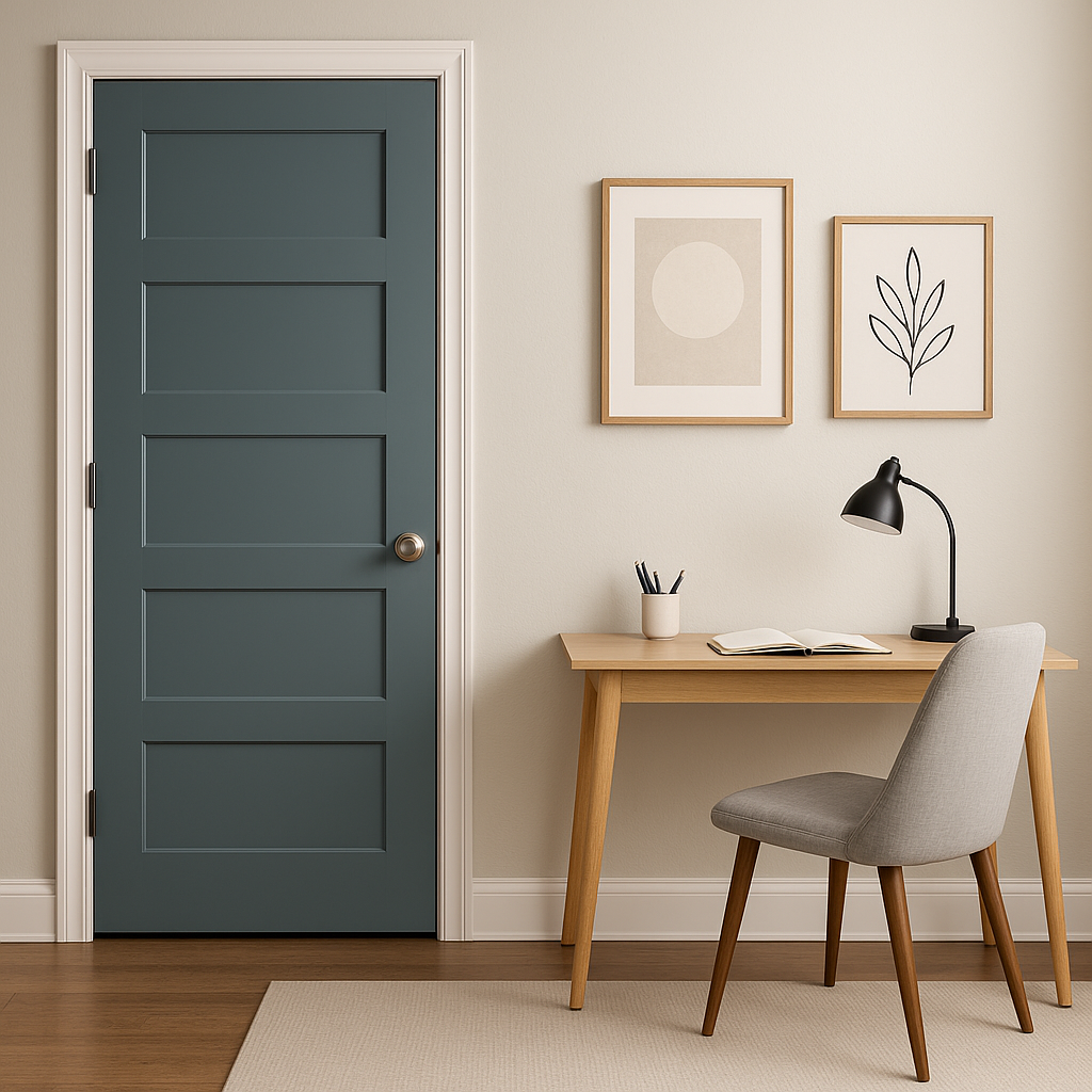
For a productive yet serene workspace, Providence (1636) offers the perfect neutral backdrop. Pair it with sleek black furniture or dark wood tones for a professional finish.
Providence's cool gray tones are ideal for bathrooms, where light often plays a pivotal role. Combine it with white subway tiles and polished chrome fixtures for a spa-like vibe.
As a mid-tone gray, Providence works well in transitional spaces like hallways and entryways. Its neutral character ensures it creates a seamless flow between rooms while maintaining a polished and inviting look.
Lighting plays a significant role in how Providence (1636) appears in your space. In bright natural light, its blue undertones become more evident, giving the room an airy and fresh feel. In dim or artificial lighting, it reads as a softer, deeper gray, perfect for cozy spaces. Always test the color in your specific lighting conditions before committing fully.
Benjamin Moore Providence (1636) is more than just a paint color; it's a sophisticated canvas for your creative vision. Its versatility, cool undertones, and ability to coordinate with a wide range of colors make it a top choice for any interior design project. Whether you're redecorating a single room or refreshing your entire home, Providence (1636) provides the perfect balance of timelessness and modern appeal.
View Colors Only by Brand (No Imagery):
Sherwin-Williams
|
Benjamin-Moore
|
Behr
|
Valspar
Live on the Eastern Slope of Colorado and looking for a local painting professional, check out all our painting services and reach out for a free estimate.
Copyright © 2026 : Wild Fox Painting Inc. : 12435 Mead Way, Littleton, CO 80125


