Benjamin Moore Winter (1555) is a sophisticated and serene gray paint color that exudes understated elegance. Perfectly suited for both modern and classic interiors, this hue is a versatile choice that can enhance a variety of design aesthetics. Whether you're looking to create a calm, neutral backdrop or add a touch of softness to a space, Winter is an ideal choice.
Winter (1555) is a cool gray with subtle blue undertones that give it a crisp, refined character. These blue undertones prevent the color from feeling flat or overly neutral, adding depth and dimension to the shade. Depending on the lighting in your room, Winter may lean more toward a steely gray or reveal a faint, icy blue cast. This dynamic quality makes it particularly versatile for spaces with changing natural light throughout the day.
When selecting coordinating colors, Winter pairs beautifully with a range of complementary hues. Its cool undertones work especially well with other cool colors and soft neutrals. Here are some suggestions:
These coordinating colors allow you to create a range of effects, from soothing monochromatic schemes to striking contrasts that make Winter stand out.
The versatility of Benjamin Moore Winter makes it suitable for a wide range of applications. Whether used as the main color in a room or as an accent, it offers timeless appeal. Here are a few ways to incorporate Winter into your home:
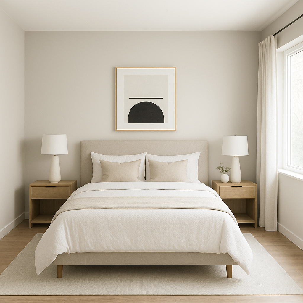
Winter’s cool and calming presence makes it a fantastic choice for living rooms and bedrooms. Pair it with plush textiles in soft blues, grays, and whites to create a serene retreat. Add metallic accents, such as brushed nickel or chrome, for a hint of sophistication.
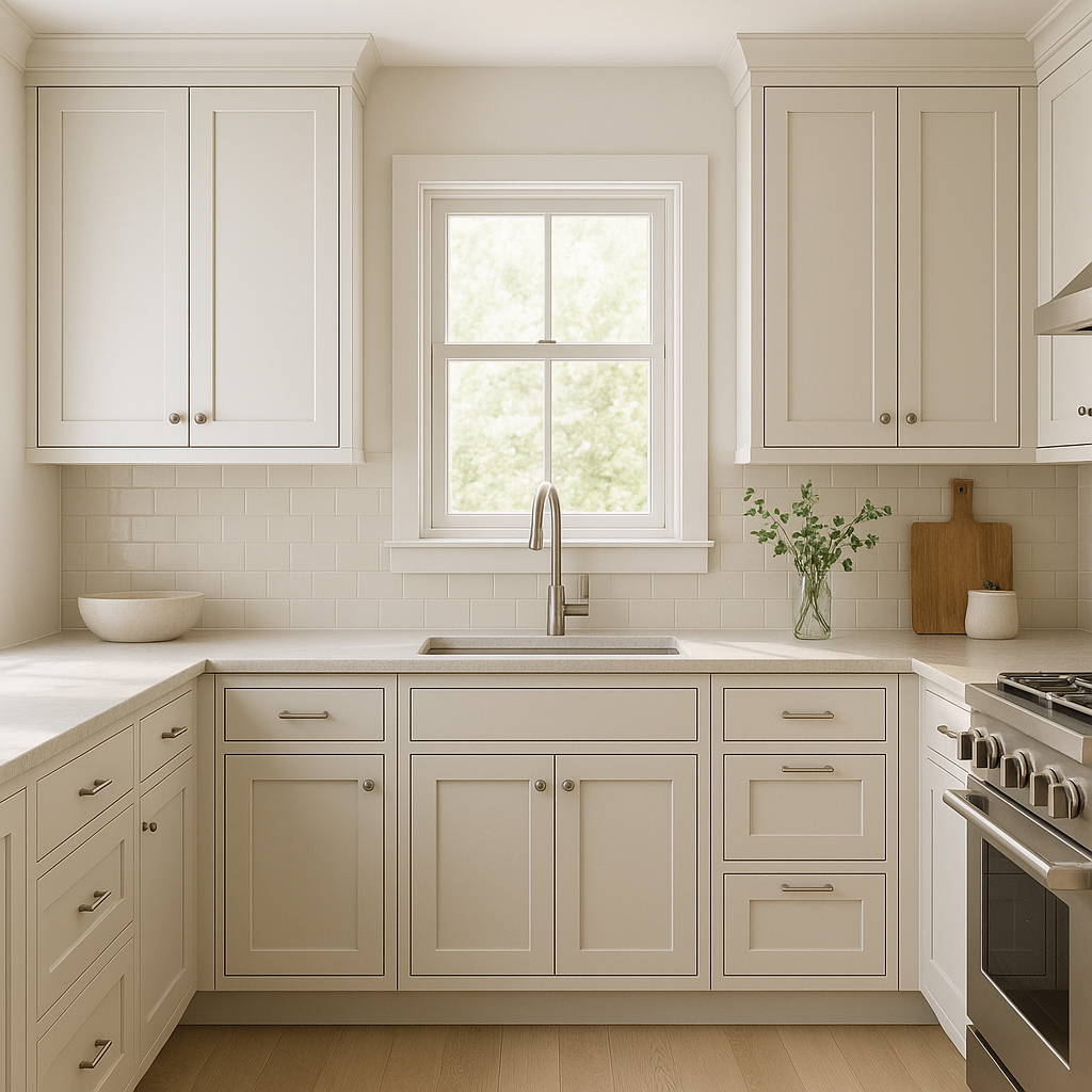
The crisp blue undertones of Winter make it especially effective in kitchens and bathrooms. It pairs beautifully with white subway tiles, stainless steel appliances, and natural stone countertops. For a spa-like bathroom, combine Winter with soft greens or blues for a tranquil atmosphere.
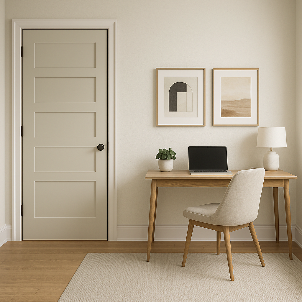
If you’re looking to add depth to a space without overwhelming it, use Winter as an accent wall color. Its muted tone draws attention without being overpowering. Pair it with lighter grays or whites to maintain balance in the room.
Winter is also an excellent choice for exterior siding or trim. Its cool undertones make it a sophisticated option for modern homes, while its timeless quality ensures it works for classic architectural styles as well. Pair it with crisp white trim or darker grays for a polished look.
As with any paint color, lighting plays a crucial role in how Benjamin Moore Winter appears in your space. In rooms with ample natural light, the blue undertones become more pronounced, giving the room a light and airy feel. In spaces with limited lighting, Winter may appear slightly darker and moodier, creating a cozy atmosphere. To ensure the best results, test Winter in different areas of your home and observe how it interacts with the light throughout the day.
Benjamin Moore Winter (1555) is a refined and versatile gray that adapts beautifully to different environments and design styles. Its cool blue undertones add depth and personality while maintaining a neutral aesthetic that pairs effortlessly with other colors. Whether you're refreshing a single room or designing an entire home, Winter is a timeless choice that will elevate your space with its sophistication and subtle charm.
View Colors Only by Brand (No Imagery):
Sherwin-Williams
|
Benjamin-Moore
|
Behr
|
Valspar
Live on the Eastern Slope of Colorado and looking for a local painting professional, check out all our painting services and reach out for a free estimate.
Copyright © 2026 : Wild Fox Painting Inc. : 12435 Mead Way, Littleton, CO 80125


