Benjamin Moore Point (155) is a refined, sophisticated neutral that effortlessly bridges the gap between modernity and classic charm. This versatile hue belongs to the gray family but carries subtle nuances that make it a standout choice for a variety of interior design styles. With its understated elegance, Point is perfect for creating serene spaces while serving as a flexible backdrop for both bold and subdued accents.
Point (155) is a medium-toned gray with blue undertones, giving it a cool and calming demeanor. The hint of blue adds depth to the color, making it feel grounded yet dynamic. This undertone ensures that the shade doesn’t appear flat or overly sterile, even in spaces with dim lighting. Rather, it exudes a sophisticated charm that works beautifully in both contemporary and traditional interiors.
The subtle coolness of Point makes it a fantastic option for rooms aiming to evoke tranquility and elegance. However, its undertones may shift slightly depending on the lighting conditions. In spaces with natural sunlight, the blue undertones become more pronounced, while artificial warm lighting may soften its coolness, giving it a slightly greige appearance. Pairing Point with complementary colors allows you to amplify or tone down its undertones, based on your desired aesthetic.
Benjamin Moore Point (155) is a versatile neutral that pairs well with a variety of shades, allowing for endless design possibilities. Here are a few coordinating colors to consider:
Crisp Whites: Pair Point with Benjamin Moore White Dove (OC-17) or Simply White (OC-117) for a clean, fresh look that enhances its crispness. This pairing is perfect for modern or minimalist spaces.
Deep Blues: Complement the cool undertones of Point with richer blues, such as Hale Navy (HC-154) or Van Deusen Blue (HC-156). These shades create dramatic depth and are ideal for accent walls, cabinetry, or decor pieces.
Muted Greens: Pair Point with soft greens like October Mist (1495) or Gray Cashmere (2138-60) to evoke a calming, nature-inspired palette.
Warm Accents: To counterbalance the coolness of Point, incorporate warm tones like Kendall Charcoal (HC-166) or Revere Pewter (HC-172). This combination adds a cozy, inviting feel to your space.
Point (155) is a true chameleon when it comes to its application. Its versatility allows it to shine in a variety of spaces and design schemes:
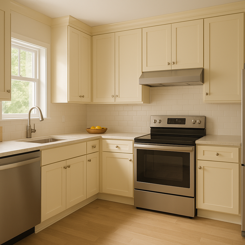
Point’s balanced gray tone creates a soothing backdrop for living rooms. Pair it with crisp white trim and textured fabrics in neutral tones for a sophisticated yet cozy atmosphere. Add pops of color through bold artwork or vibrant throw pillows for visual interest.
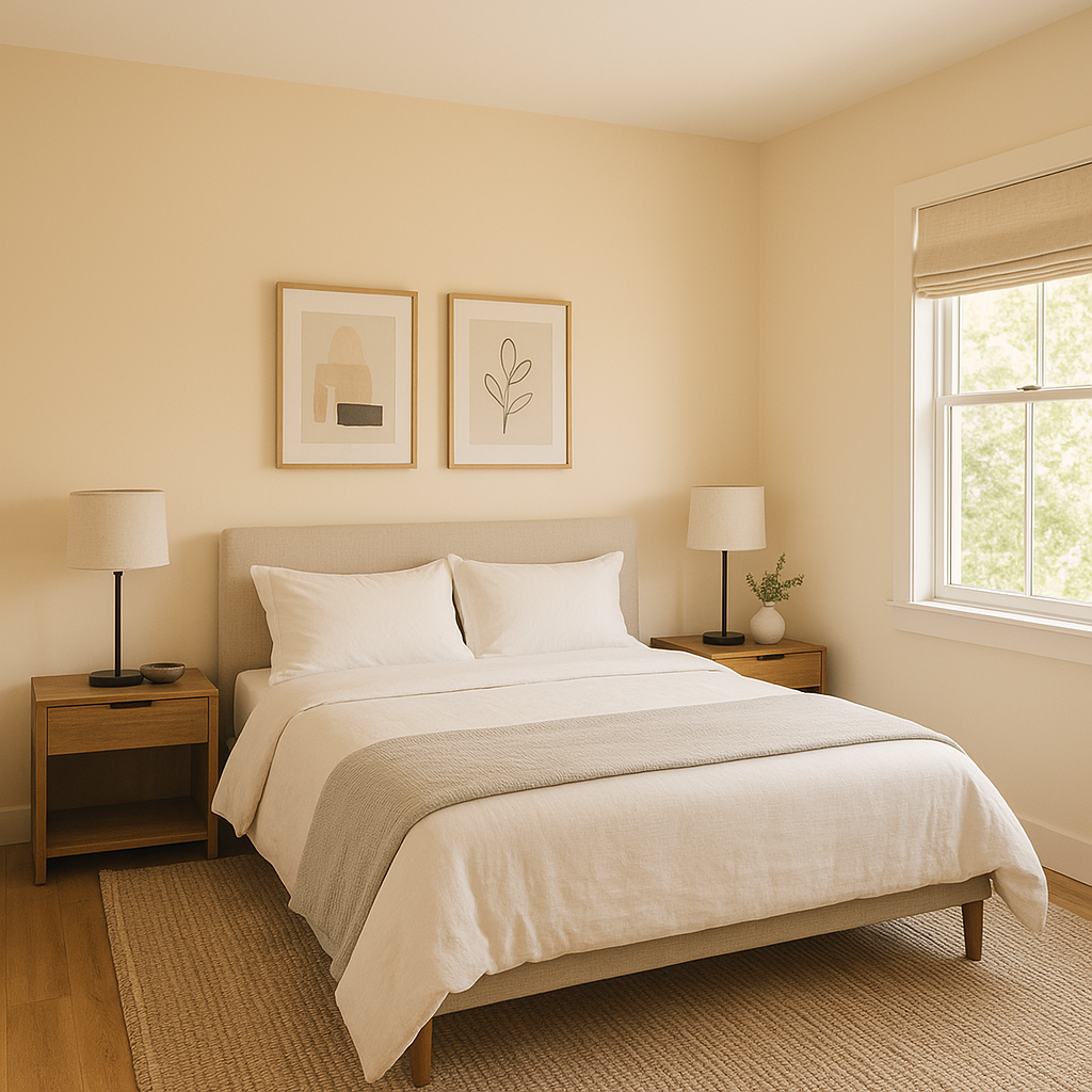
The calming blue undertones of Point make it a perfect choice for bedrooms, where relaxation is key. Layer the room with soft linens in complementary hues such as muted greens or whites, and incorporate natural wood furniture to add warmth to the space.
For bathrooms, Point provides a spa-like feel when paired with white subway tiles and polished chrome fixtures. Its cool undertones work beautifully with marble countertops and natural stone accents.
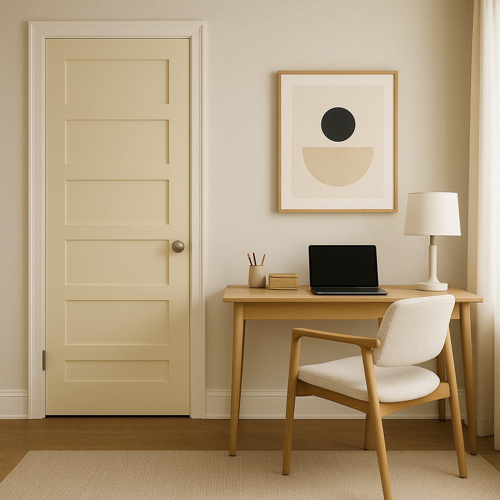
Point can foster focus and productivity in home offices. Pair it with sleek furniture, deep blue accents, and metallic finishes to create a professional yet inspiring environment.
Point is not limited to interiors; it also makes a striking exterior paint color. Use it for siding or trim to create a modern and timeless curb appeal. Pair it with crisp whites or darker grays for a cohesive look.
As with any paint color, lighting plays a significant role in how Point (155) appears in your space. In rooms with abundant natural light, its blue undertones will shine, creating a cool and airy ambiance. In dimly lit or artificial lighting conditions, the shade may lean slightly warmer, offering a more subdued and cozy feel. To ensure it works well in your home, test Point (155) on multiple walls in varying lighting conditions before committing to a full application.
Benjamin Moore Point (155) is an exceptional choice for anyone seeking a versatile, elegant gray with subtle personality. Its ability to adapt to different styles, pair seamlessly with a range of colors, and evoke a calming yet refined atmosphere makes it a favorite among interior designers and homeowners alike. Whether you're refreshing a single room or reimagining your entire home, Point is a neutral that promises timeless beauty and enduring sophistication.
View Colors Only by Brand (No Imagery):
Sherwin-Williams
|
Benjamin-Moore
|
Behr
|
Valspar
Live on the Eastern Slope of Colorado and looking for a local painting professional, check out all our painting services and reach out for a free estimate.
Copyright © 2026 : Wild Fox Painting Inc. : 12435 Mead Way, Littleton, CO 80125


